 View review
Logo score
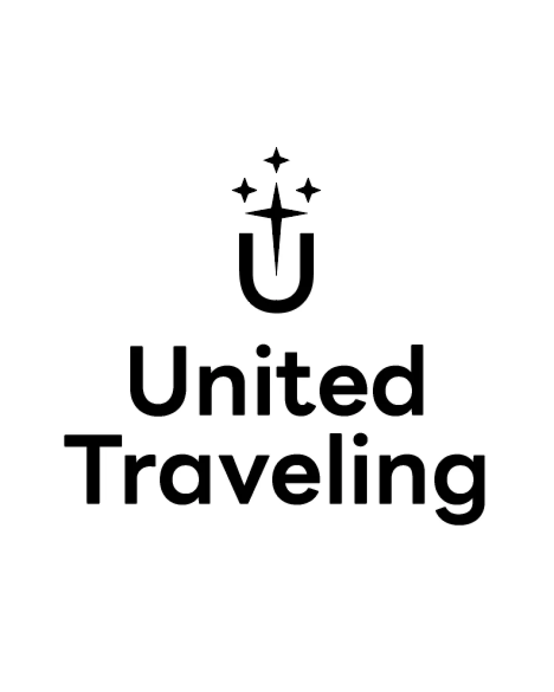
Logo review ofUnited Traveling
Review the detailed scores below to see what is working and what should be refined first.
Legibility
Originality
Misread
Balance
Scale
Detailed review
Logo performance breakdown
Legibility
![]() Font is clear and highly readable, strong contrast with background
Font is clear and highly readable, strong contrast with background![]() Text is bold, regular, and evenly spaced
Text is bold, regular, and evenly spaced
Originality
![]() U monogram paired with starburst is fairly unique for travel
U monogram paired with starburst is fairly unique for travel![]() Abstract approach separates it from cliche travel icons like planes or globes
Abstract approach separates it from cliche travel icons like planes or globes
![]() The star and sparkle motif is somewhat common across various industries; the concept could be pushed further for more distinctiveness
The star and sparkle motif is somewhat common across various industries; the concept could be pushed further for more distinctiveness
Color harmony
![]() Use of black and white ensures timeless, versatile application
Use of black and white ensures timeless, versatile application![]() No clashing or excessive color use
No clashing or excessive color use
Black
#000000
White
#FFFFFF
Balance alignment
![]() Excellent central alignment of symbol and wordmark
Excellent central alignment of symbol and wordmark![]() Consistent visual weight between the symbol and text
Consistent visual weight between the symbol and text

Scalability
![]() Simple form enables use at small and large scales
Simple form enables use at small and large scales![]() Harmony between symbol and text for multi-format reproduction
Harmony between symbol and text for multi-format reproduction
![]() Very thin lines in the starburst might lose detail at small sizes, particularly in embroidery or on small merchandise
Very thin lines in the starburst might lose detail at small sizes, particularly in embroidery or on small merchandise
200x250 px
100×125 px
50×62 px
Misinterpretations
![]() Abstract design with no suggestive, inappropriate, or unintended imagery
Abstract design with no suggestive, inappropriate, or unintended imagery
Symbol & text fit
![]() Symbol and text are consistent in weight and style, modern sans-serif matches mark's geometric feel
Symbol and text are consistent in weight and style, modern sans-serif matches mark's geometric feel
![]() Proportions feel balanced and coherent
Proportions feel balanced and coherent
Try your own review
Review my logo
Wondering how your logo performs?
Get a clear logo score, key risks, and priority fix ideas before your client or audience sees it.
Keep exploring