Wondering how your logo performs? 🧐
Get professional logo reviews in seconds and catch design issues in time.
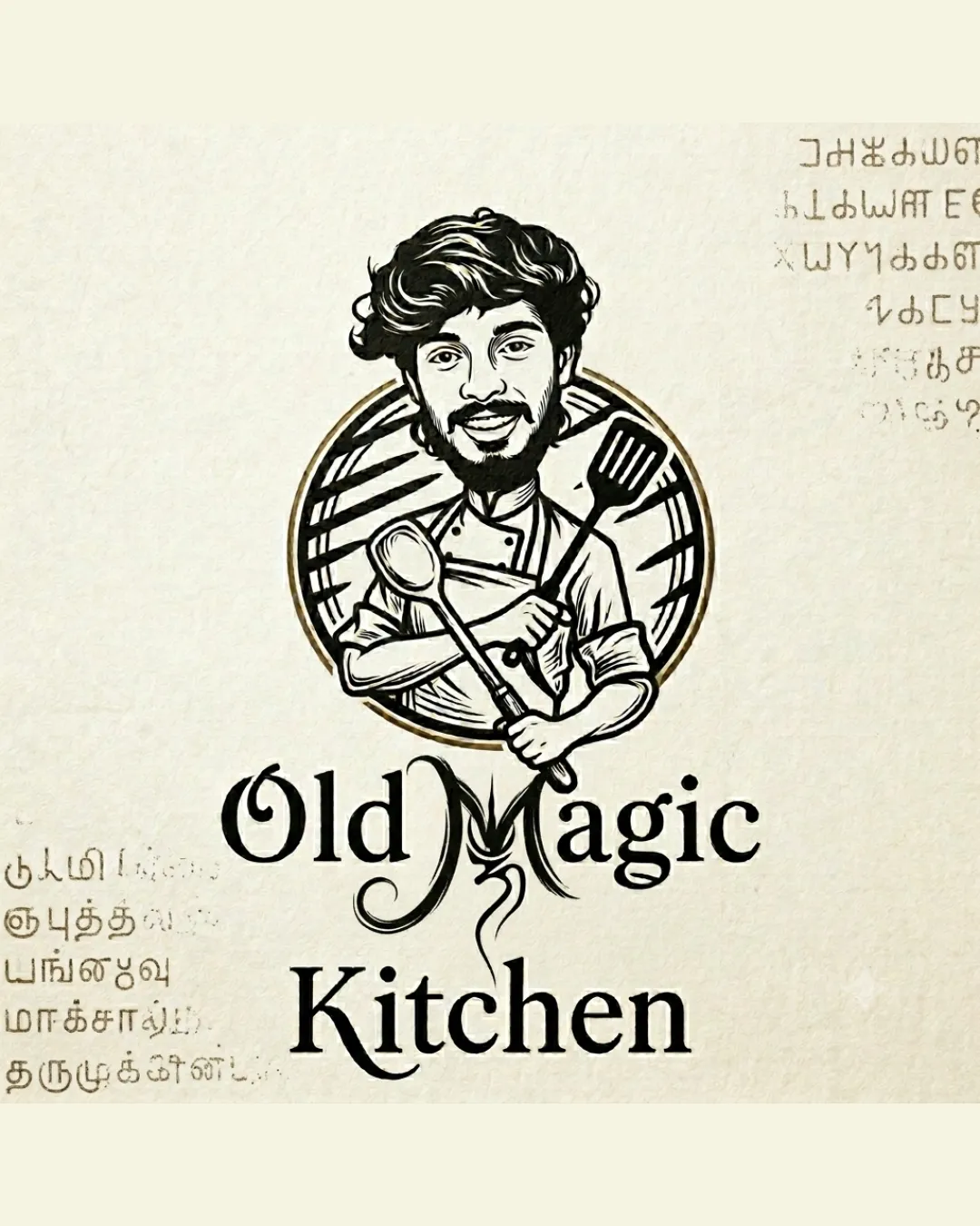
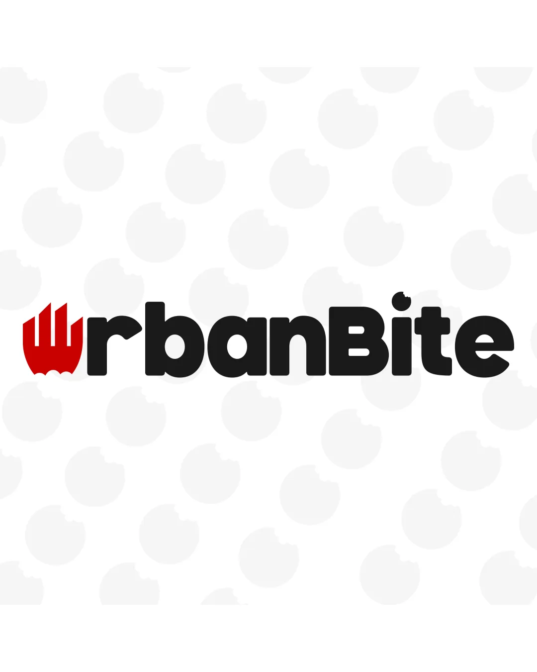
Try it Now!Logo review of urbanBite
 Logo analysis by AI
Logo type:
Style:
Detected symbol:
Detected text:
Business industry:
Review requested by Koya122024
**If AI can recognize or misinterpret it, so can people.
Structured logo review
Legibility
![]() Extremely clear and bold font enhances immediate readability.
Extremely clear and bold font enhances immediate readability.![]() Font choice is easily legible at various sizes.
Font choice is easily legible at various sizes.
Scalability versatility
![]() Bold lines and clean shapes ensure clarity at reasonably small sizes.
Bold lines and clean shapes ensure clarity at reasonably small sizes.![]() Would stand out well on digital media, packaging, and signage.
Would stand out well on digital media, packaging, and signage.
![]() Red fork detail (symbol for U) might lose subtlety in very small or embroidered applications.
Red fork detail (symbol for U) might lose subtlety in very small or embroidered applications.![]() Background 'bite' pattern may cause distraction if not removed or simplified for smaller uses.
Background 'bite' pattern may cause distraction if not removed or simplified for smaller uses.
200x250 px
100×125 px
50×62 px
Balance alignment
![]() Wordmark and logomark align horizontally and balance the visual weight.
Wordmark and logomark align horizontally and balance the visual weight.
![]() The red fork symbol is very bold relative to adjacent letters, slightly disrupting the evenness of the horizontal flow.
The red fork symbol is very bold relative to adjacent letters, slightly disrupting the evenness of the horizontal flow.

Originality
![]() Clever and industry-relevant integration of a fork shape into the letter 'U'.
Clever and industry-relevant integration of a fork shape into the letter 'U'.
![]() Fork is a common motif in food branding, making it only moderately original.
Fork is a common motif in food branding, making it only moderately original.
Logomark wordmark fit
![]() The fork seamlessly replaces the 'U', creating both a symbol and a letterform in one element.
The fork seamlessly replaces the 'U', creating both a symbol and a letterform in one element.![]() Both logomark and wordmark share a rounded, friendly design approach.
Both logomark and wordmark share a rounded, friendly design approach.
![]() Slight stylistic dissonance in the way the fork's spikes feel more angular than the otherwise rounded type.
Slight stylistic dissonance in the way the fork's spikes feel more angular than the otherwise rounded type.
Aesthetic look
![]() Playful and attractive, the logo feels modern and professional.
Playful and attractive, the logo feels modern and professional.![]() Consistent use of color makes it visually cohesive.
Consistent use of color makes it visually cohesive.
![]() Background 'bite' icons may make compositions feel slightly busy.
Background 'bite' icons may make compositions feel slightly busy.
Dual meaning and misinterpretations
![]() No inappropriate associations.
No inappropriate associations.
Color harmony
![]() Limited palette results in strong contrast and easy brand recognition.
Limited palette results in strong contrast and easy brand recognition.![]() Red accent draws the eye to the brand's unique touch without overwhelming the palette.
Red accent draws the eye to the brand's unique touch without overwhelming the palette.
Red
#D0021B
Black
#222222
White
#FFFFFF