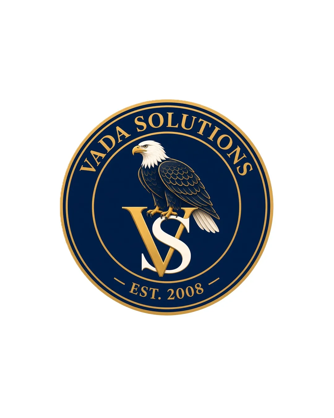
VADA SOLUTIONS EST. 2008 VS logo review
3.7/5
Logo score
Logo review of

Vada Solutions Est. 2008 Vs

A visually strong, credible emblem with classic cues. Refinement to detail level and modular adaptations would elevate its versatility and distinction.

Emblem Traditional, Formal Badge With Heraldic Cues Information Technology
4/5
Legibility
3.5/5
Originality
5/5
Misread
4/5
Balance
3/5
Scale
Action plan

What to fix first

The most important fixes to handle before polishing the full presentation.

1

Simplify the feathering detail and streamline inner circle elements for better scalability and digital adaptability.

High priority

Current fine details may blur or become illegible at small sizes, especially on digital platforms.

Impact: Improves Practical Use Across Smaller And Modern Formats. · Effort: Medium

2

Develop a standalone symbol or monogram extraction for use in responsive or digital-first scenarios.

Medium priority

Rigid emblem format limits adaptability.

Impact: Enhances Flexibility For Social Media, Icons, And App Use. · Effort: Medium

Detailed review

Logo performance breakdown

4/5

Legibility

Checkmark icon Text is clear and well-spaced.
Checkmark icon 'VS' initials remain readable despite overlap.

Warning icon 'S' partially obscured by eagle's talons and 'V', risking slight legibility loss at very small sizes.

3.5/5

Originality

Checkmark icon Eagle perched on initials feels custom and on-brand.

Warning icon Eagle-and-shield emblems are a common motif among US-based consultancies; lacks an obviously distinctive twist.

4/5

Color harmony

Checkmark icon Dark blue and gold palette is classic, high-contrast, and denotes prestige.

Warning icon Palette is conventional for the industry, missing opportunity for a more unique color accent.

Navy Blue
#11214D

Gold
#BDA060

White
#FFFFFF

Your palette is close. Refine the color roles and combinations before updating the logo.

Build brand colors
4/5

Balance alignment

Checkmark icon Symmetrical composition feels stable and centered.
Checkmark icon Badge proportions are visually pleasing.

Warning icon Complex central motif and inner text circle could crowd in tighter applications.

logo 200x250 pixels scalability test alignment grid overlay
3/5

Scalability

Checkmark icon Details remain mostly intact at moderate sizes.

Warning icon Intricate feather and text details may be lost at small scales; emblem format is relatively rigid for modern responsive applications.

logo 200x250 pixels scalability test

200x250 px

logo 100x125 pixels scalability test

100×125 px

logo 50x62 pixels scalability test

50×62 px

5/5

Misinterpretations

Checkmark icon No misinterpretation or ambiguous readings.

4/5

Logo structure & brief match

Checkmark icon Eagle, initials, and wordmark are integrated seamlessly in one unit.

Warning icon In flexible branding scenarios, decoupling mark from text would be challenging.

Checkmark icon IT + Cyber + Consulting Focus: Heraldic emblem and eagle successfully communicate authority and trust, which aligns well with consultancy and IT security-focused brands.
Checkmark icon Public And Private Sector Clients: Formal and established visual language suits both government and business audiences.

Try your own review

Wondering how your logo performs?

Get a clear logo score, key risks, and priority fix ideas before your client or audience sees it.

Review my logo