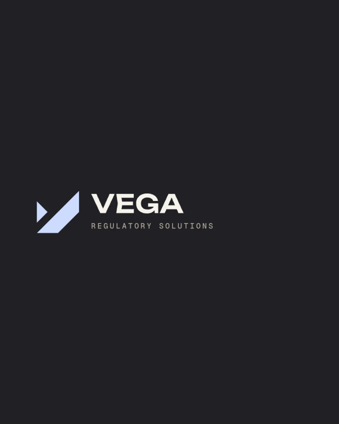
VEGA REGULATORY SOLUTIONS logo review
4/5
Logo score
Logo review of

Vega Regulatory Solutions

A strong, distinctive logo well matched to the regulatory technology space, with only minor refinements needed for micro-application robustness.

Combination Modern Geometric Telecom Technology/regulation
5/5
Legibility
4/5
Originality
5/5
Misread
4/5
Balance
4/5
Scale
Your next steps

What to fix first

Focus on the changes that matter. Keep what makes the logo work.

1

Standalone mark

Test mark legibility at reduced scales.

Worth testing Medium priority Low effort
Area to inspectApproximate location

The geometric mark uses fine negative space which may lose clarity at very small sizes.

How to check

Check if mark remains distinct at favicon and app icon sizes.
See the category review
2

tagline

Consider tightening tagline spacing for cohesiveness.

Optional refinement Low priority Low effort

The tagline letter spacing is more open than the wordmark, creating a slight tension in hierarchy and flow.

How to check

Review visual flow between wordmark and tagline.

See the category review
Detailed review

Logo performance breakdown

5/5

Brief & logo match

Based on your brief
Compared with

A telecom regulation technology company serving B2G/B2B, targeting trust, modernity, expertise and avoidance of cliché telecom imagery.

The logo expresses modernity, intelligence, and trust without cliché telecom signals, precisely matching stated brand needs.

  • Distinctiveness From Telecom Clichés

    Geometric mark avoids wireless or antenna icons, presenting a fresh visual.

  • Tone: Trustworthy And Intelligent

    Confident, modern sans-serif and sharp symbol align with 'intelligent' and 'precise.'

5/5

Legibility

  • Clear, modern typeface for primary and secondary text.
4/5

Originality

  • Distinctive arrow/check motif not a telecom cliché.
  • Bold, confident tone.
4/5

Balance alignment

  • Strong horizontal lockup, solid text/mark relationship.
  • The tagline letter spacing is more open than the wordmark, creating a slight tension in hierarchy and flow.

    Optional refinement tagline

    Try: Consider tightening tagline spacing for cohesiveness.

    Check: Review visual flow between wordmark and tagline.

Uploaded logoAlignment guide overlay

Inspect spacing with the guide. Optical balance may differ from geometric centering.

4/5

Scalability

  • Geometric mark generally scales well; single color aids reproduction.
  • The geometric mark uses fine negative space which may lose clarity at very small sizes.

    Worth testing Standalone mark

    Try: Test mark legibility at reduced scales.

    Check: Check if mark remains distinct at favicon and app icon sizes.

    Area to inspectApproximate location
Uploaded logo at 200 pixels wide
200 × 250 px
Uploaded logo at 100 pixels wide
100 × 125 px
Uploaded logo at 50 pixels wide
50 × 63 px

Compare the detail at different sizes. Labels show the full image dimensions.

5/5

Misinterpretations

  • No unintended readings; clean shape.
4/5

Symbol & text fit

  • Mark supports the forward, technological tone of the wordmark.

Black & white

Does the shape still work without color?

Preparing artwork...

Background contrast

Find the surfaces where your logo stays clear.

Compare the mark and lettering on each surface.

Blur & silhouette

A 3px blur softens fine details so you can check whether the overall shape stays recognizable. If key gaps close or elements merge, the logo may rely too heavily on detail.

Original
3px blur

Look for clear separation between shapes and a distinctive outline.

Try your own review

Wondering how your logo performs?

Get a clear logo score, key risks, and priority fix ideas before your client or audience sees it.

Review my logo