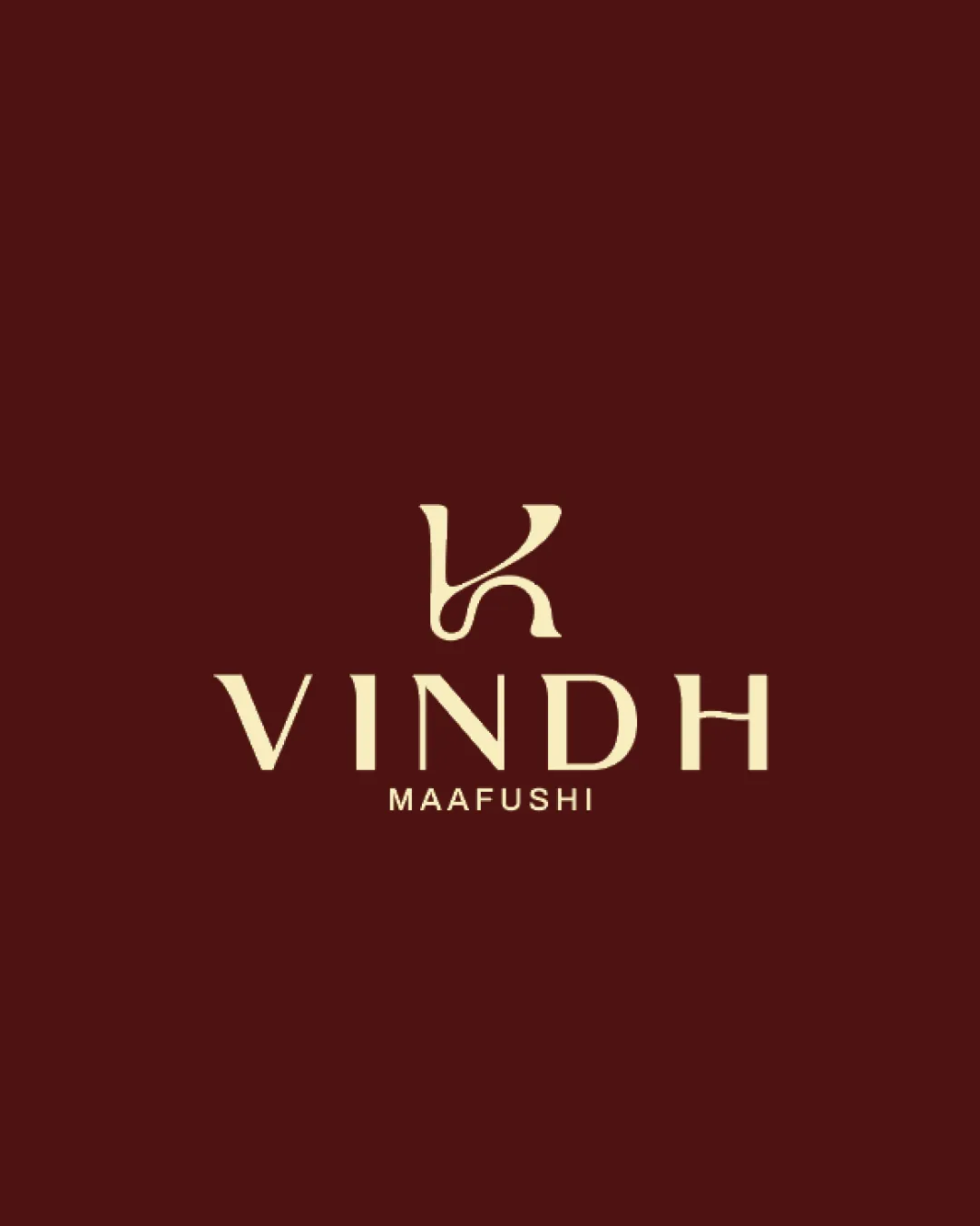
VINDH MAAFUSHI logo review
4/5
Logo score
Logo review of

Vindh Maafushi

A sophisticated and distinctive logo well suited to a Maldivian guesthouse, with only minor refinement and visibility testing needed.

Combination Mark Modern Elegant Serif Hospitality/tourism
4/5
Legibility
4/5
Originality
5/5
Misread
3/5
Balance
3/5
Scale
Your next steps

What to fix first

Focus on the changes that matter. Keep what makes the logo work.

1

monogram (top component)

Adjust or refine the monogram's alignment or optical weight for better centering and balance.

Optional refinement Medium priority Low effort
Area to inspectApproximate location

The stylized monogram appears slightly weighted to the left, which may affect the overall symmetry above the centered wordmark.

How to check

Visually compare vertical axis of the mark and the wordmark below to confirm centered appearance.

See the category review
2

monogram (top component)

Test the logo at small sizes to ensure the monogram remains distinct.

Worth testing Medium priority Low effort
Area to inspectApproximate location

Finer curves and negative space in the monogram may lose definition at small sizes, risking legibility.

How to check

Print or display the logo at under 2cm height to check monogram clarity.

See the category review
Detailed review

Logo performance breakdown

4/5

Brief & logo match

Based on your brief
Compared with

guesthouse, maldives

Captures an inviting, elegant image for a guesthouse while remaining readable and upscale.

  • Maldivian Guesthouse Feel

    Monogram and timeless serif wordmark project elegance expected from a hospitality brand in an upscale tourist locale.

  • Readability For International Guests

    Wordmark and location tagline are both clear and legible, benefiting guest clarity.

4/5

Legibility

  • Wordmark and tagline are clear and readable.
4/5

Originality

  • Elegant custom monogram adds brandable distinction.
3/5

Balance alignment

  • Wordmark is optically centered under the monogram.
  • The stylized monogram appears slightly weighted to the left, which may affect the overall symmetry above the centered wordmark.

    Optional refinement monogram (top component)

    Try: Adjust or refine the monogram's alignment or optical weight for better centering and balance.

    Check: Visually compare vertical axis of the mark and the wordmark below to confirm centered appearance.

    Area to inspectApproximate location
Uploaded logoAlignment guide overlay

Inspect spacing with the guide. Optical balance may differ from geometric centering.

3/5

Scalability

  • Clean lines support sizing; may be fragile at small scales.
  • Finer curves and negative space in the monogram may lose definition at small sizes, risking legibility.

    Worth testing monogram (top component)

    Try: Test the logo at small sizes to ensure the monogram remains distinct.

    Check: Print or display the logo at under 2cm height to check monogram clarity.

    Area to inspectApproximate location
Uploaded logo at 200 pixels wide
200 × 250 px
Uploaded logo at 100 pixels wide
100 × 125 px
Uploaded logo at 50 pixels wide
50 × 63 px

Compare the detail at different sizes. Labels show the full image dimensions.

5/5

Misinterpretations

  • No plausible secondary or inappropriate reading.
4/5

Symbol & text fit

  • Unified serif style and proportion; balanced type-mark relationship.

Black & white

Does the shape still work without color?

These tests are available only for logos uploaded in vector (SVG) format.

Background contrast

Find the surfaces where your logo stays clear.

These tests are available only for logos uploaded in vector (SVG) format.

Blur & silhouette

A 3px blur softens fine details so you can check whether the overall shape stays recognizable. If key gaps close or elements merge, the logo may rely too heavily on detail.

These tests are available only for logos uploaded in vector (SVG) format.

Try your own review

Wondering how your logo performs?

Get a clear logo score, key risks, and priority fix ideas before your client or audience sees it.

Review my logo