1
Category Fit
Good fitAligns with tech-forward agency aesthetic.
Fits sector norms.
Appropriate for client use after minor balance tweaks. Strong in legibility and versatility; slight risk of blending in within industry.
The most important fixes to handle before polishing the full presentation.
The current 'E' can appear too light compared to the boldness of the rest of the wordmark.
Impact: Medium · Effort: Low
Stacked bars may blur or merge at tiny scales, hurting brand recall.
Impact: Medium · Effort: Low
Numerous logos use similar bar treatments; unique characteristics can boost memorability.
Impact: Medium · Effort: Medium
 Clear, bold sans-serif letters with ample spacing
The abstract 'E' gives a modern twist to a simple wordmark
 Bar-style 'E' is a moderately common tech/agency device, risking generic feel
Single blue color is strong and professional, excellent contrast with white
Blue
#0033CC
White
#FFFFFF
Overall text is well-aligned horizontally Consistent optical weight between letters
Bars of the 'E' are visually lighter than main letterforms, causing slight imbalance

Bold geometric forms are strong at small and large sizes Minimal detail aids scalability
Stacked bars may merge or lose clarity at favicon size
200x250 px
100×125 px
50×62 px
No apparent inappropriate or confusing shapes
Branding/marketing Agency Positioning: Modern typographic approach fits professional, digital-savvy positioning. Bar 'E' can signal digital and dynamic qualities.
Versatility For Artists, Organizations, Businesses: Minimal design is adaptable across diverse sectors, ensuring broad appeal.
Moderately differentiated—functional, but at some risk of blending into marketing/agency category visuals.
The design communicates modernity and professionalism, but the bar 'E' is a moderately common motif in the sector, creating a medium risk for lack of distinct brand recognition.
Aligns with tech-forward agency aesthetic.
Fits sector norms.
Bar 'E' motif is used by other agencies and tech brands.
Moderate chance to be mistaken for other brands.
Communicates digital, momentum, and dynamic services.
Signal is clear and strong for sector.
Where the logo is ready to use, where it needs adjustment, and where it may break in real applications.
Bold and scalable for digital interfaces.
Simplify to just the bar 'E' or single bar motif for maximum clarity.
Single color ensures easy application.
'E' bars could blend at small sizes; refine for small icon clarity.
Simple, strong shapes are print-friendly.
A practical checklist of the logo versions to prepare before sending the final files to a client or team.
Core brand asset for most applications.
Essential for social, favicon, and small-scale applications.
Ensures versatility for dark and light backgrounds.
Guarantees clean scaling and professional print use.
Can support additional layouts if needed.
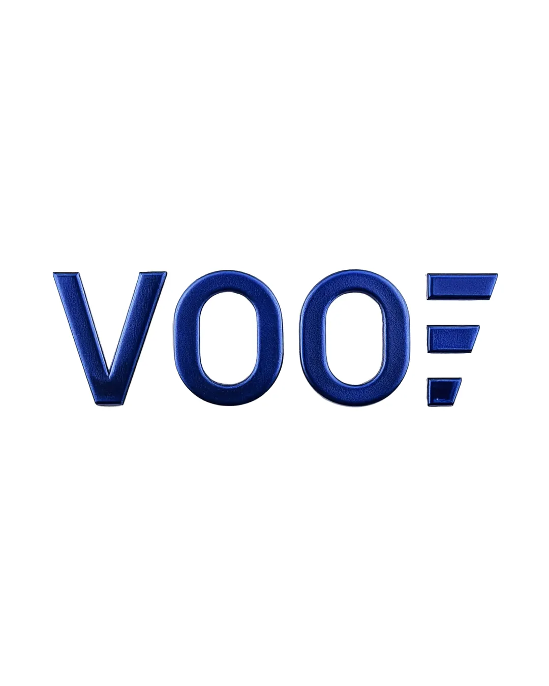
A modern, minimalist wordmark reading 'VOO' with a custom abstract 'E' made of three bold blue bars, conveying motion and digital energy.
Simple, all-caps sans-serif type creates a commanding and approachable presence, ideal for a contemporary marketing agency.
The 'E' is reimagined as three blue horizontal bars, hinting at digital progress and streamlined services while standing out as a brand shorthand.
A bold, modern logotype that communicates confidence and digital expertise, ideal for a marketing and branding agency.
The custom 'E' with bars injects energy and movement into a clean, professional wordmark.
All-caps construction signals authority and reliability.
Get a clear logo score, key risks, and priority fix ideas before your client or audience sees it.
More credits needed
Add credits to continue without losing your work.