VOO logo review
4.6 / 5
Logo score

Logo review ofVoo

A strong, modern identity with good originality and functional versatility; well-suited for a professional agency.

Wordmark With Symbol Modern Minimalist Geometric Marketing/branding Agency
5/5
Legibility
4/5
Originality
5/5
Misread
4/5
Balance
4/5
Scale
Review next
Action plan

What to fix first

The most important fixes to handle before polishing the full presentation.

1

Increase visual weight of the three-line symbol to better balance with 'VOO'.

Medium priority

Currently, the symbol appears slighter than the bold letterforms, which reduces overall cohesion.

Impact: Improves Visual Harmony And Perceived Stability Of The Identity. · Effort: Low

2

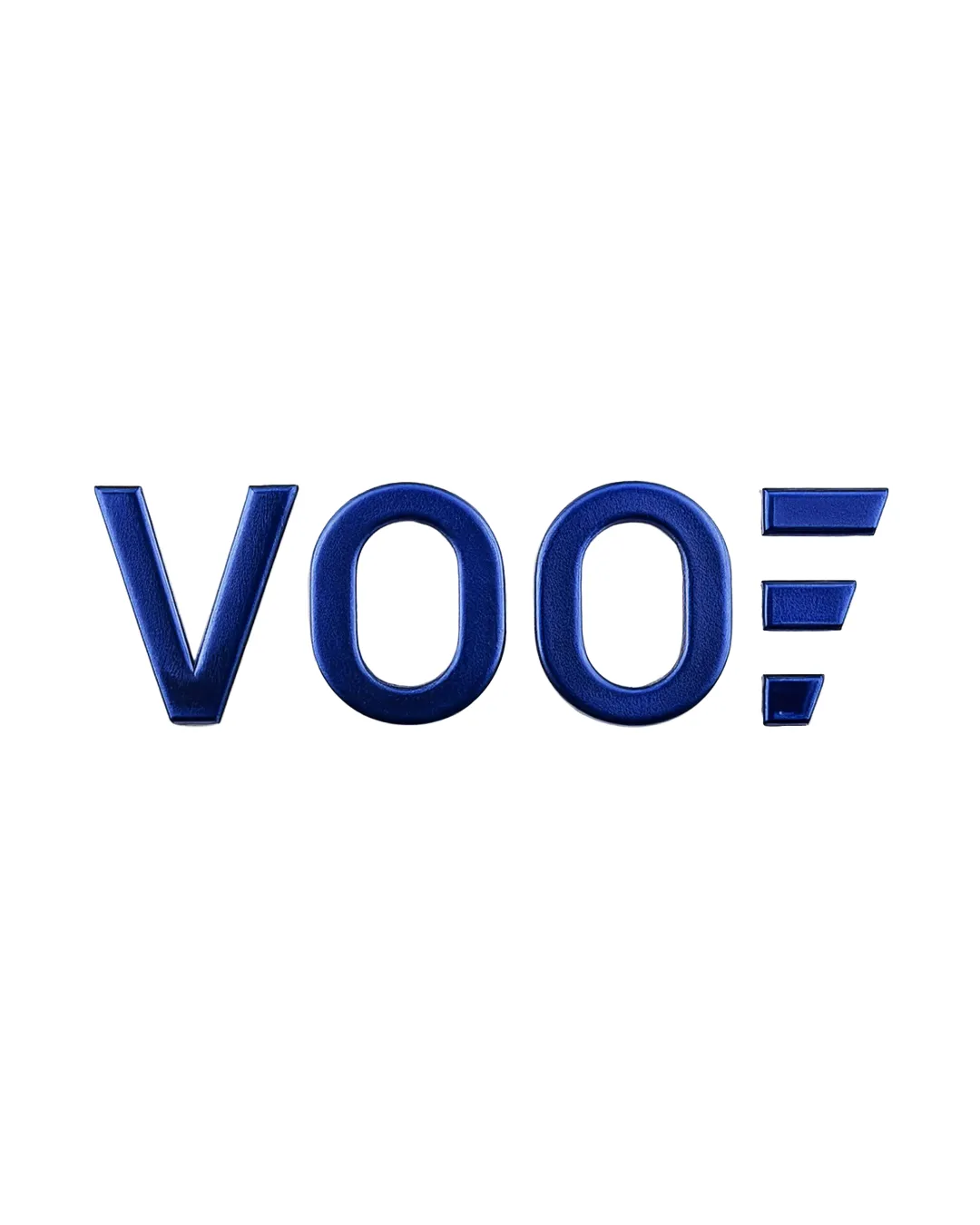
Test flat and grayscale versions to ensure 3D effect is not required for distinctiveness.

Medium priority

The blue shading adds depth, but should not be essential for recognition.

Impact: Ensures The Logo Is Adaptable Across All Media And Situations. · Effort: Low

3

Consider slight alignment tweaks to the symbol to fine-tune spatial balance with the wordmark.

Low priority

Marginal gains possible via micro-adjustments.

Impact: Minor Improvement To Optical Harmony. · Effort: Low

Detailed review

Logo performance breakdown

5/5

Legibility

Checkmark icon All letters are highly legible and clear at various sizes.

4/5

Originality

Checkmark icon The use of three parallel lines as a unique abstract accent helps set the wordmark apart.

Warning icon The design concept of parallel lines is seen in various service/agency logos, so it's not fully unique.

5/5

Color harmony

Checkmark icon Consistent deep blue contributes to the image of trust and professionalism.

DarkBlue
#173389

4/5

Balance alignment

Checkmark icon Wordmark is visually balanced with the symbol well-aligned to the right.
Checkmark icon Spacing between elements is even and harmonious.

Warning icon The symbol is visually lighter than the letterforms, creating a slight imbalance.

logo 200x250 pixels scalability test alignment grid overlay
4/5

Scalability

Checkmark icon Simple shapes and bold strokes will reproduce well at small and large sizes.
Checkmark icon Can be used effectively in one color.

Warning icon Slight 3D effect may not translate as well in flat applications.

logo 200x250 pixels scalability test

200x250 px

logo 100x125 pixels scalability test

100×125 px

logo 50x62 pixels scalability test

50×62 px

5/5

Misinterpretations

Checkmark icon No inappropriate or unintended visual readings are apparent.

5 / 5

Logo structure & brief match

Checkmark icon Logomark (three lines) is cleanly integrated with the wordmark; the combination appears intentional.

Checkmark icon Modern Appearance: The sharp geometry and clean sans-serif styling communicate a modern brand.
Checkmark icon Strategic, Trustworthy, Results-driven Brand: The minimal design and bold blue align well with attributes of trust, professionalism, and strategic thinking.
Checkmark icon Growth And Innovation: The dynamic, forward-leaning parallel lines suggest progress and momentum, connecting with the ideas of growth and innovation.

4.2/5
Market fit

Category positioning

Above-average fit and professional distinctiveness.

The logo aligns closely with modern agency visual trends, while its symbol offers category relevance and some distinctiveness.

1
Category Fit
Good fit

Bold sans-serif logotypes with abstract marks are well established for agencies; this fits expectations.

Visually plausible as an agency/consultancy—trusted professional cues.
2
Differentiation Risk
Some overlap

Parallel-line motif is not highly unique but is executed with clarity.

Could risk blending with similar marks if not supported by strong collateral.

3
Market Signal
Clear signal

Readable, modern, and confident—a positive cue for B2B and public sector clients.

No signals of unprofessionalism or irrelevance.

How to stand out more
  • Emphasize line-symbol meaning as part of growth/process story.
  • Leverage blue for trust-building in client materials.
Real-world usage

Use-case readiness

Where the logo is ready to use, where it needs adjustment, and where it may break in real applications.

1

Website Header

Ready

Logo is bold and legible on web backgrounds.

3

Favicon/app Icon

Ready

Symbol works at small sizes.

5

One-color Use

Ready

Simple geometry supports monochrome applications.

2

Social/avatar

Ready

Three-line symbol can become a strong, simple avatar.

4

Print/signage

Ready

Letterforms and mark will reproduce effectively.

Delivery checklist

Logo suite verification

A practical checklist of the logo versions to prepare before sending the final files to a client or team.

Detected in this upload

Already included

Visible

primary wordmark (VOO + symbol)

Main lockup for most applications.

Before delivery

Versions to remember

1

logomark/symbol only

High priority Recommended

Essential for icons, avatars, and compact uses.

2

one-color/monochrome version

High priority Recommended

Ensures versatility for print, emboss, and minimal color applications.

3

horizontal and vertical lockups

Medium priority Optional

May be useful for varied layouts, though primary lockup is strong.

4

high-res and vector file formats (SVG, EPS, PDF)

High priority Recommended

Required for professional usage and scale.

Presentation kit

Finalize and present this logo

Primary lockup description

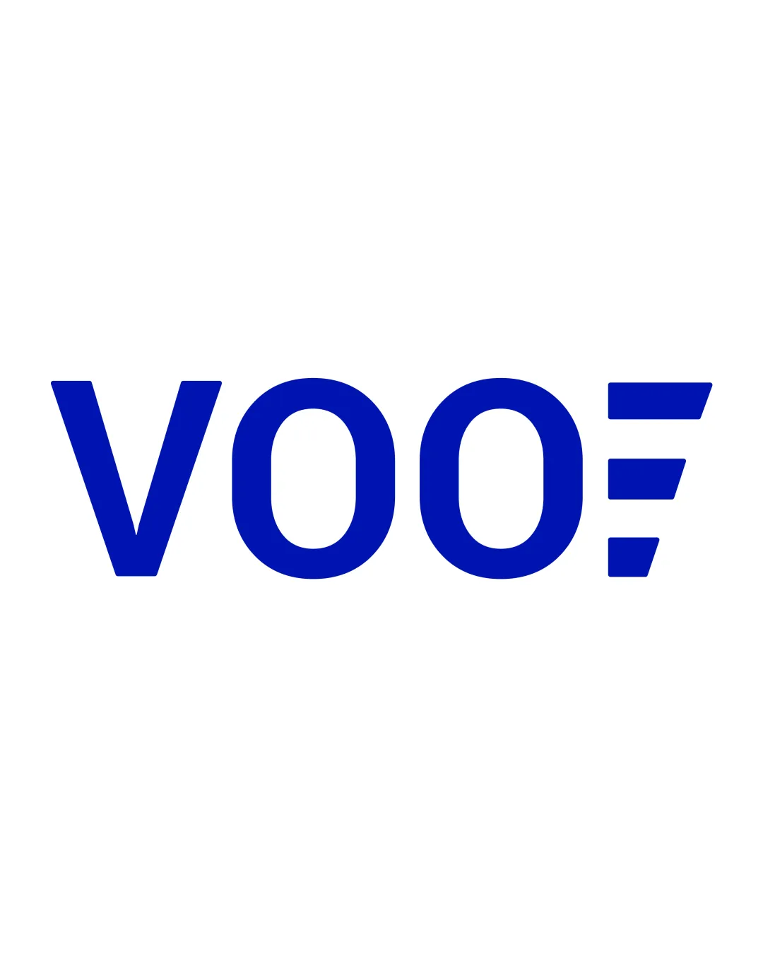
The VOO logo presents a bold geometric wordmark with a right-aligned three-line symbol, evoking movement and progress.

Wordmark description

All-caps sans-serif 'VOO' features rounded forms and confident geometry, reinforcing a modern, trustworthy brand.

Logomark description

Three right-facing parallel lines—stacked and angled—suggest dynamic forward movement and measurable growth.

Color palette description

A deep blue color unifies all elements, projecting reliability and professional confidence.

Positioning statement

The VOO logo embodies momentum, growth, and strategic focus with its bold geometric forms and dynamic accent.

Design rationale

The three-line symbol conveys forward-thinking energy and measurable outcomes.

A deep blue palette reinforces trust, reliability, and modern professionalism.

Tips for the logo presentation

Mockup ideas
  • Branded business cards and letterhead showing logo on white and dark backdrops.
  • Website homepage hero section with logo in header and as favicon.
  • Social media avatar and app icon using the three-line symbol.
Possible objections
  • The symbol could feel too visually light next to the name—slight thickening will resolve this.
  • 3D effect is not crucial; identity remains strong in flat or one-color use.
Presentation tips
  • Display the logo on both white and dark backgrounds for contrast.
  • Show mockups in digital and print contexts to highlight adaptability.
Try your own review

Wondering how your logo performs?

Get a clear logo score, key risks, and priority fix ideas before your client or audience sees it.

Review my logo