WEAR FIRE logo review
4.5 / 5
Logo score

Logo review ofWear Fire

Review the detailed scores below to see what is working and what should be refined first.

Combination Mark Modern, Minimal, Flat Fashion
5/5
Legibility
4/5
Originality
4/5
Misread
5/5
Balance
4/5
Scale
Review next
Action plan

What to fix first

The most important fixes to handle before polishing the full presentation.

1

Fix possible misinterpretation

High priority

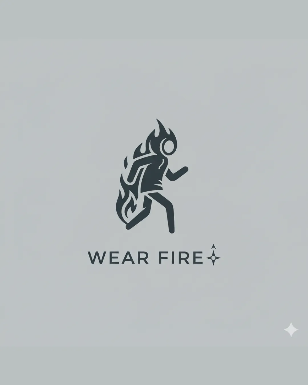
There is a faint risk that the running figure on fire could be misconstrued as a distress image for some viewers, depending on context. Careful usage and branding language are needed.
Impact: High · Effort: Medium

Detailed review

Logo performance breakdown

5/5

Legibility

Checkmark icon Text is simple, bold, and easily readable.
Checkmark icon Excellent spacing and font choice that enhance clarity.

4/5

Originality

Checkmark icon Creative integration of flames and human figure to convey activewear with a 'fiery' or energetic theme.
Checkmark icon Distinctive and memorable concept that stands out from more generic fashion marks.

Warning icon Running human silhouettes are somewhat common in activewear branding, though the flame execution elevates originality.

5/5

Color harmony

Checkmark icon Limited to two colors, with high contrast and excellent background/foreground separation.
Checkmark icon Monochrome scheme ensures adaptability across uses and backgrounds.

Baltic
#23292E

Geyser
#DBE3E6

5/5

Balance alignment

Checkmark icon Excellent vertical centering between icon and text.
Checkmark icon The visual weight between the logomark and wordmark is harmonious.

logo 200x250 pixels scalability test alignment grid overlay
4/5

Scalability

Checkmark icon Simple, bold mark maintains clarity at large and small scales.
Checkmark icon Works well on larger applications like apparel tags, signage, or packaging.

Warning icon The small sparkle/star icon next to the text may lose clarity on very small applications such as favicons or embroidery.

logo 200x250 pixels scalability test

200x250 px

logo 100x125 pixels scalability test

100×125 px

logo 50x62 pixels scalability test

50×62 px

4/5

Misinterpretations

Checkmark icon Human figure and flame are clearly identifiable and appropriately stylized.

Warning icon There is a faint risk that the running figure on fire could be misconstrued as a distress image for some viewers, depending on context. Careful usage and branding language are needed.

5 / 5

Symbol & text fit

Checkmark icon Modern logomark pairs cohesively with the clean wordmark, both sharing a minimal style.
Checkmark icon Both elements are complementary in size and visual style.

Try your own review

Wondering how your logo performs?

Get a clear logo score, key risks, and priority fix ideas before your client or audience sees it.

Review my logo




