Wondering how your logo performs? 🧐
Get professional logo reviews in seconds and catch design issues in time.
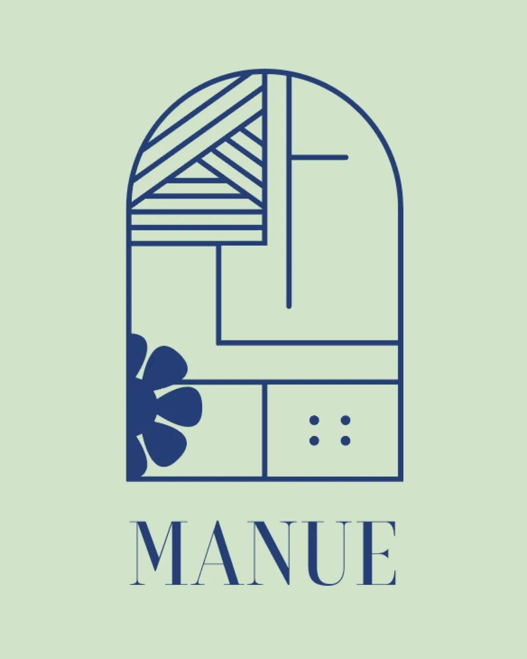
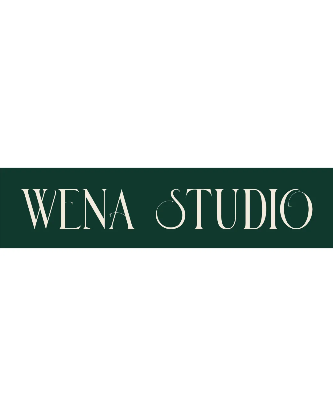
Try it Now!Logo review of WENA STUDIO
 Logo analysis by AI
Logo type:
Style:
Detected text:
Business industry:
Review requested by Wena
**If AI can recognize or misinterpret it, so can people.
Structured logo review
Legibility
![]() Clear and readable from a distance.
Clear and readable from a distance.![]() Elegant serif font adds a sophisticated touch.
Elegant serif font adds a sophisticated touch.
![]() Thin strokes may reduce clarity on small sizes.
Thin strokes may reduce clarity on small sizes.
Scalability versatility
![]() Works well on large formats like posters.
Works well on large formats like posters.
![]() Thin lines may not translate well to small items like business cards.
Thin lines may not translate well to small items like business cards.
200x250 px
100×125 px
50×62 px
Balance alignment
![]() Good balance across the two words.
Good balance across the two words.![]() Nice spacing between letters.
Nice spacing between letters.

Originality
![]() Stylized serif adds a unique flair.
Stylized serif adds a unique flair.
![]() Typographic style is somewhat common in the industry.
Typographic style is somewhat common in the industry.
Aesthetic look
![]() Elegant and clean design.
Elegant and clean design.
![]() Limited color palette reduces visual impact.
Limited color palette reduces visual impact.
Dual meaning and misinterpretations
![]() No inappropriate dual meanings detected.
No inappropriate dual meanings detected.
Color harmony
![]() Harmonious color combination.
Harmonious color combination.
![]() Lack of contrast might not stand out on all backgrounds.
Lack of contrast might not stand out on all backgrounds.