 View review
Logo score
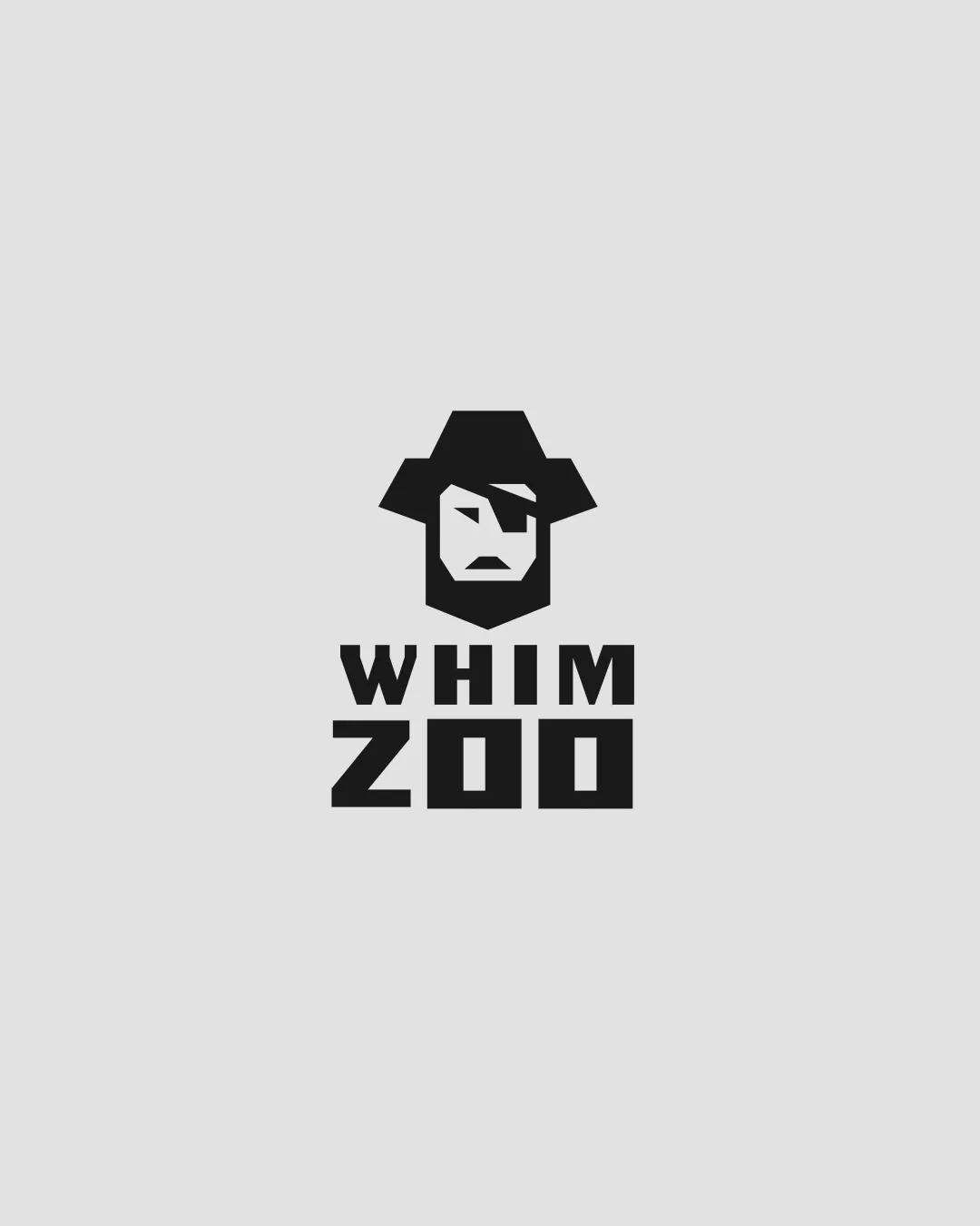
Logo review ofWhim Zoo
Review the detailed scores below to see what is working and what should be refined first.
Legibility
Originality
Misread
Balance
Scale
Detailed review
Logo performance breakdown
Legibility
![]() Text is bold, simple, and highly readable.
Text is bold, simple, and highly readable.![]() Characters are spaced evenly, with clear differentiation between WHIM and ZOO.
Characters are spaced evenly, with clear differentiation between WHIM and ZOO.
Originality
![]() Distinct cowboy character with geometric reduction is rare.
Distinct cowboy character with geometric reduction is rare.![]() Combination of playful type and icon feels fresh.
Combination of playful type and icon feels fresh.
![]() Cowboy theme itself is not entirely unique; context/relation to brand could elevate it.
Cowboy theme itself is not entirely unique; context/relation to brand could elevate it.
Color harmony
![]() Adheres to a high-contrast, monochrome palette that enhances clarity.
Adheres to a high-contrast, monochrome palette that enhances clarity.![]() Single color usage aids in versatility.
Single color usage aids in versatility.
Bunker
#131313
WhiteSmoke
#F3F3F3
Balance alignment
![]() Symbol and text are well-aligned vertically.
Symbol and text are well-aligned vertically.![]() Typography visually balances with the boldness of the icon.
Typography visually balances with the boldness of the icon.

Scalability
![]() Geometric and bold design ensure strong legibility at smaller sizes.
Geometric and bold design ensure strong legibility at smaller sizes.![]() Minimal details allow for effective reproduction across print and digital formats.
Minimal details allow for effective reproduction across print and digital formats.
![]() Fine lines on the cowboy’s face features may slightly blur at tiny scales, such as favicons.
Fine lines on the cowboy’s face features may slightly blur at tiny scales, such as favicons.![]() Logo may appear a bit stark on highly colorful or photo-based backgrounds.
Logo may appear a bit stark on highly colorful or photo-based backgrounds.
200x250 px
100×125 px
50×62 px
Misinterpretations
![]() No inappropriate or unintended imagery detected.
No inappropriate or unintended imagery detected.![]() Shape reads clearly as a cowboy face.
Shape reads clearly as a cowboy face.
Symbol & text fit
![]() Icon and wordmark share similar thickness and geometric construction.
Icon and wordmark share similar thickness and geometric construction.
![]() Visual language is consistent between all elements.
Visual language is consistent between all elements.
Try your own review
Review my logo
Wondering how your logo performs?
Get a clear logo score, key risks, and priority fix ideas before your client or audience sees it.
Keep exploring


