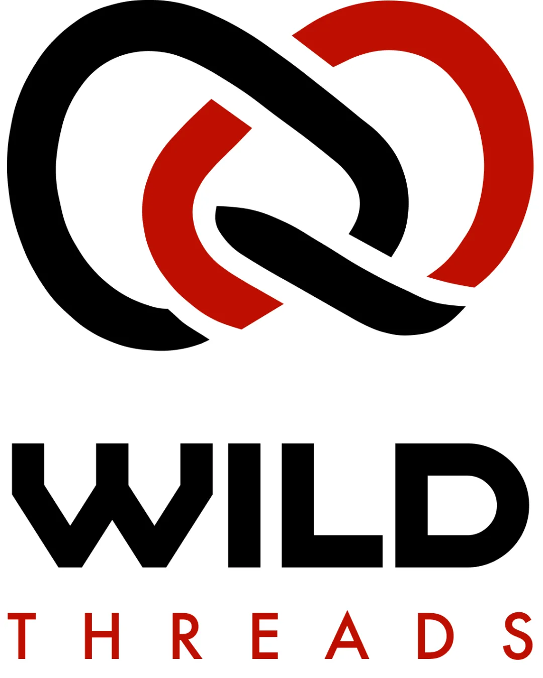
WILD THREADS logo review
4.3/5
Logo score
Logo review of

Wild Threads

Distinctive, bold, and industry-appropriate logo with strong presence and minimal risks.

Combination Mark Modern Geometric Bold Clothing
4.5/5
Legibility
4/5
Originality
5/5
Misread
4.5/5
Balance
4/5
Scale
Action plan

What to fix first

The most important fixes to handle before polishing the full presentation.

1

Slightly adjust the thickness of thin sections in the mark for better small-size reproduction.

Medium priority

Minor refinement will support scalability for clothing applications.

Impact: Improves Legibility And Versatility Across Print And Embroidery. · Effort: Low

Detailed review

Logo performance breakdown

4.5/5

Legibility

Checkmark icon 'WILD' is highly readable with strong custom letterforms.
Checkmark icon 'THREADS' is clear and evenly spaced.

Warning icon Minor thickness variance between word sections.

4/5

Originality

Checkmark icon Abstract mark is distinctive and not generic.
Checkmark icon Custom wordmark avoids standard fonts.

Warning icon Interlocking loop concept is familiar in fashion, but execution is differentiated.

4/5

Color harmony

Checkmark icon Red and black palette is dynamic and fits fashion context.
Checkmark icon Sufficient contrast ensures visibility.

Warning icon Limited color range could affect flexibility on varied apparel colors.

Black
#000000

DarkRed
#B22222

White
#FFFFFF

Your palette is close. Refine the color roles and combinations before updating the logo.

Build brand colors
4.5/5

Balance alignment

Checkmark icon Balanced composition between mark and wordmark.
Checkmark icon Strong vertical and horizontal alignment.

Warning icon Mark might visually overpower wordmark when scaled very small.

logo 200x250 pixels scalability test alignment grid overlay
4/5

Scalability

Checkmark icon Mark and text remain clear when scaled down.
Checkmark icon Simple, bold forms aid reproduction.

Warning icon Thinner strokes in mark risk minor loss at very small sizes.

logo 200x250 pixels scalability test

200x250 px

logo 100x125 pixels scalability test

100×125 px

logo 50x62 pixels scalability test

50×62 px

5/5

Misinterpretations

Checkmark icon No plausible unintended or inappropriate readings in abstract form.

4.5/5

Logo structure & brief match

Checkmark icon Geometric forms echo between mark and type.
Checkmark icon Color harmony and spacing tie elements together.

Warning icon Slight stylistic difference between mark’s curves and wordmark’s rigidity.

Checkmark icon Industry: The expressive mark and bold wordmark are well-suited for apparel, signaling trendiness and energy.

Try your own review

Wondering how your logo performs?

Get a clear logo score, key risks, and priority fix ideas before your client or audience sees it.

Review my logo