 View review
Logo score
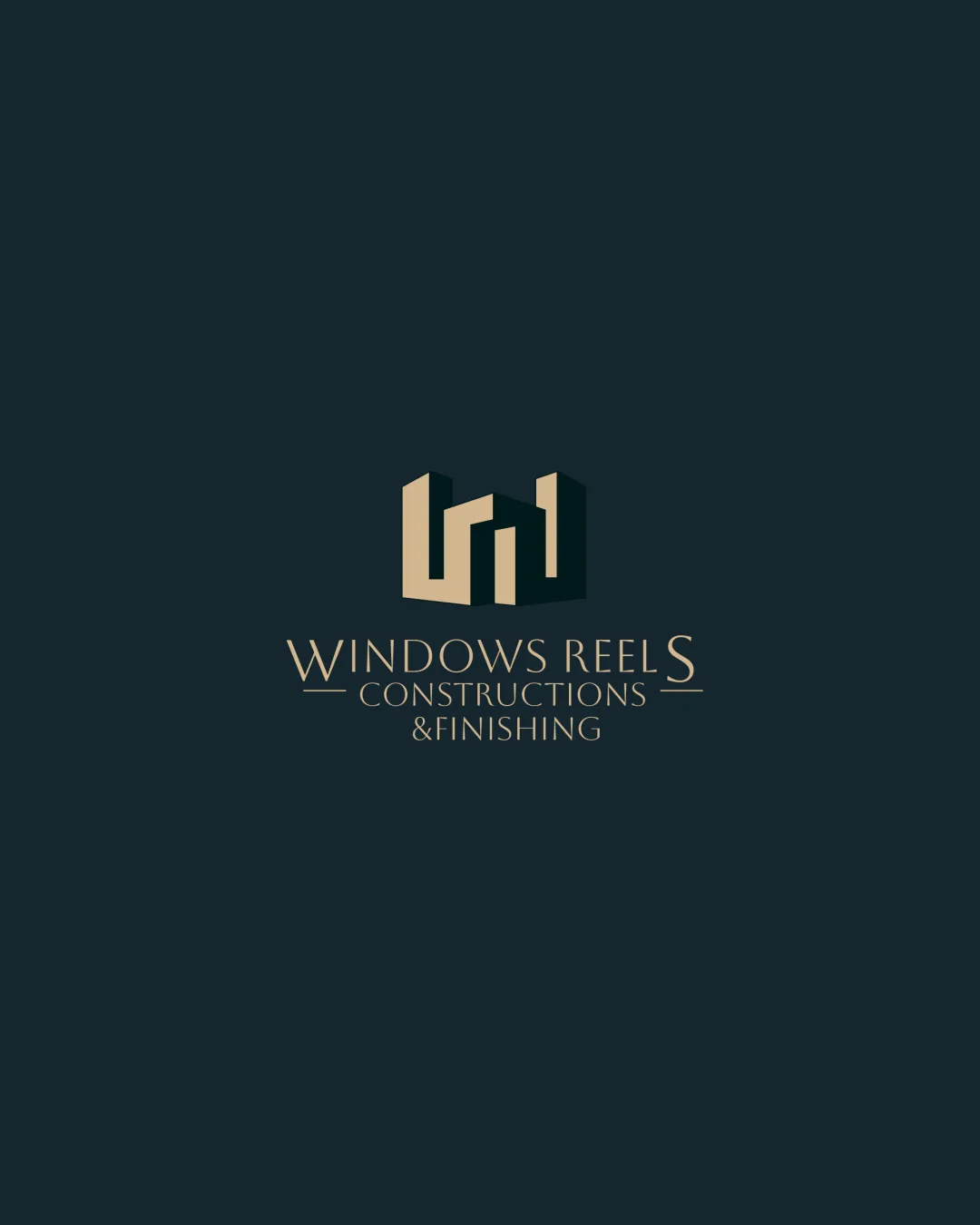
Logo review ofWindows Reels Constructions & Finishing
Review the detailed scores below to see what is working and what should be refined first.
Legibility
Originality
Misread
Balance
Scale
Detailed review
Logo performance breakdown
Legibility
![]() Primary brand words are clearly readable.
Primary brand words are clearly readable.![]() Contrasting colors make the text stand out against the dark background.
Contrasting colors make the text stand out against the dark background.
![]() All-caps serif typeface in subtext is smaller and could cause readability issues at very small sizes.
All-caps serif typeface in subtext is smaller and could cause readability issues at very small sizes.![]() The ampersand and thin lines may disappear when scaled down.
The ampersand and thin lines may disappear when scaled down.
Originality
![]() Abstracted buildings/windows create a unique form.
Abstracted buildings/windows create a unique form.![]() Negative space usage to form 'windows' or 'towers' is creative.
Negative space usage to form 'windows' or 'towers' is creative.
![]() Forms risk blending in with common construction logos based on buildings and geometric stacks.
Forms risk blending in with common construction logos based on buildings and geometric stacks.
Color harmony
![]() Sophisticated and limited color palette.
Sophisticated and limited color palette.![]() Strong contrast enhances elegance and readability.
Strong contrast enhances elegance and readability.
Teak
#B7996E
Gunmetal
#232B2D
Balance alignment
![]() Logo mark is centered above the wordmark.
Logo mark is centered above the wordmark.![]() Text is visually balanced with the geometric mark.
Text is visually balanced with the geometric mark.
![]() The long brand name and horizontal lines disrupt overall unity.
The long brand name and horizontal lines disrupt overall unity.![]() Hierarchy feels a bit forced with three text lines and line separators.
Hierarchy feels a bit forced with three text lines and line separators.

Scalability
![]() Geometric mark is simple enough to scale for signage and digital platforms.
Geometric mark is simple enough to scale for signage and digital platforms.![]() Logo works well on dark backgrounds and can be reversed for light.
Logo works well on dark backgrounds and can be reversed for light.
![]() Thin text and ampersand will lose clarity at favicon or embroidery scale.
Thin text and ampersand will lose clarity at favicon or embroidery scale.![]() Details in the subline ('& FINISHING') risk disappearing or becoming illegible in smaller applications.
Details in the subline ('& FINISHING') risk disappearing or becoming illegible in smaller applications.
200x250 px
100×125 px
50×62 px
Misinterpretations
![]() No inappropriate or unintended dual meanings detected.
No inappropriate or unintended dual meanings detected.
Symbol & text fit
![]() Both logomark and wordmark share an elegant, architectural style.
Both logomark and wordmark share an elegant, architectural style.
![]() Color and geometry of symbol matches sophistication of typeface.
Color and geometry of symbol matches sophistication of typeface.
![]() The heavy, upright geometry of the logomark doesn’t fully match the thin, elongated serifs in the wordmark; mild visual tension.
The heavy, upright geometry of the logomark doesn’t fully match the thin, elongated serifs in the wordmark; mild visual tension.
Try your own review
Review my logo
Wondering how your logo performs?
Get a clear logo score, key risks, and priority fix ideas before your client or audience sees it.
Keep exploring


