Wondering how your logo performs? 🧐
Get professional logo reviews in seconds and catch design issues in time.
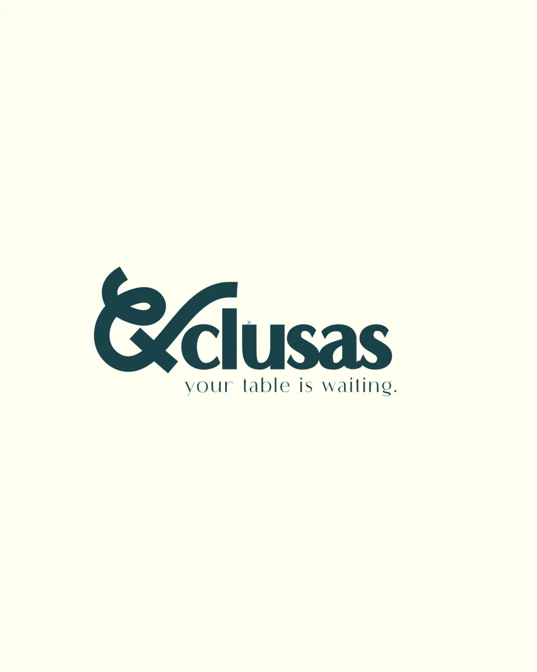
Try it Now!Logo review of xclusas
 Logo analysis by AI
Recognized style:
Logo type:
Detected symbol:
Detected text:
Business industry:
Review requested by Holydoomed
**If AI can recognize or misinterpret it, so can people.
Structured logo review
Legibility
![]() The business name is clearly readable.
The business name is clearly readable.
![]() The ampersand might initially be mistaken for a letter, causing confusion.
The ampersand might initially be mistaken for a letter, causing confusion.
Scalability versatility
![]() The bold design ensures visibility at different sizes.
The bold design ensures visibility at different sizes.
200x250 px
100×125 px
50×62 px
Balance alignment
![]() The text is well-aligned and balanced.
The text is well-aligned and balanced.
![]() Slight imbalance due to the size of the ampersand relative to the rest of the text.
Slight imbalance due to the size of the ampersand relative to the rest of the text.

Originality
![]() Integrating an ampersand as the first character is unique.
Integrating an ampersand as the first character is unique.
![]() Ampersands are common symbols and might reduce originality.
Ampersands are common symbols and might reduce originality.
Aesthetic look
![]() The logo is aesthetically pleasing and professional.
The logo is aesthetically pleasing and professional.
![]() A different typeface might enhance sophistication.
A different typeface might enhance sophistication.
Cultural sensitivity dual meaning
![]() No cultural sensitivity issues detected.
No cultural sensitivity issues detected.
Color harmony
![]() The color scheme is simple and effective.
The color scheme is simple and effective.
![]() A slightly more vibrant color could enhance visibility.
A slightly more vibrant color could enhance visibility.


