 View review
Logo score
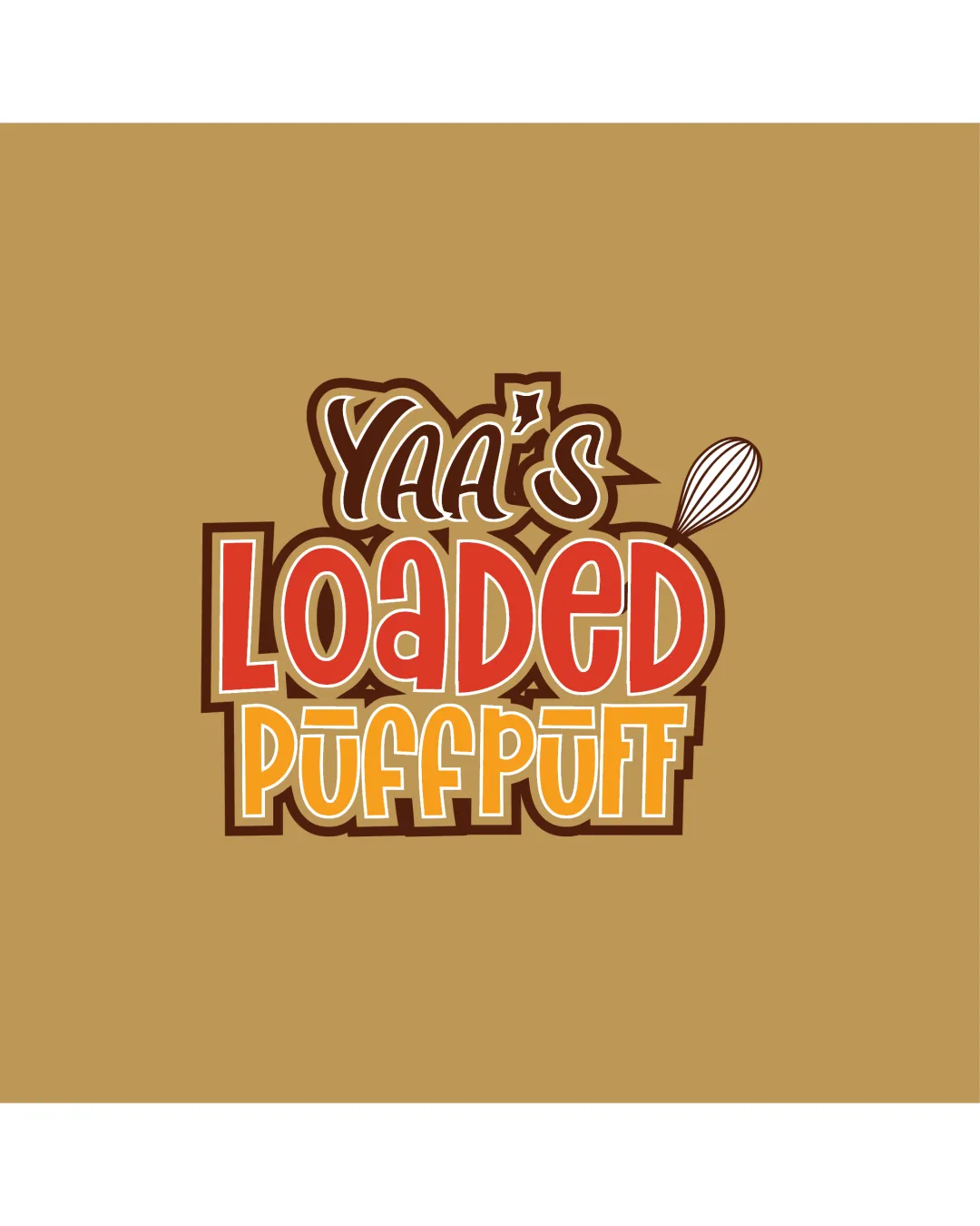
Logo review ofYaa's Loaded Puffpuff
Review the detailed scores below to see what is working and what should be refined first.
Legibility
Originality
Misread
Balance
Scale
Detailed review
Logo performance breakdown
Legibility
![]() All the text is clear and readable at a moderate size.
All the text is clear and readable at a moderate size.![]() Good color contrast between letters and background.
Good color contrast between letters and background.
![]() ‘Yaa’s’ at the top appears slightly cramped due to stylized font and overlapping outline.
‘Yaa’s’ at the top appears slightly cramped due to stylized font and overlapping outline.![]() Multiple outlines can reduce clarity at smaller sizes.
Multiple outlines can reduce clarity at smaller sizes.
Originality
![]() Unique, playful typographic approach fitting for a food/snack business.
Unique, playful typographic approach fitting for a food/snack business.![]() Use of a whisk adds relevant industry context.
Use of a whisk adds relevant industry context.
![]() Typography-driven food brands are common; more unique integration of whisk or a custom letter form could push originality further.
Typography-driven food brands are common; more unique integration of whisk or a custom letter form could push originality further.
Color harmony
![]() Color palette is appetizing and well-suited to food.
Color palette is appetizing and well-suited to food.![]() Contrasting outlines aid separation between layers.
Contrasting outlines aid separation between layers.
![]() Using many shades in the wordmark increases complexity and can harm simplicity.
Using many shades in the wordmark increases complexity and can harm simplicity.
Teak
#B7996E
Flame
#E64229
Saffron
#F6C54E
Seashell
#FFF7ED
Pineapple
#542308
Your palette is close. Explore sharper color combinations with Colorfly.design before updating the logo.
Explore palettesBalance alignment
![]() Stacked type layouts are balanced horizontally.
Stacked type layouts are balanced horizontally.![]() Whisk placement adds dynamic flair.
Whisk placement adds dynamic flair.
![]() Whisk graphic feels visually detached and slightly awkward due to its small size and placement.
Whisk graphic feels visually detached and slightly awkward due to its small size and placement.![]() Variable letter sizes and heavy outlines create inconsistent visual weight.
Variable letter sizes and heavy outlines create inconsistent visual weight.

Scalability
![]() Distinct typographic style stands out at medium to large sizes (signage, posters, packaging).
Distinct typographic style stands out at medium to large sizes (signage, posters, packaging).
![]() Excessive detail in outlines and complex overlaying text will lose clarity at smaller scales (favicons, small merchandise tags, embroidery).
Excessive detail in outlines and complex overlaying text will lose clarity at smaller scales (favicons, small merchandise tags, embroidery).![]() Whisk symbol's thin lines may disappear entirely in tiny formats.
Whisk symbol's thin lines may disappear entirely in tiny formats.
200x250 px
100×125 px
50×62 px
Misinterpretations
![]() No inappropriate or ambiguous imagery present.
No inappropriate or ambiguous imagery present.
Symbol & text fit
![]() Wordmark and whisk icon relate by theme (baking/food).
Wordmark and whisk icon relate by theme (baking/food).
![]() Stylistic mismatch: whisk is minimalist, outline type is bold and cartoonish; visual styles are not harmonized.
Stylistic mismatch: whisk is minimalist, outline type is bold and cartoonish; visual styles are not harmonized.
Try your own review
Review my logo
Wondering how your logo performs?
Get a clear logo score, key risks, and priority fix ideas before your client or audience sees it.
Keep exploring


