 View review
Logo score
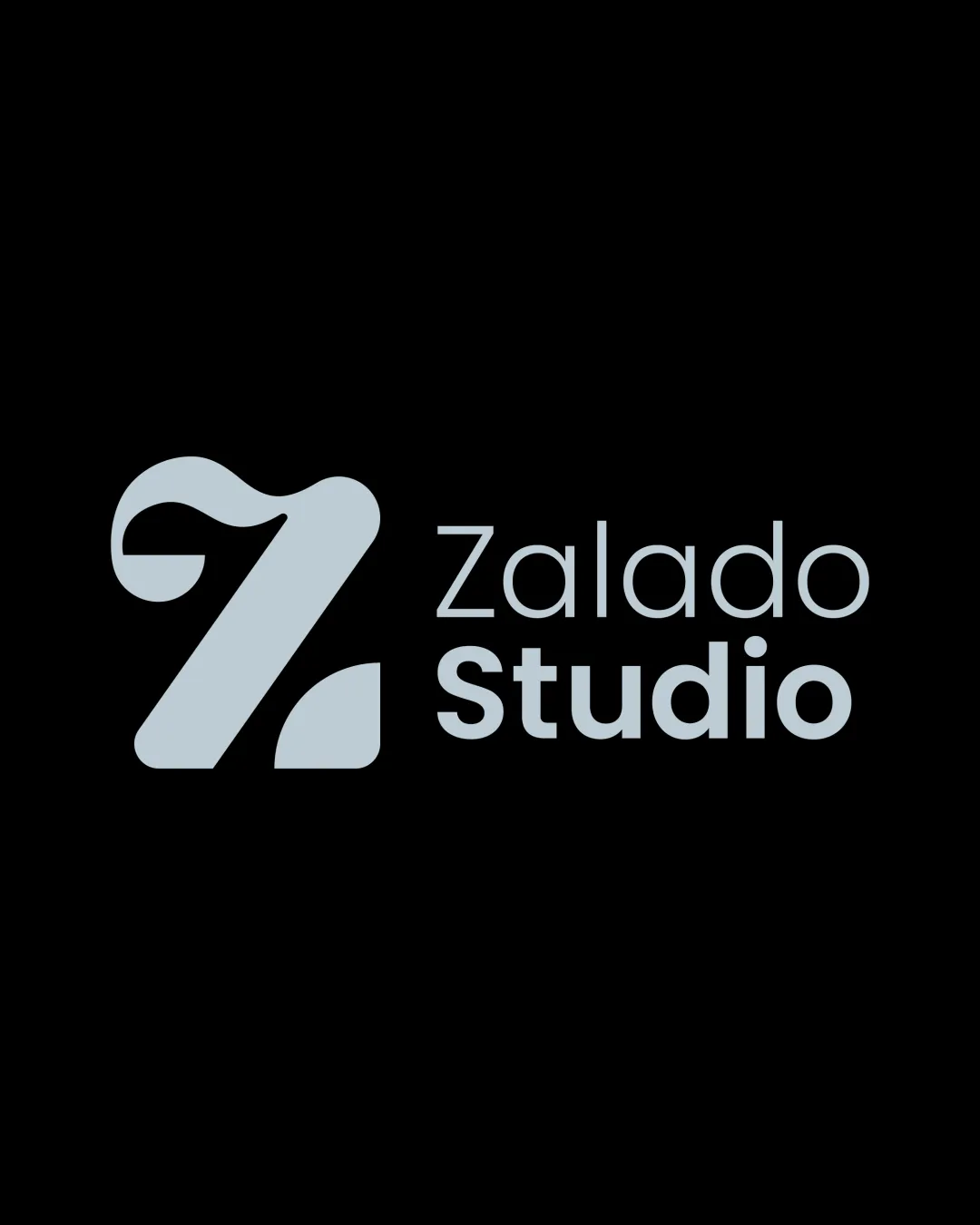
Logo review ofZalado Studio
Review the detailed scores below to see what is working and what should be refined first.
Legibility
Originality
Misread
Balance
Scale
Detailed review
Logo performance breakdown
Legibility
![]() Clear and readable text
Clear and readable text![]() Good contrast against the background
Good contrast against the background
![]() Slight complexity in the 'Z' could affect readability at smaller sizes
Slight complexity in the 'Z' could affect readability at smaller sizes
Originality
![]() Unique interpretation of the letter 'Z'
Unique interpretation of the letter 'Z'![]() Creative symbol integration
Creative symbol integration
![]() Slightly resembles other stylized 'Z' logos but maintains distinctiveness
Slightly resembles other stylized 'Z' logos but maintains distinctiveness
Color harmony
![]() Simple color palette
Simple color palette![]() Good contrast
Good contrast
![]() Limited color variation may not stand out in all contexts
Limited color variation may not stand out in all contexts
Your palette is close. Explore sharper color combinations with Colorfly.design before updating the logo.
Explore palettesBalance alignment
![]() Well-balanced between symbol and text
Well-balanced between symbol and text![]() Aligned composition
Aligned composition

Scalability
![]() Works well on various applications like signage and digital formats
Works well on various applications like signage and digital formats
![]() Detail in the 'Z' might lose clarity at very small sizes
Detail in the 'Z' might lose clarity at very small sizes
200x250 px
100×125 px
50×62 px
Misinterpretations
![]() No inappropriate interpretations
No inappropriate interpretations
Symbol & text fit
![]() Cohesive aesthetic between symbol and text
Cohesive aesthetic between symbol and text
![]() Symbol complements the brand name
Symbol complements the brand name
Try your own review
Review my logo
Wondering how your logo performs?
Get a clear logo score, key risks, and priority fix ideas before your client or audience sees it.
Keep exploring


