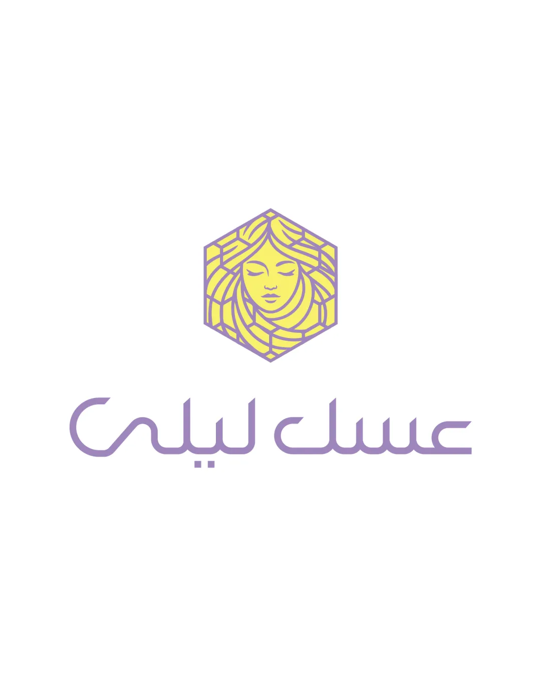
عسل لیلی logo review
4.3 / 5
Logo score
Logo review of

عسل لیلی

Review the detailed scores below to see what is working and what should be refined first.

Objective AI feedback. Your creative decision.

Combination Mark Modern, Line Art, Minimalistic Cosmetics
4/5
Legibility
4/5
Originality
5/5
Misread
5/5
Balance
3/5
Scale
Detailed review

Logo performance breakdown

4/5

Legibility

Checkmark icon The Arabic script is clean and well-proportioned.
Checkmark icon Color contrast between text and background is excellent for readability.

Warning icon The highly stylized script could pose legibility challenges for those unfamiliar with the typeface, especially at smaller sizes.


4/5

Originality

Checkmark icon The fusion of a female figure within a hexagon delivers a distinctive and memorable mark.
Checkmark icon Subtle reference to honeycomb structure through the hexagon links well to the likely product.

Warning icon Female face motifs are relatively common in beauty/cosmetic branding, though combined treatment here is differentiated.

4/5

Color harmony

Checkmark icon Limited palette creates harmony and visual unity.
Checkmark icon Pastel tones foster an inviting and sophisticated mood.

Warning icon Yellow and purple combination may not have the highest possible contrast, potentially impacting legibility for some colorblind viewers.

light yellow
#F6E06C

light lavender
#B099DE

white
#FFFFFF

Your palette is close. Refine the color roles and combinations before updating the logo.

Build brand colors
5/5

Balance alignment

Checkmark icon The logo exhibits strong vertical alignment between the emblem and the wordmark.
Checkmark icon Symmetry of the face within the hexagon anchors the design.

logo 200x250 pixels scalability test alignment grid overlay
3/5

Scalability

Checkmark icon The hexagonal mark can function as a social media icon or favicon.
Checkmark icon Simplicity in colors enhances adaptability.

Warning icon Thin linework in the face and hair illustration may lose clarity in very small sizes or embroidery.
Warning icon Text could be hard to read at reduced scales, especially on packaging or labels.

logo 200x250 pixels scalability test

200x250 px

logo 100x125 pixels scalability test

100×125 px

logo 50x62 pixels scalability test

50×62 px

5/5

Misinterpretations

Checkmark icon No inappropriate or misleading visual interpretations detected.

5 / 5

Symbol & text fit

Checkmark icon Both symbol and typography utilize line-based minimalism for cohesive visual synergy.
Checkmark icon Color palette is consistently applied in both elements.

Try your own review

Wondering how your logo performs?

Get a clear logo score, key risks, and priority fix ideas before your client or audience sees it.

Review my logo


