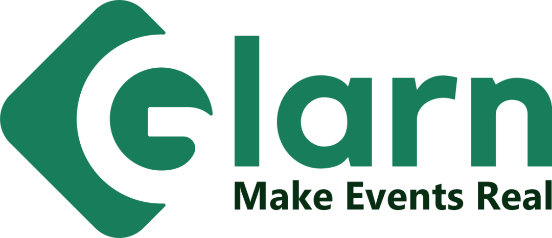
Glar[?] logo review
2.8/5
Partial score Wordmark with tagline category

Glar[?]

creative189089 Essential logo review

The visible design is bold and cohesive, but the supplied image cuts off essential text.

This logo lockup has a workable foundation; improving text readability is the clearest next step; layout still needs assessment.

Symbols recognized:
rounded angular bracket around a stylized G
Legible text:
Glar[?]; Make Events Rea[?]
Wordmark With Tagline Bold Geometric Lettering With An Enclosing Initial Treatment Events
2/5
Legibility
3/5
Originality
3/5
Balance
3/5
Scale
4/5
Color
Your next steps

What to fix first

Focus on the changes that matter. Keep what makes the logo work.

Concept & direction

A bracket-like form frames the initial, giving the otherwise straightforward wordmark a recognizable feature.

Spelling & grammar

Confirm the wording

The name and tagline extend beyond the right edge, so their endings cannot be confirmed.
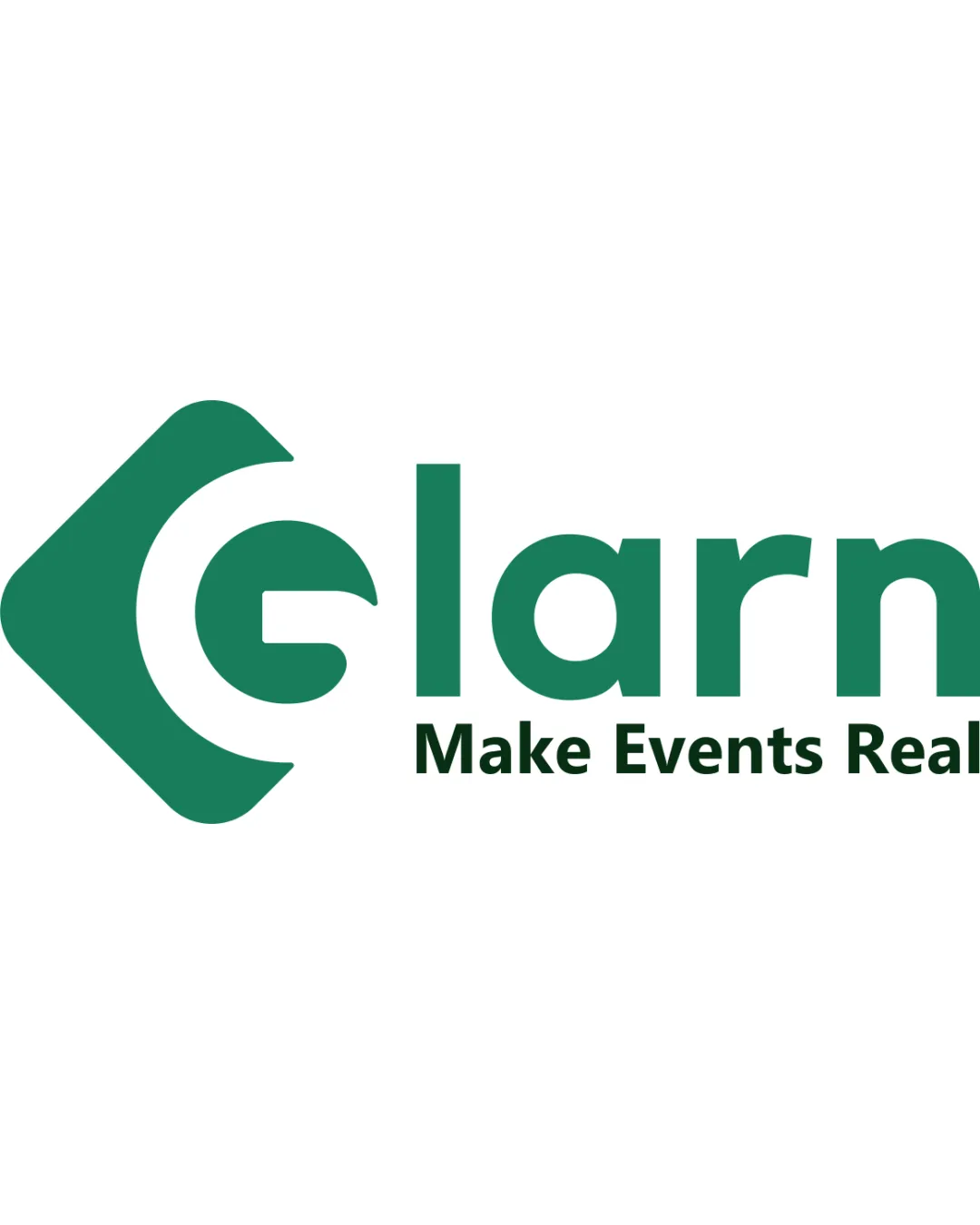
1

Right edge of the wordmark and tagline

Restore the complete artwork with clear space around both text lines.

High priority Visible issue Low effort

Both text lines run into the image edge, leaving the end of the name and tagline uncertain.

See the category review
Detailed review

Logo performance breakdown

3/5

Brief & logo match

The tagline points to an events category, though the cropped name limits assessment of the complete identity.

2/5

Legibility

  • The visible letters are bold and generally easy to distinguish.
  • Both text lines run into the image edge, leaving the end of the name and tagline uncertain.

    Visible issue Right edge of the wordmark and tagline

    Try: Restore the complete artwork with clear space around both text lines.

3/5

Originality

  • The bracket gives the initial a recognizable silhouette.
  • The rounded sans-serif lettering and enclosing bracket are familiar devices, making the visible treatment functional rather than especially distinctive.

    Optional refinement Wordmark and initial treatment
3/5

Balance alignment

  • The tagline aligns with the main text after the initial.
Uploaded logoAlignment guide overlay

Inspect spacing with the guide. Optical balance may differ from geometric centering.

3/5

Scalability

  • The main lettering uses substantial, simple shapes.
4/5

Color harmony

  • The two greens create a cohesive hierarchy between name and tagline.
Green#1D8061
Dark green#103B24

Estimated colors. Use the original design file for exact values.

Create a full color palette using these colors

Create new palette
5/5

Misinterpretations

  • No supported harmful or intimate reading is apparent.
Try your own review

Wondering how your logo performs?

Get a clear logo score, key risks, and priority fix ideas before your client or audience sees it.

Review my logo