Concept & direction
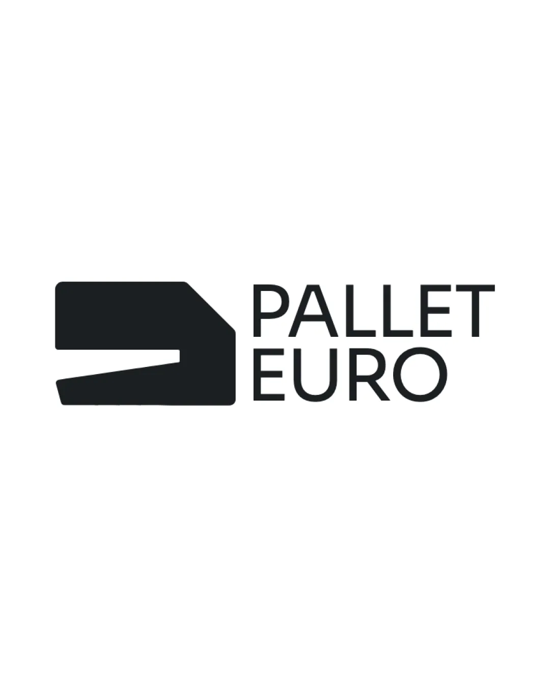
An angular block and tapered cutout give the two-line name a simple industrial-looking visual anchor.
Spelling & grammar
No obvious issue foundPALLET EURO is readable as the brand name.

A clear, cohesive industrial lockup with a restrained but relatively familiar visual vocabulary.
This logo lockup shows solid execution, supported by visual balance and text readability; improving distinctiveness is the clearest next step.
Focus on the changes that matter. Keep what makes the logo work.
An angular block and tapered cutout give the two-line name a simple industrial-looking visual anchor.
PALLET EURO is readable as the brand name.
Symbol and wordmark
The abstract cutout and straightforward sans-serif lettering use familiar geometric forms; the symbol alone does not immediately communicate pallets.
Ask viewers what they recall and associate with the mark after a brief exposure.
The name directly identifies the pallet business and the block-like mark supports an industrial context, although the symbol is abstract rather than immediately product-specific.
Symbol 3/5 · Wordmark 3/5
The abstract cutout and straightforward sans-serif lettering use familiar geometric forms; the symbol alone does not immediately communicate pallets.
Try: Test whether the symbol is memorable and recognizable without the name.
Check: Ask viewers what they recall and associate with the mark after a brief exposure.
Wordmark 4/5 · Layout 4/5
Symbol 4/5 · Wordmark 4/5 · Layout 4/5

Inspect spacing with the guide. Optical balance may differ from geometric centering.
Symbol 4/5 · Wordmark 4/5 · Layout 4/5
The cutout narrows toward its right end, where it could close up in small or coarse reproductions.
Try: Test the mark at intended sizes and on relevant production surfaces.
Does the shape still work without color?
Find the surfaces where your logo stays clear.
Compare the mark and lettering on each surface.
Shows the lower-contrast areas of the logo (5th percentile). Tiny details may have lower contrast. Good ≥ 4.5:1 · Medium ≥ 3:1 · Bad < 3:1. A visual guide, not an accessibility rating.
A 3px blur softens fine details so you can check whether the overall shape stays recognizable. If key gaps close or elements merge, the logo may rely too heavily on detail.
Look for clear separation between shapes and a distinctive outline.
Get a clear logo score, key risks, and priority fix ideas before your client or audience sees it.
More credits needed
Add credits to continue without losing your work.
Then $7/month. Cancel anytime.
Essential logo review
Usually takes under a minute