View review
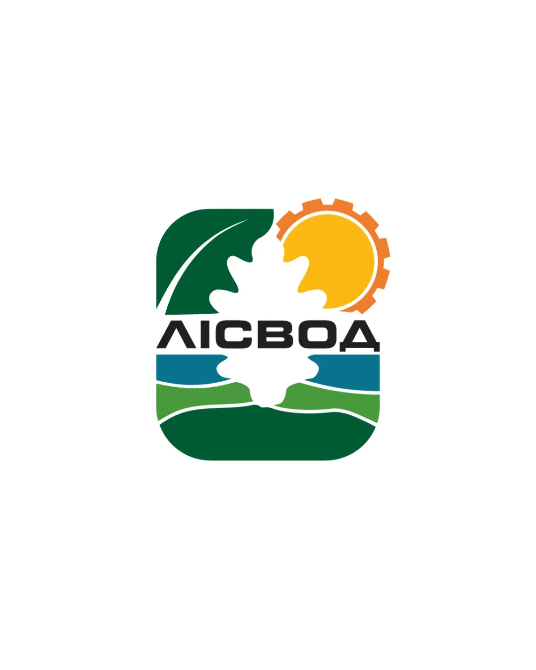
Лісвод
Review the detailed scores below to see what is working and what should be refined first.
Objective AI feedback. Your creative decision.
Logo performance breakdown
Legibility
Text is bold and clear; uses a strong sans-serif that is readable at most sizes.
Color contrast between the text and background aids legibility.
The geometric cut through the wordmark (caused by the oak leaf) slightly disrupts flow and could be less readable in small formats or poor printing conditions.

Originality
Oak leaf as negative space with gear and water is a creative and less common approach.
Imaginative integration of multiple environmental motifs into one compact icon.
Sun/gears and leaves together are moderately typical for environmental/forestry/industrial brands, though the execution here is above average.
Packed symbolism can risk visual cliché if not handled with restraint.
Color harmony
Strong and natural color harmony: green for nature, blue for water, yellow/orange for sun/energy.
Color areas do not clash and reinforce the meaning.
MediumGreen
#207045
CyanBlue
#58AEB1
Sunglow
#F09B27
Black
#181B1B
White
#FFFFFF
Balance alignment
Main elements (leaf, sun/gear, text, water, and background) are visually balanced within the square container.
The sun/gear creates a solid upper-right focal point, countered by the dark leaf on the left.
The intersecting oak cutout in the center creates a minor visual tension, sometimes pulling the eye awkwardly and affects the continuity between top and bottom.
Scalability
Design is compact and mostly holds together at smaller sizes.
The color blocking can work at large formats like billboards or vehicle wraps.
Fine details such as the wave lines, leaf veins, and gear cogs may blur or become indistinct at small-scale applications like favicons or embroidery patches.
Multiple elements could result in complexity when reduced in size or used in monochrome.
200x250 px
100×125 px
50×62 px
Misinterpretations
No inappropriate or misleading shapes observed.
Symbolism is clear and avoids problematic associations.
Symbol & text fit
Wordmark and symbol are visually integrated via the oak leaf cutout, sharing alignment and proportion.
Typeface pairs well with the geometric icon, suggesting a professional identity.
Text slightly suffers from being split by the graphic – cleaner separation could improve cohesion.
Slight misweight between the dense symbol above and text below in some contexts.
Wondering how your logo performs?
Get a clear logo score, key risks, and priority fix ideas before your client or audience sees it.