ЯРИНЧИНА ПІЧ logo review
3.9 / 5
Logo score

Logo review ofЯринчина Піч

Review the detailed scores below to see what is working and what should be refined first.

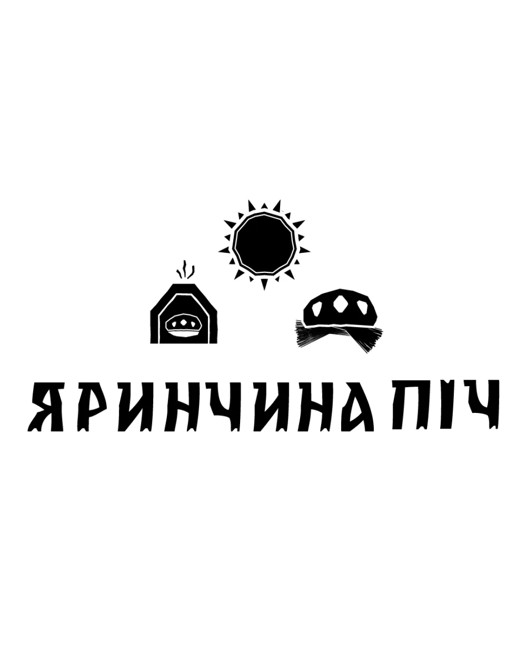
Combination Mark Folk, Rustic, Illustrative Food
4/5
Legibility
4/5
Originality
5/5
Misread
3/5
Balance
3/5
Scale
Review next
Detailed review

Logo performance breakdown

4/5

Legibility

Checkmark icon Text is bold, high contrast, and readable even at a distance.
Checkmark icon Letterforms are distinct and unique, aligning with the folk theme.

Warning icon Some stylized letter shapes may marginally affect instant recognition, especially for those less familiar with the typeface.


4/5

Originality

Checkmark icon Distinctive folk-inspired illustration style with cultural cues and hand-made feeling.
Checkmark icon Good integration of bread, oven, sun—specific to the culinary theme.

Warning icon Oven and bread iconography are commonly seen in food and bakery branding, though the folk treatment elevates its uniqueness.

5/5

Color harmony

Checkmark icon Monochrome palette ensures maximum versatility and contrast.
Checkmark icon No jarring or excessive color usage.

Black
#000000

White
#FFFFFF

3/5

Balance alignment

Checkmark icon Three symbols above the wordmark create a clear, central focal point.
Checkmark icon Text is evenly spaced and visually grounded beneath the icons.

Warning icon Weight distribution feels slightly top-heavy with three separate icons above, causing mild imbalance.
Warning icon Symbols lack alignment with text width, making the whole composition feel disjointed.

logo 200x250 pixels scalability test alignment grid overlay
3/5

Scalability

Checkmark icon Strong high-contrast shapes ensure core elements remain recognizable when scaled.
Checkmark icon Black-and-white palette simplifies reproduction.

Warning icon Fine details such as the steam from the oven and subtle sun spikes may be lost at smaller scales, especially in embroidery or favicon use.
Warning icon Multiple elements above the text may not shrink well for business cards or labels, risking detail loss.

logo 200x250 pixels scalability test

200x250 px

logo 100x125 pixels scalability test

100×125 px

logo 50x62 pixels scalability test

50×62 px

5/5

Misinterpretations

Checkmark icon No inappropriate shapes or ambiguous imagery detected.

3 / 5

Symbol & text fit

Checkmark icon Both icons and wordmark share a hand-drawn, rustic visual language, supporting overall cohesiveness.

Warning icon Relative sizing and positioning of symbols and wordmark could be refined for stronger integration, as icons somewhat overpower the text.

Try your own review

Wondering how your logo performs?

Get a clear logo score, key risks, and priority fix ideas before your client or audience sees it.

Review my logo