 View review
Logo score
Logo review of
Яринчина Піч
Review the detailed scores below to see what is working and what should be refined first.
Objective AI feedback. Your creative decision.
Legibility
Originality
Misread
Balance
Scale
Detailed review
Logo performance breakdown
Legibility
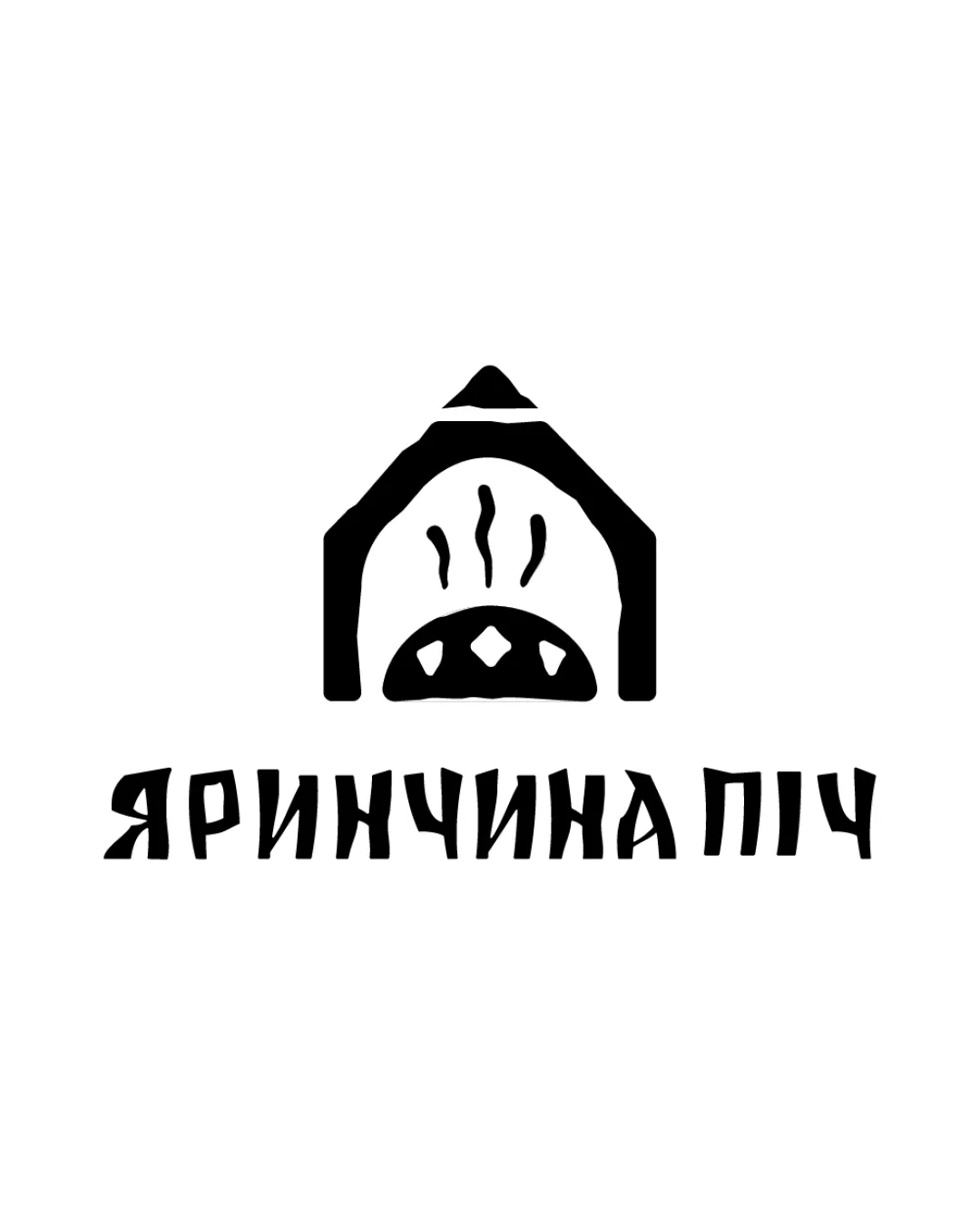
 Text is generally readable and matches the hand-drawn folk style. Distinct letterforms support logo personality.
 Some letter shapes are unconventional and may be difficult to read quickly, especially to those unfamiliar with the typeface or alphabet. Moderate stroke variations could hinder quick recognition at a glance.
Originality
The folk-art style and custom oven illustration feel authentic and tailored to traditional bakery or food concept. Handmade, non-generic look that avoids common food/oven clichés.
The oven motif is recognizable in the industry; while well-executed, it's not a groundbreaking approach.
Color harmony
Monochromatic palette delivers strong impact and clear applications. High contrast ensures excellent visibility.
Black
#000000
White
#FFFFFF
Balance alignment
Logomark is well-centered above the wordmark, creating strong vertical alignment. Visual weight is evenly distributed; both logo and text feel cohesive and intentional.

Scalability
Works well in black and white for a broad range of applications. Bold, simple forms preserve clarity at moderate to small sizes.
Thin lines suggesting steam may disappear at very small sizes (e.g., as a favicon or app icon). Some fine details in the logomark may be lost if scaled down for embroidery or small product labels.
200x250 px
100×125 px
50×62 px
Misinterpretations
Logo elements are clear and inoffensive. No negative or inappropriate connotations detected.
Symbol & text fit
Both elements share a consistent hand-drawn, rustic visual language.
Size ratio between logomark and wordmark feels harmonious.
Try your own review
Review my logo
Wondering how your logo performs?
Get a clear logo score, key risks, and priority fix ideas before your client or audience sees it.
Keep exploring