Concept & direction
A rounded, streamlined wordmark gives the service name a digital character.
Spelling & grammar
No obvious issue foundThe visible name reads “nexdata works”; its intended spelling has not been verified.
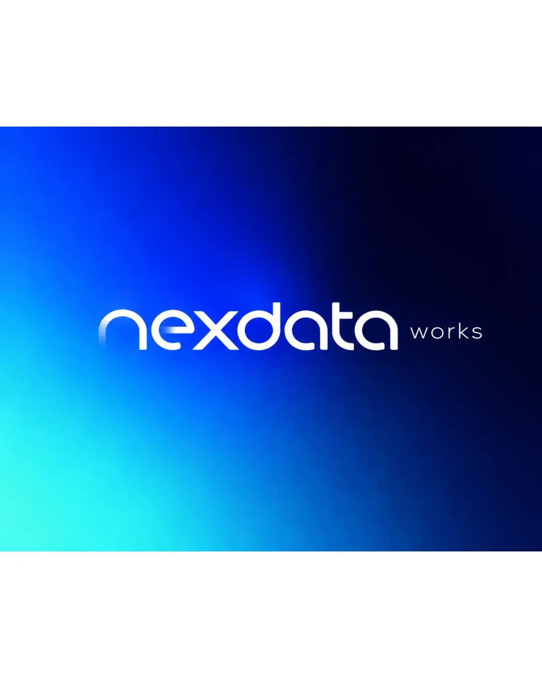
A readable, clean wordmark with a familiar geometric treatment and a few details worth testing at smaller sizes.
This wordmark shows solid execution, supported by text readability and visual balance; improving distinctiveness is the clearest next step.
Focus on the changes that matter. Keep what makes the logo work.
A rounded, streamlined wordmark gives the service name a digital character.
The visible name reads “nexdata works”; its intended spelling has not been verified.
Left stem of the initial n
The stem fades into the background, which may weaken the initial at smaller sizes or on a different background.
See the category reviewThe streamlined digital lettering suits freelance office and document services, though it does not specifically communicate those offerings.
The rounded geometric lowercase forms are familiar, limiting distinctiveness despite the customized initial and x.
The stem fades into the background, which may weaken the initial at smaller sizes or on a different background.
Try: Test the initial at practical display sizes and on intended backgrounds; strengthen the fade if it disappears.
“Works” is much smaller and finer than “nexdata,” so it may lose clarity when the wordmark is reduced.
Try: Test the complete name at typical use sizes and adjust the smaller lettering if needed.
Estimated colors. Use the original design file for exact values.
Create a full color palette using these colors
Create new palette
Inspect spacing with the guide. Optical balance may differ from geometric centering.
Get a clear logo score, key risks, and priority fix ideas before your client or audience sees it.
More credits needed
Add credits to continue without losing your work.
Then $7/month. Cancel anytime.
Essential logo review
Usually takes under a minute