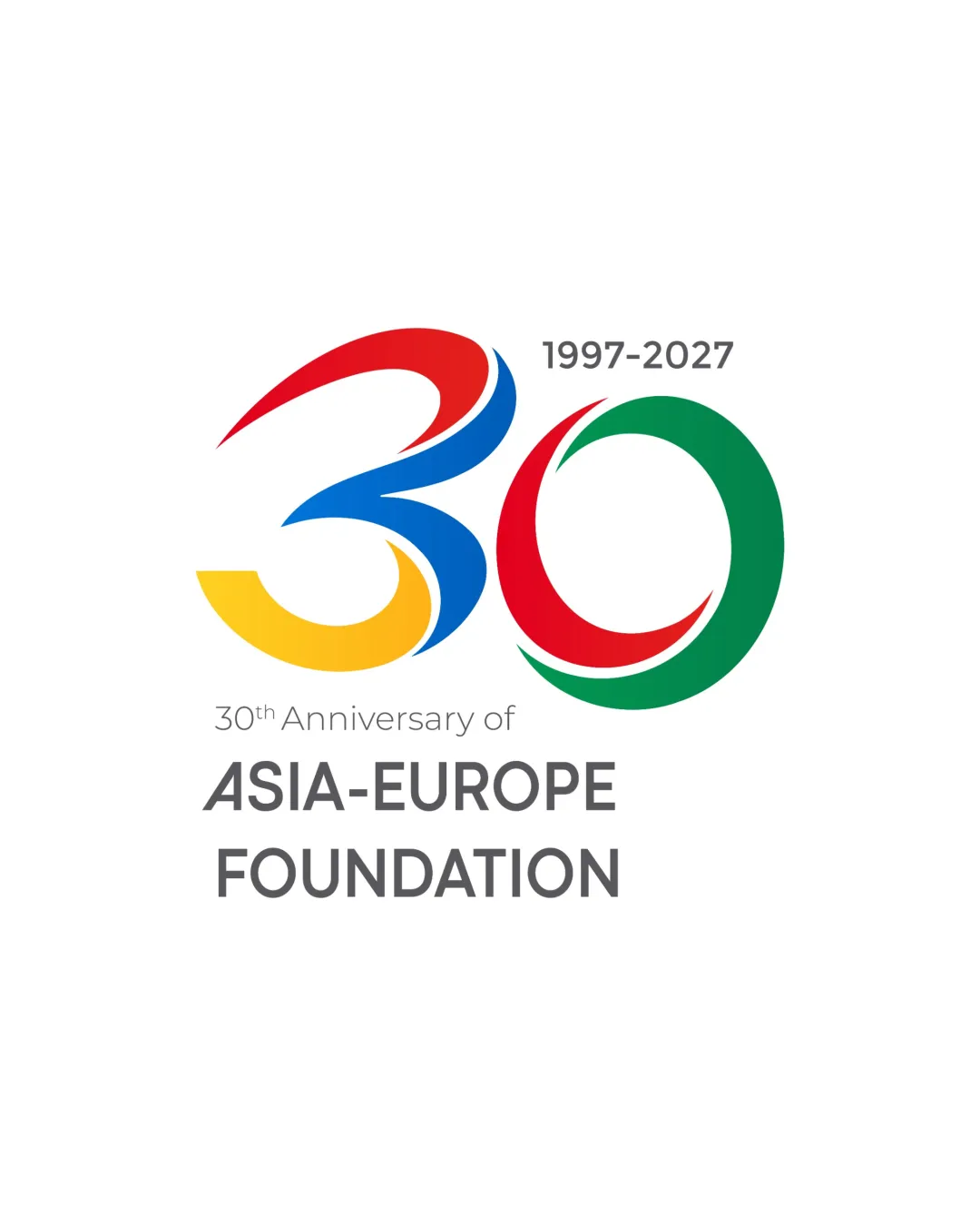
1997-2027 30th Anniversary of ASIA-EUROPE FOUNDATI.. logo review
4.5/5
Logo score
Logo review of

1997 2027 30th Anniversary Of Asia Europe Foundati..

A vibrant, distinctive anniversary logo that communicates its purpose with clarity and flair.

Combination Modern, Celebratory, Dynamic Non-profit / Foundation
5/5
Legibility
4/5
Originality
5/5
Misread
4/5
Balance
4/5
Scale
Your next steps

What to fix first

Focus on the changes that matter. Keep what makes the logo work.

1

Standalone mark (30)

Test legibility and integrity at reduced scales, especially for print and small digital icons.

Worth testing Medium priority Low effort
Area to inspectApproximate location

Fine tapers in the strokes of '30' might lose clarity at very small sizes.

How to check

Inspect the smallest intended use size for loss of shape or color definition.

See the category review
2

wordmark and tagline alignment

Slightly adjust font weight or vertical spacing of the tagline for clearer hierarchy.

Optional refinement Low priority Low effort
Area to inspectApproximate location

The tagline text '30th Anniversary of' appears slightly less optically balanced with the bold wordmark beneath, which may impact perceived hierarchy.

How to check

Review visual balance in print and digital mockups.

See the category review
Detailed review

Logo performance breakdown

5/5

Brief & logo match

Based on your brief
Compared with

Anniversary Logo

The design delivers an energetic, memorable anniversary mark that aligns directly with celebratory goals.

  • Anniversary Theme

    The '30' is prominent and colorful, immediately signaling a milestone celebration.

  • Brand Visibility

    Full foundation name is clearly presented below the mark, ensuring clarity of origin.

5/5

Legibility

  • Text and numbers are highly readable.
  • Clear hierarchy of information.
4/5

Originality

  • Dynamic multi-color treatment of '30' adds distinctiveness.
5/5

Color harmony

  • Bright, celebratory palette with good contrast.
Red#E5322E
Green#009245
Yellow#F9B233
Blue#0071BC
DarkGray#555555
White#FFFFFF

Estimated colors. Use the original design file for exact values.

Create a full color palette using these colors

Create new palette
4/5

Balance alignment

  • Wordmark and symbol are well-composed overall.
  • The tagline text '30th Anniversary of' appears slightly less optically balanced with the bold wordmark beneath, which may impact perceived hierarchy.

    Optional refinement wordmark and tagline alignment

    Try: Slightly adjust font weight or vertical spacing of the tagline for clearer hierarchy.

    Check: Review visual balance in print and digital mockups.

    Area to inspectApproximate location
Uploaded logoAlignment guide overlay

Inspect spacing with the guide. Optical balance may differ from geometric centering.

4/5

Scalability

  • Bold lines and major shapes are resilient.
  • Fine tapers in the strokes of '30' might lose clarity at very small sizes.

    Worth testing Standalone mark (30)

    Try: Test legibility and integrity at reduced scales, especially for print and small digital icons.

    Check: Inspect the smallest intended use size for loss of shape or color definition.
    Area to inspectApproximate location
Uploaded logo at 200 pixels wide
200 × 250 px
Uploaded logo at 100 pixels wide
100 × 125 px
Uploaded logo at 50 pixels wide
50 × 63 px

Compare the detail at different sizes. Labels show the full image dimensions.

5/5

Misinterpretations

  • No plausible negative readings in shape or text.
5/5

Symbol & text fit

  • The flowing mark and straightforward wordmark pair effectively.

Black & white

Does the shape still work without color?

These tests are available only for logos uploaded in vector (SVG) format.

Background contrast

Find the surfaces where your logo stays clear.

These tests are available only for logos uploaded in vector (SVG) format.

Blur & silhouette

A 3px blur softens fine details so you can check whether the overall shape stays recognizable. If key gaps close or elements merge, the logo may rely too heavily on detail.

These tests are available only for logos uploaded in vector (SVG) format.

Try your own review

Wondering how your logo performs?

Get a clear logo score, key risks, and priority fix ideas before your client or audience sees it.

Review my logo