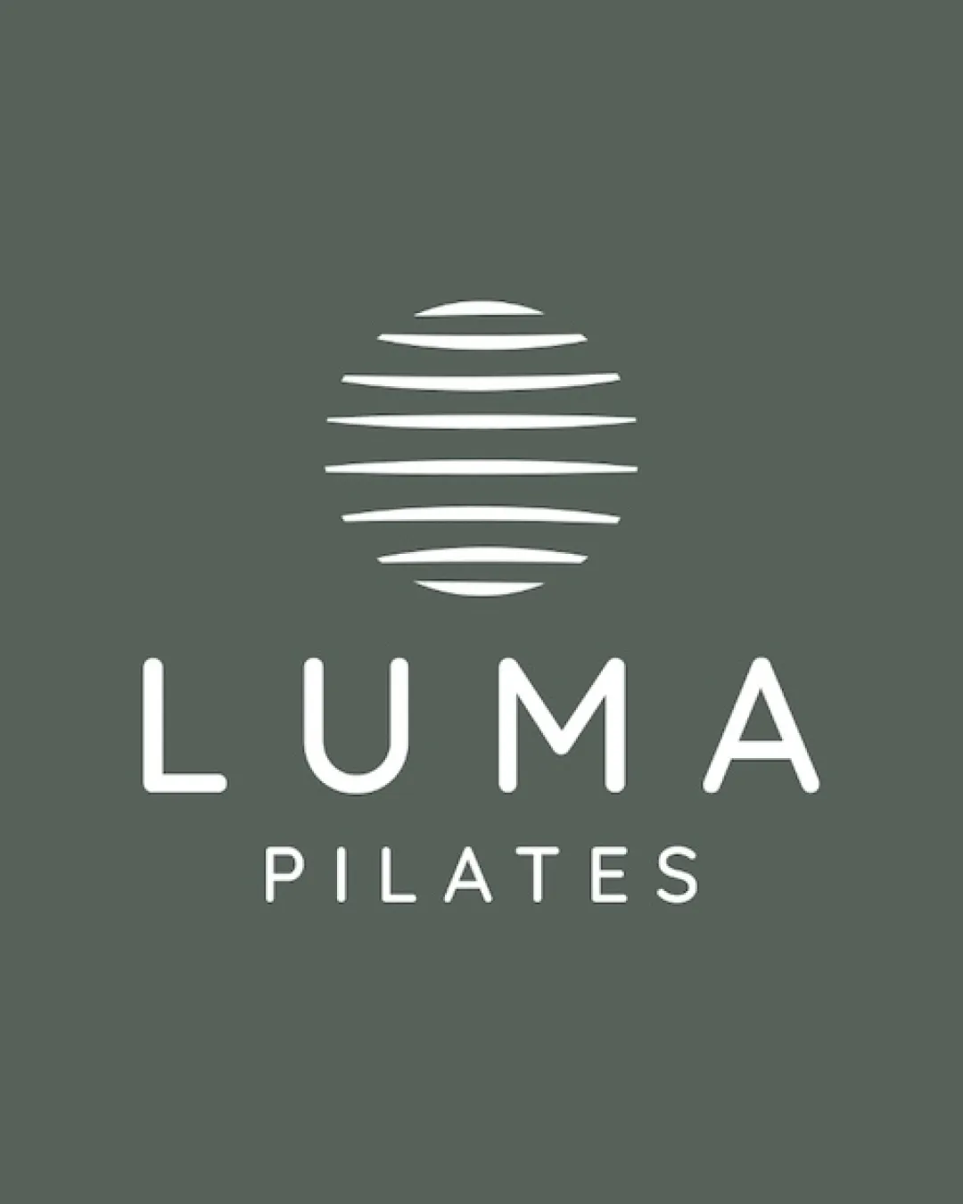
LUMA PILATES logo review
4.5/5
Logo score
Logo review of

Luma Pilates

A polished, elegant pilates studio identity with a soothing, boutique feel and only minor questions around mark uniqueness.

Combination Modern Minimal Sans-serif Fitness/wellness
5/5
Legibility
4/5
Originality
5/5
Misread
5/5
Balance
4/5
Scale
Your next steps

What to fix first

Focus on the changes that matter. Keep what makes the logo work.

1

Standalone mark

Explore a minor twist or custom line treatment to reinforce uniqueness.

Optional refinement Medium priority Medium effort

The stacked curved lines concept is elegant but somewhat familiar in wellness and fitness branding.

How to check

Compare to Pilates and wellness icon trends for distinctiveness.

See the category review
Detailed review

Logo performance breakdown

5/5

Brief & logo match

Based on your brief
Compared with

boutique pilates studio

Logo convincingly conveys boutique quality and pilates movement with elegance.

  • Calm, Boutique Appeal

    Type and symbol both project a serene, high-end fitness experience.

  • Movement/flexibility

    Curved lines in the mark subtly suggest flexibility and flow, tying to pilates.

5/5

Legibility

  • Wordmark is crisp, minimal, and highly readable.
4/5

Originality

  • Organic linework offers a serene identity.
  • Modern type adds boutique appeal.
  • The stacked curved lines concept is elegant but somewhat familiar in wellness and fitness branding.

    Optional refinement Standalone mark

    Try: Explore a minor twist or custom line treatment to reinforce uniqueness.

    Check: Compare to Pilates and wellness icon trends for distinctiveness.
5/5

Balance alignment

  • Excellent vertical stacking and optical spacing.
Uploaded logoAlignment guide overlay

Inspect spacing with the guide. Optical balance may differ from geometric centering.

4/5

Scalability

  • Minimal detail ensures clear scaling.
Uploaded logo at 200 pixels wide
200 × 250 px
Uploaded logo at 100 pixels wide
100 × 125 px
Uploaded logo at 50 pixels wide
50 × 63 px

Compare the detail at different sizes. Labels show the full image dimensions.

5/5

Misinterpretations

  • No distracting alternate meanings present.
5/5

Symbol & text fit

  • Harmonious minimalism and shared weight across elements.

Black & white

Does the shape still work without color?

These tests are available only for logos uploaded in vector (SVG) format.

Background contrast

Find the surfaces where your logo stays clear.

These tests are available only for logos uploaded in vector (SVG) format.

Blur & silhouette

A 3px blur softens fine details so you can check whether the overall shape stays recognizable. If key gaps close or elements merge, the logo may rely too heavily on detail.

These tests are available only for logos uploaded in vector (SVG) format.

Try your own review

Wondering how your logo performs?

Get a clear logo score, key risks, and priority fix ideas before your client or audience sees it.

Review my logo