Wondering how your logo performs? 🧐
Get professional logo reviews in seconds and catch design issues in time.
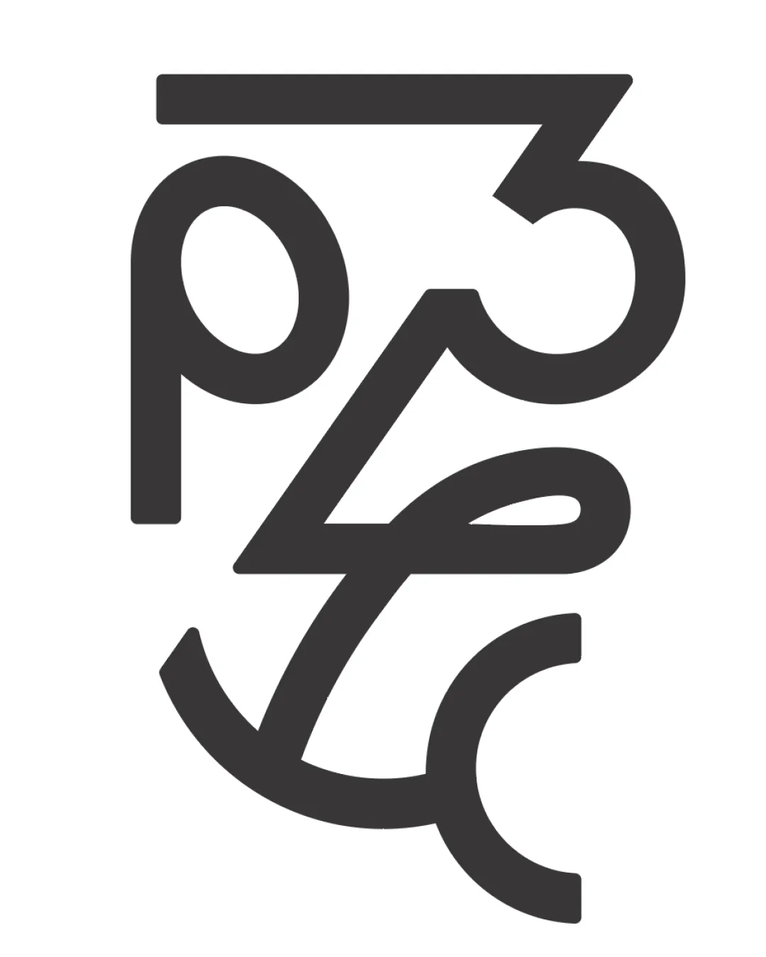
Try it Now!Logo review of 2345
 Logo analysis by AI
Logo type:
Style:
Detected symbol:
Detected text:
Business industry:
Review requested by Chang928
**If AI can recognize or misinterpret it, so can people.
Structured logo review
Legibility
![]() The numbers are bold and consistent in stroke width.
The numbers are bold and consistent in stroke width.
![]() Significant overlapping makes it difficult to read the numbers individually.
Significant overlapping makes it difficult to read the numbers individually.![]() The artistic arrangement sacrifices clarity for stylization, causing confusion for viewers unfamiliar with the intended numbers.
The artistic arrangement sacrifices clarity for stylization, causing confusion for viewers unfamiliar with the intended numbers.
Scalability versatility
![]() Simple, bold lines allow the design to be recognizable at various sizes.
Simple, bold lines allow the design to be recognizable at various sizes.![]() Would work well on digital media, print, and large format signage.
Would work well on digital media, print, and large format signage.
![]() Fine intersections and tight composition may blur or merge at very small scales, particularly in embroidery or small icon use.
Fine intersections and tight composition may blur or merge at very small scales, particularly in embroidery or small icon use.
200x250 px
100×125 px
50×62 px
Balance alignment
![]() Compact construction with deliberate overlap provides visual tension.
Compact construction with deliberate overlap provides visual tension.
![]() Arrangement feels slightly bottom-heavy due to the larger lower strokes.
Arrangement feels slightly bottom-heavy due to the larger lower strokes.![]() Some elements (like the curve of '5') extend further out, making the logo feel imbalanced overall.
Some elements (like the curve of '5') extend further out, making the logo feel imbalanced overall.

Originality
![]() Clever integration of sequential numbers in a monogram is uncommon in logo design.
Clever integration of sequential numbers in a monogram is uncommon in logo design.![]() Abstract composition adds uniqueness and interest.
Abstract composition adds uniqueness and interest.
![]() The forms are so abstract they risk being interpreted as something other than numbers, reducing distinctiveness if not clarified elsewhere.
The forms are so abstract they risk being interpreted as something other than numbers, reducing distinctiveness if not clarified elsewhere.
Aesthetic look
![]() Minimal and stylish, the geometric lines present a striking, modern aesthetic.
Minimal and stylish, the geometric lines present a striking, modern aesthetic.![]() Good use of negative space enhances the abstract feel without clutter.
Good use of negative space enhances the abstract feel without clutter.
![]() Aesthetically may lack appeal for audiences favoring clear, straightforward logos.
Aesthetically may lack appeal for audiences favoring clear, straightforward logos.![]() Possible overcomplication where legibility is sacrificed for form.
Possible overcomplication where legibility is sacrificed for form.
Dual meaning and misinterpretations
![]() No inappropriate or unintended connotations detected.
No inappropriate or unintended connotations detected.![]() Abstract shapes do not appear to form accidental symbols or imagery.
Abstract shapes do not appear to form accidental symbols or imagery.
Color harmony
![]() Limited to a single dark color, ensuring strong visual impact and flexibility.
Limited to a single dark color, ensuring strong visual impact and flexibility.![]() Can be inverted for light or dark backgrounds without losing effect.
Can be inverted for light or dark backgrounds without losing effect.
Shark
#232323
White
#FFFFFF