FIOMARÉ CIA DE BONECOS logo review
4.1 / 5
Logo score
Logo review of

Fiomaré Cia De Bonecos

Review the detailed scores below to see what is working and what should be refined first.

Objective AI feedback. Your creative decision.

Combination Mark Playful, Hand-drawn Entertainment
4/5
Legibility
4/5
Originality
5/5
Misread
3/5
Balance
4/5
Scale
Detailed review

Logo performance breakdown

4/5

Legibility

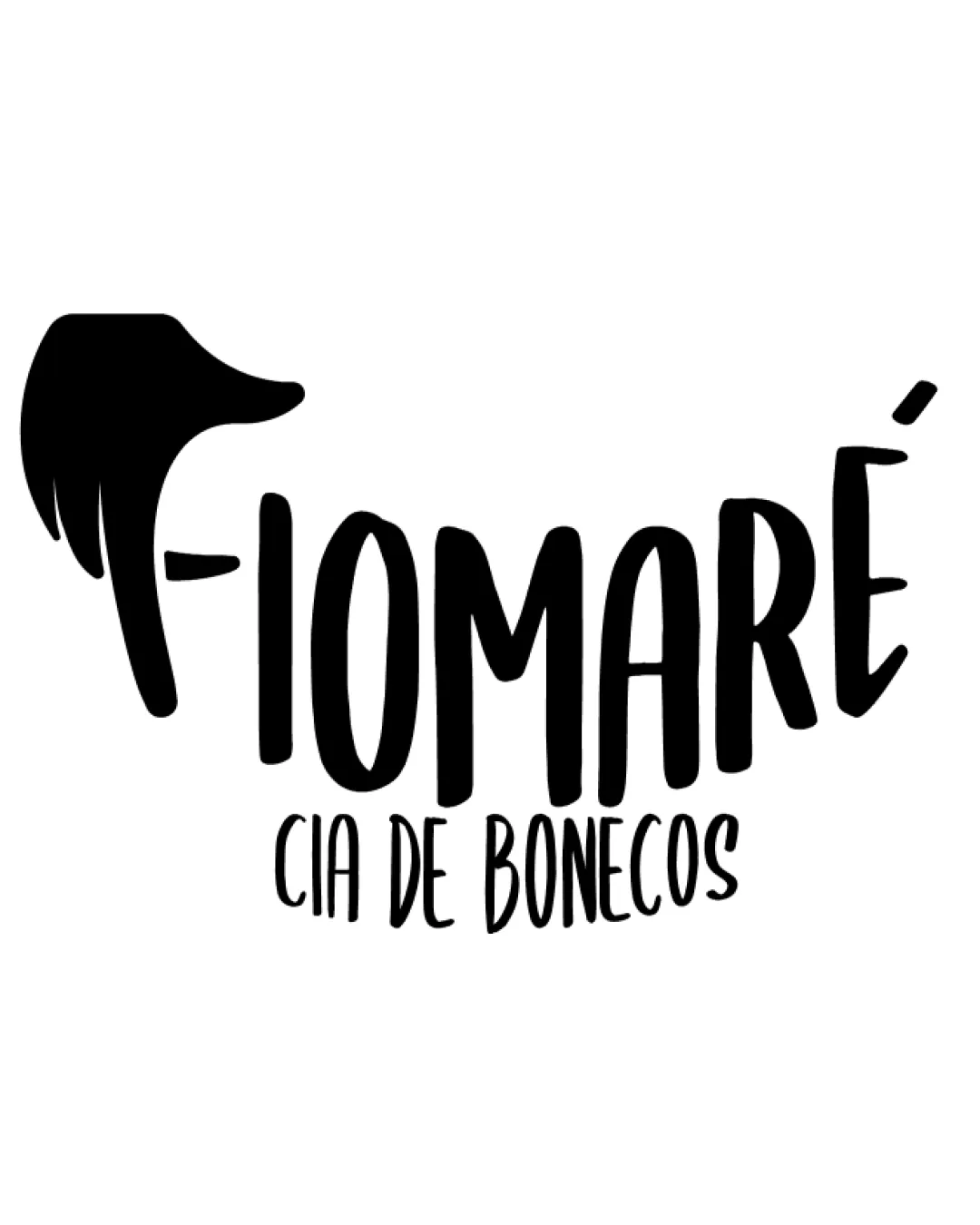
Checkmark icon Main text 'FIOMARÉ' is highly legible and bold.
Checkmark icon 'CIA DE BONECOS' is readable despite smaller size.

Warning icon The hand forming the 'F' may cause minor hesitation in instant recognition for unfamiliar viewers.
4/5

Originality

Checkmark icon Creative transformation of a hand into the letter 'F'.
Checkmark icon Distinct playful style aligning with the entertainment industry.

Warning icon Hand symbols in puppet-related fields are somewhat common, though the execution here is above average.

5/5

Color harmony

Checkmark icon Limited black and white palette ensures maximum versatility and clarity.
Checkmark icon Strong contrast maintains visibility across various applications.

Black
#000000

White
#FFFFFF

3/5

Balance alignment

Checkmark icon Text and symbol are integrated in a unified composition.
Checkmark icon Curved hand and letter shapes provide dynamic movement.

Warning icon The large hand on the left makes the logo slightly left-heavy, compromising overall visual balance.
Warning icon The vertical weight of the hand symbol does not fully harmonize with the lighter 'CIA DE BONECOS' text below.

logo 200x250 pixels scalability test alignment grid overlay
4/5

Scalability

Checkmark icon Bold shapes and high contrast make the logo adaptable to many sizes.
Checkmark icon Clear lines ensure good reproduction in print and digital formats.

Warning icon 'CIA DE BONECOS' may become harder to read at very small scales, such as on business cards or pin badges.

logo 200x250 pixels scalability test

200x250 px

logo 100x125 pixels scalability test

100×125 px

logo 50x62 pixels scalability test

50×62 px

5/5

Misinterpretations

Checkmark icon No inappropriate or ambiguous elements detected.

4 / 5

Symbol & text fit

Checkmark icon Both symbol (hand) and wordmark share a hand-drawn, whimsical aesthetic.
Checkmark icon Integration of hand into text is clever and doesn’t feel forced.

Warning icon Size mismatch between the bold hand and the finer subtext causes a minor discord.

Try your own review

Wondering how your logo performs?

Get a clear logo score, key risks, and priority fix ideas before your client or audience sees it.

Review my logo




