View review
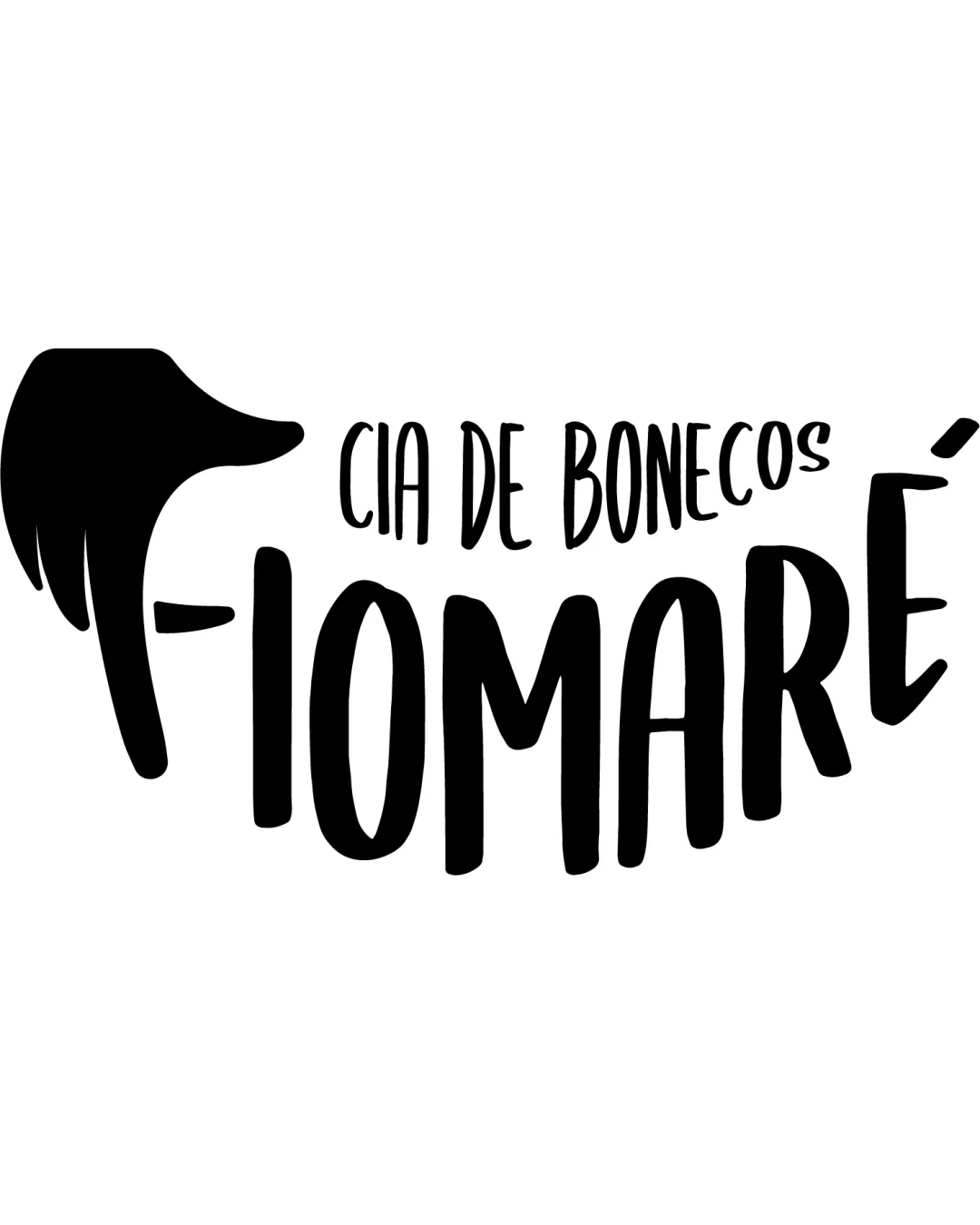
Cia De Bonecos Fiomaré
Review the detailed scores below to see what is working and what should be refined first.
Objective AI feedback. Your creative decision.
Logo performance breakdown
Legibility
Main brand name 'FIOMARÉ' is highly legible due to bold, large lettering.
Distinctive character shapes create strong word recognition.
'CIA DE BONECOS' uses a much thinner font and could be hard to read at small sizes, especially in cluttered environments.
The heavy stylization of the 'F' may confuse some users at a glance.

Originality
Hand puppet integration in the 'F' is highly creative and perfectly suited to the puppet/entertainment theme.
Illustrative, organic forms feel customized, avoiding generic font templates.
Color harmony
Single color ensures exceptional clarity and focus.
No color harmony issues—very direct and flexible.
Black
#000000
White
#FFFFFF
Balance alignment
Good overall flow—'F' mark leads smoothly into the name.
Curved baseline of 'FIOMARÉ' adds energy and enhances visual interest.
Top-heavy left side due to oversized hand/puppet shape compared to the more even rhythm of the remaining letters.
Vertically, tagline and large letters are well-separated but could feel slightly disconnected if used in horizontal layouts.
Scalability
Bold marks and contrasts allow the logo to be visible across many mediums like posters, flyers, and digital banners.
Simplicity and lack of colors aids scalability.
Thin tag line may lose legibility entirely in small-scale applications such as business cards or embroidery.
Detail of the puppet-hand/finger shape may blur or become ambiguous at very small sizes.
Logo might not adapt as cleanly to monochrome product labels if shrinkage is needed.
200x250 px
100×125 px
50×62 px
Misinterpretations
Hand/puppet form clearly references industry without accidental negative connotations.
Wondering how your logo performs?
Get a clear logo score, key risks, and priority fix ideas before your client or audience sees it.



