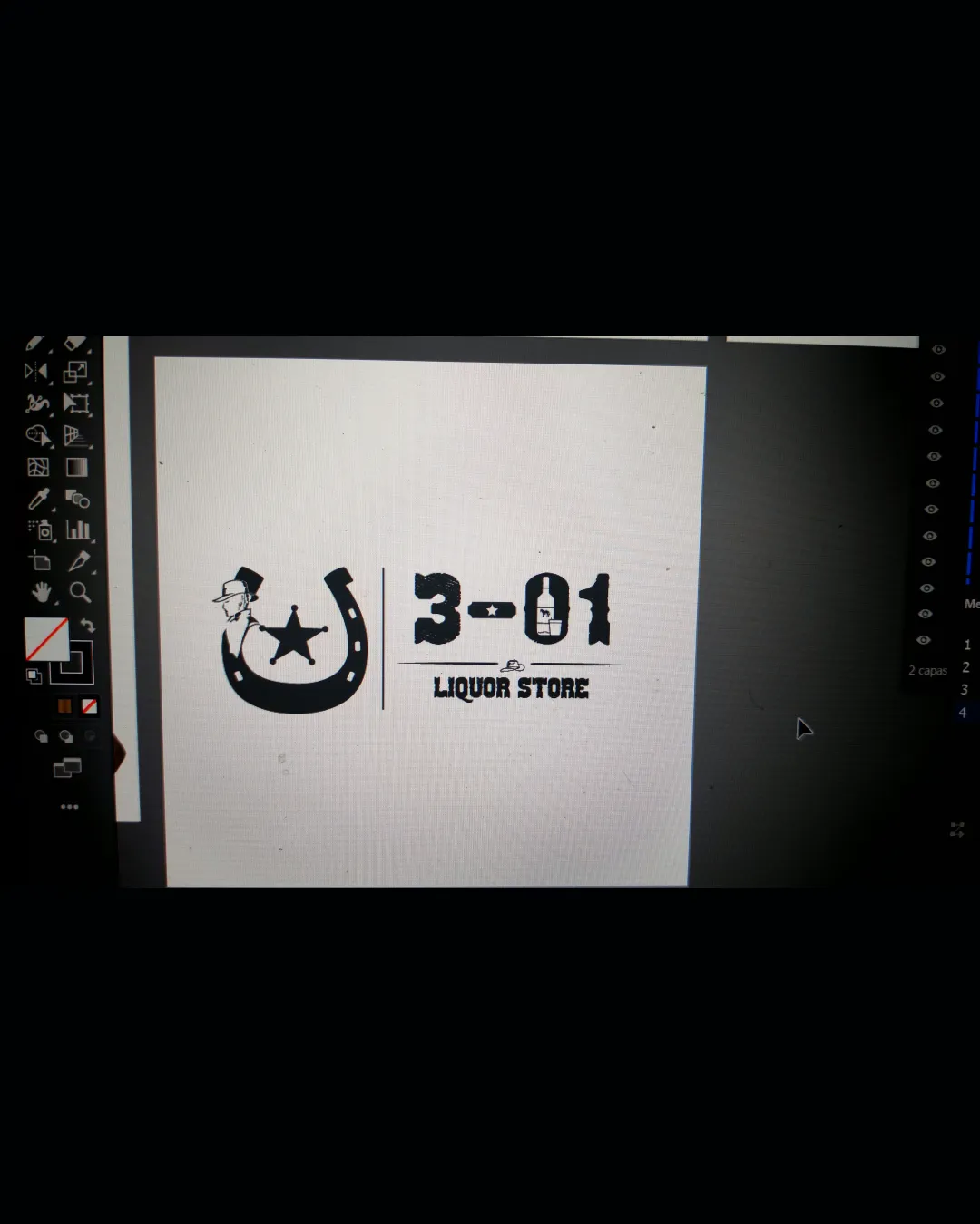
3-01 LIQUOR STORE logo review
3.3/5
Logo score
Logo review of

3 01 Liquor Store

Solid themed logo with clear direction; requires refinements in detail management and lockup balance for professional polish.

Combination Mark Western Badge, Distressed, Vintage Liquor
4/5
Legibility
3/5
Originality
4/5
Misread
3/5
Balance
3/5
Scale
Action plan

What to fix first

The most important fixes to handle before polishing the full presentation.

1

Reduce detail in small elements like the cowboy hat for better small-size legibility.

High priority

Preserves clarity and avoids muddiness in miniature formats.

Impact: Improves Usage On Smaller Displays And Print. · Effort: Medium

2

Consider balancing the visual weight by adjusting the scale or placement between mark and text.

Medium priority

Aids professional polish and client appeal.

Impact: Achieves Visual Harmony, Making The Lockup Feel More Cohesive. · Effort: Low

Detailed review

Logo performance breakdown

4/5

Legibility

Checkmark icon Main text is readable and distinctive; font matches theme.

Warning icon Distressed effect slightly reduces sharpness at smaller sizes.

3/5

Originality

Checkmark icon Cowboy theme and use of sheriff star add personality.

Warning icon Western motifs (horseshoe, sheriff star, hat) are common; could be mistaken for bar or steakhouse.

3/5

Balance alignment

Checkmark icon Mark and wordmark separated cleanly by a line; elements not crowded.

Warning icon Visual weight of the horseshoe and text is slightly uneven, making the left heavier.

logo 200x250 pixels scalability test alignment grid overlay
3/5

Scalability

Checkmark icon Simple icon and bold text; works at moderate sizes.

Warning icon Distressed font and detailed hat/cowboy head may lose clarity at small scales.

logo 200x250 pixels scalability test

200x250 px

logo 100x125 pixels scalability test

100×125 px

logo 50x62 pixels scalability test

50×62 px

4/5

Misinterpretations

Checkmark icon No obvious misreadings or inappropriate shapes.

4/5

Logo structure & brief match

Checkmark icon Western motif in both mark and type unite the lockup.

Checkmark icon Theme: The Western theme is clear and appropriate for a liquor store aiming for a rustic saloon identity.

Try your own review

Wondering how your logo performs?

Get a clear logo score, key risks, and priority fix ideas before your client or audience sees it.

Review my logo