What to preserve
The logo conveys tranquility and elegance via a graceful female profile, nature motifs, and minimal gold linework, alluding to holistic beauty or wellness.
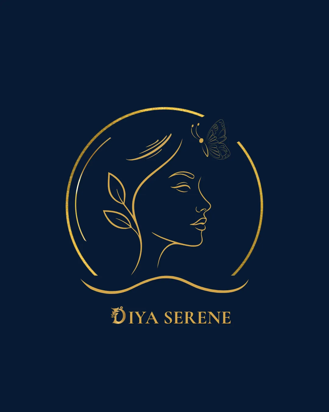
A polished, serene logo with strong luxury cues, but fine line detail needs testing for small-scale use.
This logo lockup shows strong execution, supported by visual balance and text readability; improving distinctiveness is the clearest next step.
Focus on the changes that matter. Keep what makes the logo work.
The logo conveys tranquility and elegance via a graceful female profile, nature motifs, and minimal gold linework, alluding to holistic beauty or wellness.
Logo preview unavailable. The written feedback is still available on this card.
Standalone mark
Fine gold linework in the face, leaves, and butterfly motifs may lose clarity or merge at small sizes, especially the facial features and butterfly details.
See the category reviewFits premium wellness or beauty with serene feminine and natural motifs, but the familiar concept and fine lines require testing for distinction and scalability.
Wordmark 5/5 · Layout 5/5
Symbol 5/5 · Wordmark 5/5
Estimated colors. Use the original design file for exact values.
Create a full color palette using these colors
Create new paletteSymbol 4/5 · Wordmark 5/5 · Layout 4/5
Upper circle is intentionally open, but the gap's asymmetry with the lower segment and space around the butterfly could slightly disrupt overall harmony for some viewers.

Inspect spacing with the guide. Optical balance may differ from geometric centering.
Symbol 3/5 · Wordmark 5/5 · Layout 4/5
Fine gold linework in the face, leaves, and butterfly motifs may lose clarity or merge at small sizes, especially the facial features and butterfly details.
Try: Test the logo at small scale to ensure all key details are distinguishable and do not blend together.
Logo preview unavailable. The written feedback is still available on this card.
Symbol 3/5 · Wordmark 4/5
Elegant female profile and butterfly/nature motifs are familiar in wellness/beauty branding; execution is refined, but conceptual elements are not highly distinctive for the sector.
Get a clear logo score, key risks, and priority fix ideas before your client or audience sees it.
More credits needed
Add credits to continue without losing your work.
Then $7/month. Cancel anytime.
Essential logo review with AI
Estimated progress