What to preserve
A hand-drawn book with stitching that forms a 'G' clearly conveys artisanal bookbinding and links directly to the brand name.
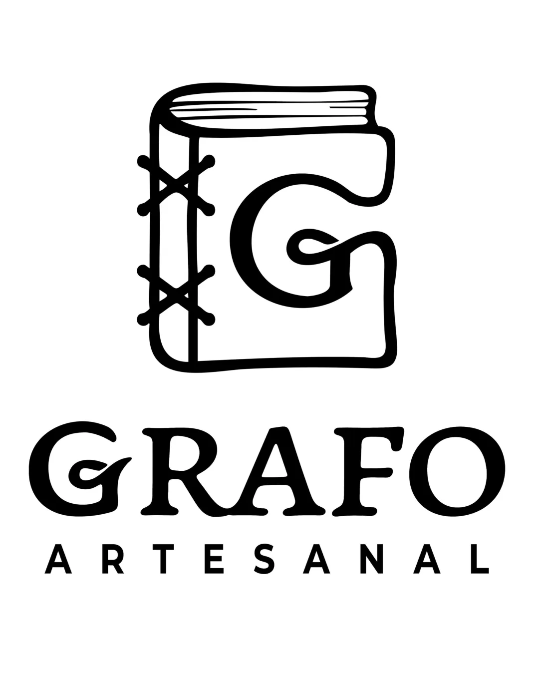
A visually appealing, conceptually strong logo that clearly expresses artisanal bookbinding through a distinctive G-book symbol; only minor polish is needed to enhance balance and micro-detail.
This logo lockup shows strong execution, supported by visual balance and text readability; improving distinctiveness is the clearest next step.
Focus on the changes that matter. Keep what makes the logo work.
A hand-drawn book with stitching that forms a 'G' clearly conveys artisanal bookbinding and links directly to the brand name.
Logo preview unavailable. The written feedback is still available on this card.
mark and wordmark horizontal alignment
The illustrated mark is slightly visually heavier on top compared to the centered wordmark and tagline below; the base of the 'G' in the mark and wordmark are not perfectly aligned, which may cause a mild visual disconnect.
See the category reviewThe logo's hand-drawn book-as-'G' motif convincingly expresses the artisanal bookbinding focus, directly linking the visual and business concept.
Wordmark 5/5 · Layout 5/5
Symbol 4/5 · Wordmark 5/5 · Layout 4/5
Symbol 4/5 · Wordmark 4/5 · Layout 4/5
The illustrated mark is slightly visually heavier on top compared to the centered wordmark and tagline below; the base of the 'G' in the mark and wordmark are not perfectly aligned, which may cause a mild visual disconnect.
Try: Refine vertical alignment and optical centering between the book mark and the wordmark for greater visual balance.
Logo preview unavailable. The written feedback is still available on this card.

Inspect spacing with the guide. Optical balance may differ from geometric centering.
Symbol 4/5 · Wordmark 3/5
Combining the initial G with a distinct artisanal book binding is expressive but similar book-icon concepts are occasionally seen in book-related crafts.
Get a clear logo score, key risks, and priority fix ideas before your client or audience sees it.
More credits needed
Add credits to continue without losing your work.
Then $7/month. Cancel anytime.
Essential logo review with AI
Estimated progress