What to preserve
A bold geometric monogram combines the idea of '6AM' with a hexagonal shape, symbolizing early rising and productivity in a clean, contemporary manner.
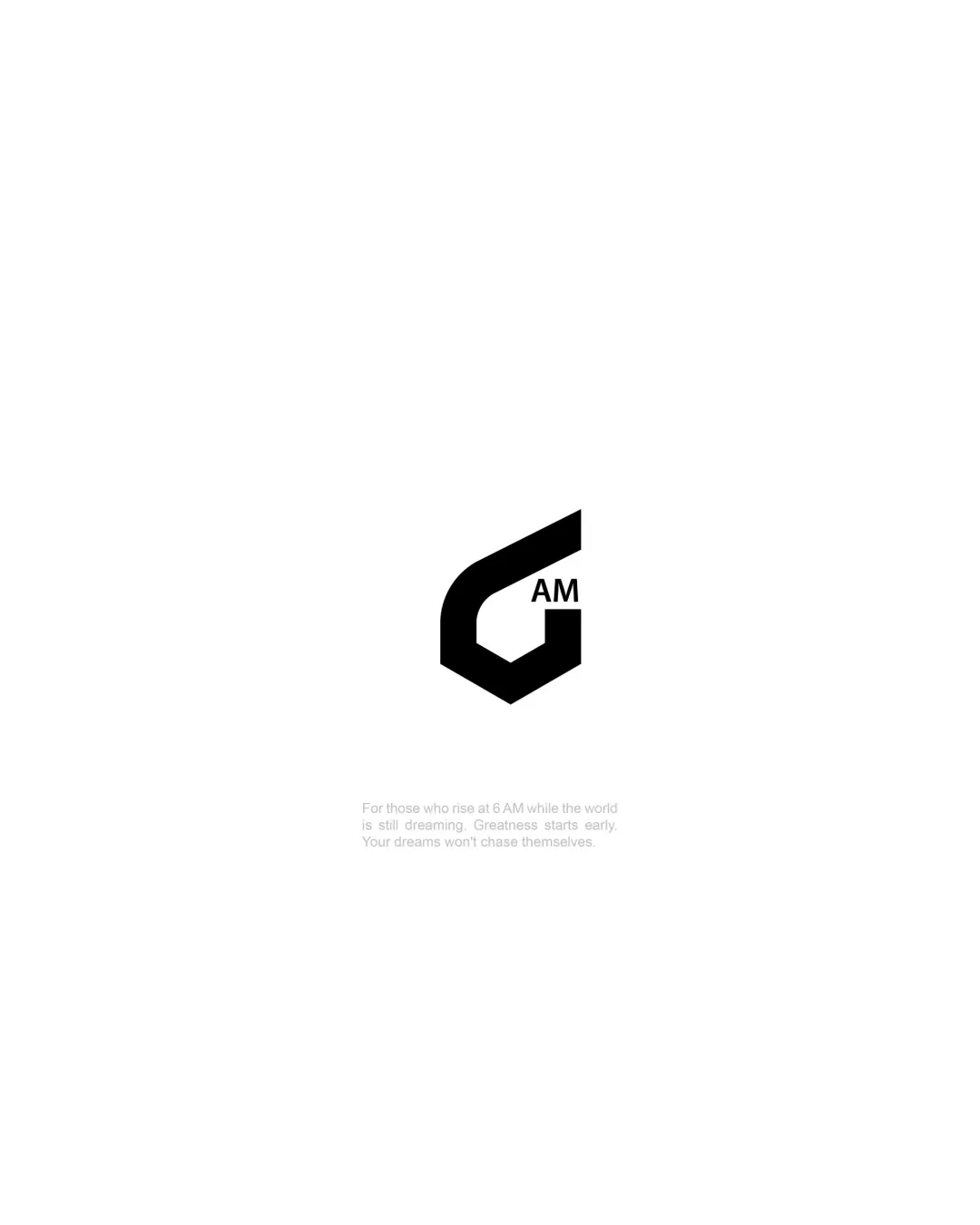
The logo features a memorable and cohesive mark that effectively blends a '6' and geometric form with clear '6AM' text, but the tagline's tiny size limits broad usability.
This logo lockup shows solid execution, supported by visual balance and text readability; improving distinctiveness is the clearest next step.
Focus on the changes that matter. Keep what makes the logo work.
A bold geometric monogram combines the idea of '6AM' with a hexagonal shape, symbolizing early rising and productivity in a clean, contemporary manner.
Logo preview unavailable. The written feedback is still available on this card.
tagline
The tagline is very small and light, making it difficult to read at standard viewing distances or reduced sizes.
See the category reviewThe logo strongly fits a motivational or productivity-focused lifestyle brand, stating '6AM' with a dynamic, modern symbol to reinforce early rising and achievement.
Wordmark 4/5 · Layout 4/5
The tagline is very small and light, making it difficult to read at standard viewing distances or reduced sizes.
Try: Increase tagline weight or size for improved readability, or offer as a separate asset.
Logo preview unavailable. The written feedback is still available on this card.
Symbol 4/5 · Wordmark 4/5 · Layout 4/5

Inspect spacing with the guide. Optical balance may differ from geometric centering.
Symbol 4/5 · Wordmark 4/5 · Layout 4/5
Symbol 4/5 · Wordmark 3/5
The stylized '6' and hexagonal monogram is distinctive, though the technique of merging numerals with geometric shapes is moderately familiar.
Get a clear logo score, key risks, and priority fix ideas before your client or audience sees it.
More credits needed
Add credits to continue without losing your work.
Then $7/month. Cancel anytime.
Essential logo review with AI
Estimated progress