What to preserve
The logo uses an abstract swirl suggestive of chocolate or fluidity, paired with an elegant serif wordmark, effectively conveying sophistication suitable for a high-end chocolate brand.
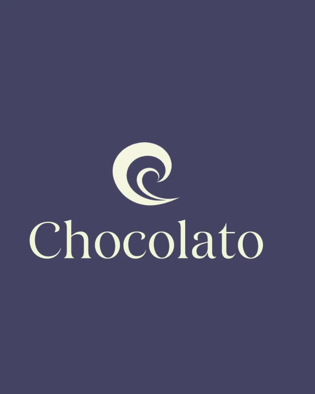
This logo demonstrates a sophisticated, visually cohesive presence for a high-end chocolate brand, with well-crafted type and an abstract yet elegant symbol; only minor tweaks are suggested for optimal lockup cohesion.
This logo lockup shows strong execution, supported by visual balance and distinctive construction.
Focus on the changes that matter. Keep what makes the logo work.
The logo uses an abstract swirl suggestive of chocolate or fluidity, paired with an elegant serif wordmark, effectively conveying sophistication suitable for a high-end chocolate brand.
Logo preview unavailable. The written feedback is still available on this card.
primary lockup
There is a slight sense of vertical gap between the symbol and wordmark, which might reduce the cohesion between elements especially on packaging or social display.
See the category reviewElegant serif typography and a refined swirl symbol convey sophistication and premium positioning, matching the high-end chocolate and packaging brief.
Wordmark 5/5 · Layout 5/5
Symbol 4/5 · Wordmark 4/5
The abstract swirl is elegant and appropriate but does not strongly or uniquely evoke chocolate without supporting context; this is typical in luxury categories.
Symbol 4/5 · Wordmark 4/5 · Layout 4/5
There is a slight sense of vertical gap between the symbol and wordmark, which might reduce the cohesion between elements especially on packaging or social display.
Try: Reduce the vertical separation between the symbol and wordmark for tighter cohesion.
Logo preview unavailable. The written feedback is still available on this card.

Inspect spacing with the guide. Optical balance may differ from geometric centering.
Symbol 4/5 · Wordmark 4/5 · Layout 4/5
Get a clear logo score, key risks, and priority fix ideas before your client or audience sees it.
More credits needed
Add credits to continue without losing your work.
Then $7/month. Cancel anytime.
Essential logo review with AI
Estimated progress