Concept & direction
A modern geometric monogram 'UK' combines with bilingual wordmarks to suggest professionalism and serve an international audience.
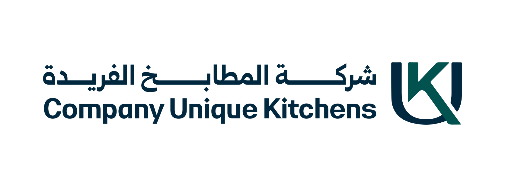
A competent, modern bilingual logo with a functional monogram, good legibility, and strong bilingual execution, needing only minor refinements to alignment and increased distinctiveness to stand out.
This logo lockup shows solid execution, supported by text readability and clarity at smaller sizes; improving distinctiveness is the clearest next step.
Focus on the changes that matter. Keep what makes the logo work.
A modern geometric monogram 'UK' combines with bilingual wordmarks to suggest professionalism and serve an international audience.
Logo preview unavailable. The written feedback is still available on this card.
bilingual wordmark and monogram alignment
The baseline and optical weight of the Arabic and English wordmark lines do not align perfectly with the monogram, leading to a slight imbalance in the lockup.
See the category reviewThe logo's modern geometric monogram and bilingual presentation fit the brand's promise of quality and appeal to a Saudi-based, international-facing audience, but greater visual uniqueness would better distinguish the brand in a competitive industry.
Monogram 5/5 · Wordmark 4/5 · Layout 4/5
The Arabic wordmark uses adequate proportion and spacing, but clarity may reduce at very small sizes.
Monogram 4/5 · Wordmark 4/5
Estimated colors. Use the original design file for exact values.
Create a full color palette using these colors
Create new paletteMonogram 4/5 · Wordmark 4/5 · Layout 4/5
Monogram 3/5 · Wordmark 3/5
The monogram relies on a standard approach—a geometric union of 'U' and 'K'—common in other industries, risking generic appearance.
Monogram 3/5 · Wordmark 3/5 · Layout 3/5
The baseline and optical weight of the Arabic and English wordmark lines do not align perfectly with the monogram, leading to a slight imbalance in the lockup.
Try: Refine alignment and baseline positioning between wordmarks and monogram for a more unified composition.
Logo preview unavailable. The written feedback is still available on this card.

Inspect spacing with the guide. Optical balance may differ from geometric centering.
Does the shape still work without color?
Find the surfaces where your logo stays clear.
Compare the mark and lettering on each surface.
Shows the lower-contrast areas of the logo (5th percentile). Tiny details may have lower contrast. Good ≥ 4.5:1 · Medium ≥ 3:1 · Bad < 3:1. A visual guide, not an accessibility rating.
A 3px blur softens fine details so you can check whether the overall shape stays recognizable. If key gaps close or elements merge, the logo may rely too heavily on detail.
Look for clear separation between shapes and a distinctive outline.
Get a clear logo score, key risks, and priority fix ideas before your client or audience sees it.
More credits needed
Add credits to continue without losing your work.
Then $7/month. Cancel anytime.
Essential logo review with AI
Estimated progress