 View review
Logo score
Logo review of
A
Review the detailed scores below to see what is working and what should be refined first.
Objective AI feedback. Your creative decision.
Legibility
Originality
Misread
Balance
Scale
Detailed review
Logo performance breakdown
Legibility
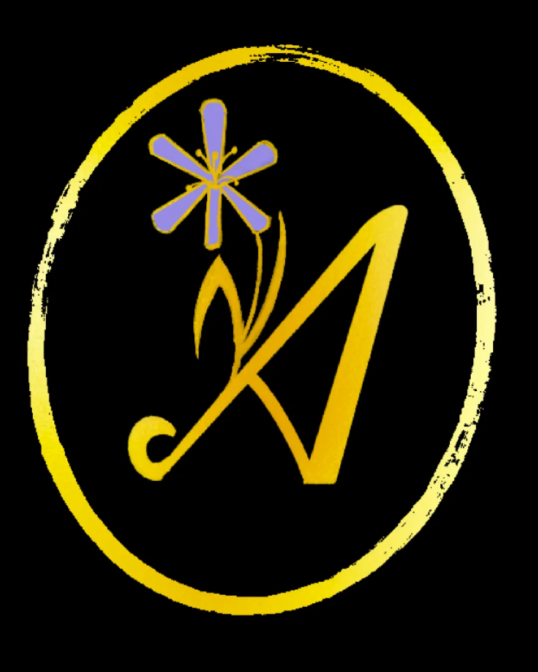
 The 'A' shape is mostly clear and easy to distinguish. Simple yet distinctive single letter is recognizable.
 Flower and flourish details may distract from the legibility of the 'A', especially at small sizes.
Originality
Creative integration of floral motif and calligraphic letter 'A'. Unique use of line and color within a simple shape.
Combining a letter with a flower is moderately common in floral/garden branding.
Color harmony
Limited, harmonious palette of yellow and lavender. Colors contrast well, making the symbol stand out against black.
Yellow on some backgrounds may risk low contrast; black background constrains versatility.
Gold
#FFD700
Lavender
#7D5FFF
Black
#000000
Your palette is close. Refine the color roles and combinations before updating the logo.
Build brand colorsBalance alignment
Centralized composition inside the oval creates visual focus.
Flower makes the composition top-heavy, causing imbalance. The flourish at the bottom left pulls the eye downward, competing with upper elements.

Scalability
Bold strokes of the letter help maintain clarity at medium scales. Simple color blocking aids reproduction.
Thin details in the flower and rough oval border may be lost or look uneven at small scales (e.g. favicons or embroidery). Textural border may not translate well to every application, such as app icons or monochrome formats.
200x250 px
100×125 px
50×62 px
Misinterpretations
No inappropriate or unintended imagery detected. The flower clearly reads as floral and non-controversial.
Try your own review
Review my logo
Wondering how your logo performs?
Get a clear logo score, key risks, and priority fix ideas before your client or audience sees it.
Keep exploring


