 View review
Logo score
Logo review of
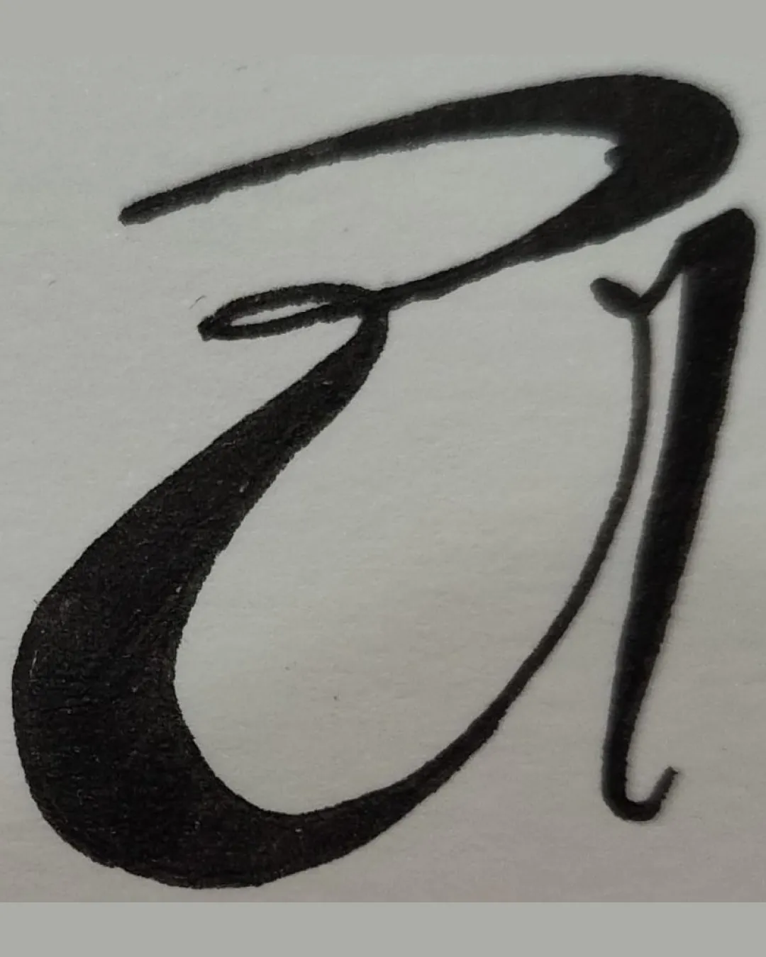
A Or Ai
Review the detailed scores below to see what is working and what should be refined first.
Objective AI feedback. Your creative decision.
Legibility
Originality
Misread
Balance
Scale
Detailed review
Logo performance breakdown
Legibility
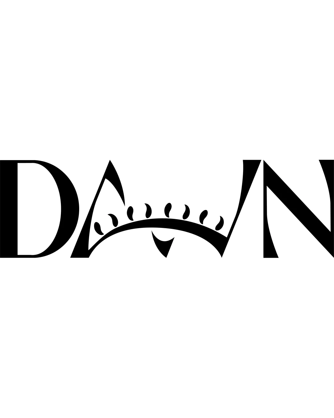
 Distinct thick and thin line contrast draws attention Artistic style implies creativity
 Letter shape is ambiguous; could be interpreted as either 'A', 'AI', or something else Not immediately recognizable; may confuse viewers unfamiliar with the brand
Originality
Custom calligraphic approach lends a unique, crafted quality Not a generic stock font or overused design
Calligraphy as a style is generally popular, so the mark is only moderately original Lack of additional brand identifiers or integrated symbolism limits memorability
Color harmony
Classic black on white provides maximum legibility and timelessness No clashes or unnecessary color distractions
Black
#000000
Gray
#DFDFDF
Balance alignment
Flowing lines give a sense of movement Weight distribution is mostly even in the lower stroke
Upper flourish overextends compared to the rest of the character, which disrupts symmetry The right vertical stroke feels visually disconnected from the heavy left stroke, creating imbalance

Scalability
Simple black-and-white color scheme aids in versatility Bold main stroke will hold up at moderate sizes
Delicate, thin lines (especially at the top and side) may get lost at small sizes (e.g. on favicons, embroidery, small labels) High stroke contrast and intricate curves likely to lose detail or clarity when scaled down drastically
200x250 px
100×125 px
50×62 px
Misinterpretations
No inappropriate or suggestive shapes detected No accidental negative connotations present
Try your own review
Review my logo
Wondering how your logo performs?
Get a clear logo score, key risks, and priority fix ideas before your client or audience sees it.
Keep exploring