Wondering how your logo performs? 🧐
Get professional logo reviews in seconds and catch design issues in time.
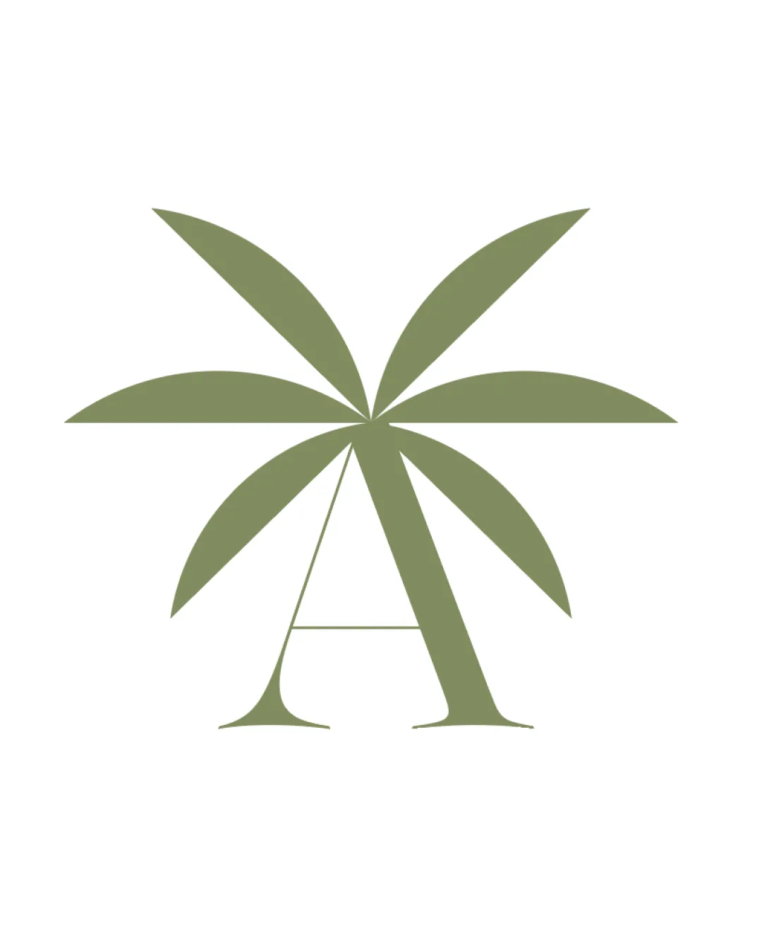
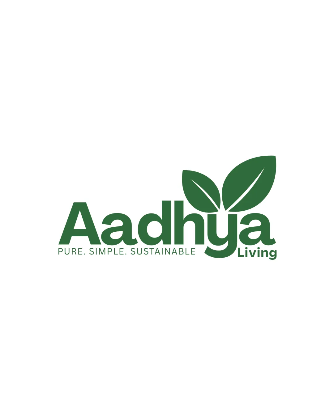
Try it Now!Logo review of Aadhya Living
 Logo analysis by AI
Logo type:
Style:
Detected symbol:
Detected text:
Business industry:
Review requested by Santhoush
**If AI can recognize or misinterpret it, so can people.
Structured logo review
Legibility
![]() Text is bold and easy to read at all sizes.
Text is bold and easy to read at all sizes.![]() High contrast between green text and white background enhances legibility.
High contrast between green text and white background enhances legibility.
Scalability versatility
![]() Simple shapes and bold font make it adaptable across most media, including packaging, signage, and social media icons.
Simple shapes and bold font make it adaptable across most media, including packaging, signage, and social media icons.![]() Logo works well on both light and dark backgrounds with potential adjustments.
Logo works well on both light and dark backgrounds with potential adjustments.
![]() Smaller applications like embroidery or very tiny icons may lose the separation detail between the two leaves.
Smaller applications like embroidery or very tiny icons may lose the separation detail between the two leaves.
200x250 px
100×125 px
50×62 px
Balance alignment
![]() Overall, the wordmark and leaf symbol are well integrated.
Overall, the wordmark and leaf symbol are well integrated.![]() Visual weight of the leaves balances the length of the word 'Aadhya'.
Visual weight of the leaves balances the length of the word 'Aadhya'.
![]() The offset alignment of the leaves above 'y' can create slight imbalance, making the right side feel heavier.
The offset alignment of the leaves above 'y' can create slight imbalance, making the right side feel heavier.

Originality
![]() Simple, direct symbolism that clearly communicates sustainability.
Simple, direct symbolism that clearly communicates sustainability.
![]() Leaf motifs are highly generic and widely used in eco and lifestyle brands without unique transformation or twist.
Leaf motifs are highly generic and widely used in eco and lifestyle brands without unique transformation or twist.
Logomark wordmark fit
![]() Consistent color palette ties logomark and wordmark together.
Consistent color palette ties logomark and wordmark together.![]() Rounded shapes of the font echo the soft, organic forms of the leaves.
Rounded shapes of the font echo the soft, organic forms of the leaves.
![]() Leaf placement feels a bit arbitrary; clashing styles are avoided, but additional integration could improve cohesiveness.
Leaf placement feels a bit arbitrary; clashing styles are avoided, but additional integration could improve cohesiveness.
Aesthetic look
![]() Clean, uncluttered layout.
Clean, uncluttered layout.![]() Modern and inviting expression fits the brand's positioning.
Modern and inviting expression fits the brand's positioning.
![]() Design lacks a distinctive or memorable quality; not particularly eye-catching.
Design lacks a distinctive or memorable quality; not particularly eye-catching.
Dual meaning and misinterpretations
![]() No inappropriate or confusing symbolism detected.
No inappropriate or confusing symbolism detected.
Color harmony
![]() Monochromatic green is soothing and harmonious, aligning perfectly with the eco-friendly theme.
Monochromatic green is soothing and harmonious, aligning perfectly with the eco-friendly theme.![]() Color scheme is minimally applied for clarity.
Color scheme is minimally applied for clarity.
Green
#34663B
White
#FFFFFF