Aahara KIRANA logo logo review
3.4/5
Logo score Combination mark category

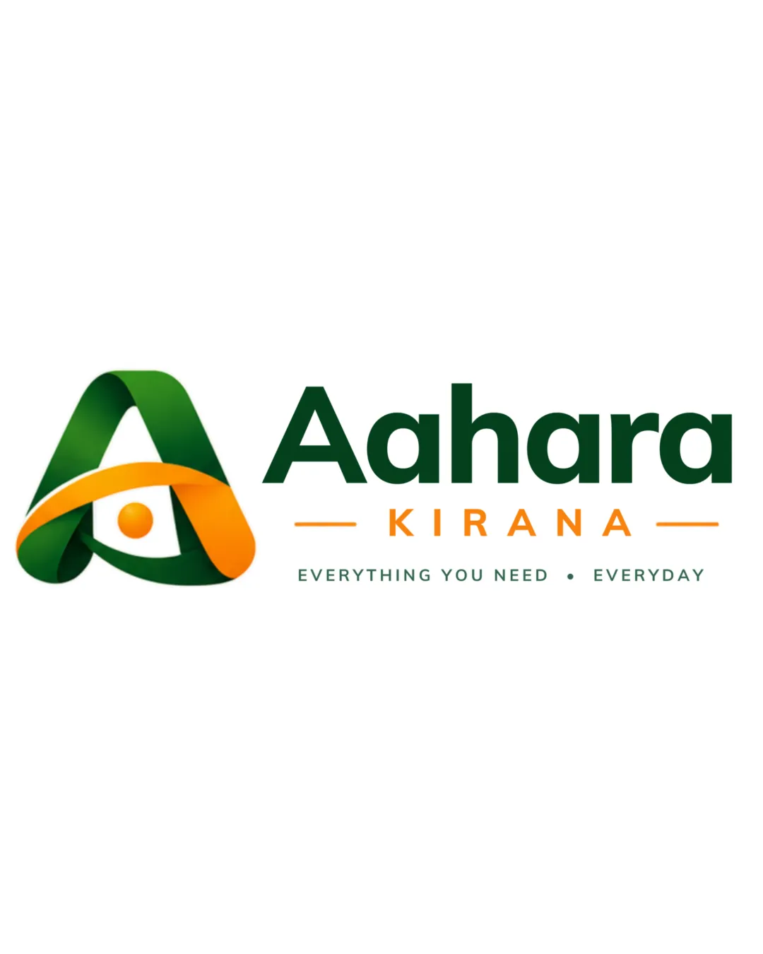
Aahara KIRANA logo

creative424808 Essential logo review

Flat elements and rendered 3D shading use conflicting visual treatments; unify the style and simplify the shaded details.

This logo lockup needs a consistent rendering style; mixing flat elements with rendered 3D detail limits its originality, style consistency and scalability scores.

Combination Mark Modern, Dimensional Grocery/food Retail
4.4/5
Legibility
2.4/5
Originality
4/5
Balance
3.2/5
Scale
4/5
Color
2/5
Style consistency
Your next steps

What to fix first

Focus on the changes that matter. Keep what makes the logo work.

1

mark (ribbon cross-section)

Test mark at small sizes and create a flat/monochrome-safe version if needed.

High priority Worth testing Medium effort

The mark relies on fine gradients and overlapping shapes for dimensional effect, which may lose clarity or flatten out at small sizes or in single-color prints.

See the category review


Detailed review

Logo performance breakdown

4/5

Brief & logo match

The logo's ribbon mark, vibrant color palette, and readable text suit a modern grocery or food retailer, but the 3D mark may need simplification for broad use.

5/5

Misinterpretations

  • No plausible unintended readings.
4.4/5

Legibility

Wordmark 4/5 · Layout 5/5

  • Main name highly readable; tagline could benefit from stronger contrast.
4/5

Color harmony

Symbol 4/5 · Wordmark 4/5

  • Green and orange palette is appealing and food-appropriate.
DarkGreen#185235
Orange#EDA402
White#FFFFFF

Estimated colors. Use the original design file for exact values.

Create a full color palette using these colors

Create new palette
4/5

Balance alignment

Symbol 4/5 · Wordmark 4/5 · Layout 4/5

  • Clear hierarchy and balanced layout.
  • The tagline's small, light grey uppercase text feels faint and subordinate and might lack sufficient contrast versus the bright background, risking legibility especially at reduced sizes.

    Optional refinement tagline under wordmark
Uploaded logoAlignment guide overlay

Inspect spacing with the guide. Optical balance may differ from geometric centering.

3.2/5

Scalability

Symbol 2/5 · Wordmark 4/5 · Layout 4/5

  • Mark's 3D style is visually appealing but may not reproduce clearly in all formats.
  • Modeled highlights and shadows add detail that needs simplification for consistent flat reproduction.

    Visible issue mark
  • The mark relies on fine gradients and overlapping shapes for dimensional effect, which may lose clarity or flatten out at small sizes or in single-color prints.

    Worth testing mark (ribbon cross-section)

    Try: Test mark at small sizes and create a flat/monochrome-safe version if needed.

2.4/5

Originality

Symbol 2/5 · Wordmark 3/5

Available in Advanced logo reviews
2/5

Style consistency

Available in Advanced logo reviews
Try your own review

Wondering how your logo performs?

Get a clear logo score, key risks, and priority fix ideas before your client or audience sees it.

Review my logo