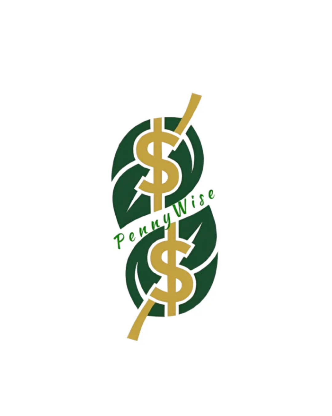
PennyWise logo logo review
2.7/5
Logo score Combination mark category

PennyWise logo

creative499857 Essential logo review

The logo expresses financial growth using universal motifs, but its complexity and ordinary concept limit memorability and small-size clarity; simplification and more inventive integration are recommended.

This logo lockup has a workable foundation; improving distinctiveness is the clearest next step.

Combination Mark Modern, Minimal Color, Flat Fintech/personal Finance
3.1/5
Legibility
2/5
Originality
2.8/5
Balance
2.4/5
Scale
4/5
Color
3/5
Style consistency
Your next steps

What to fix first

Focus on the changes that matter. Keep what makes the logo work.

1

entire mark

Simplify the symbol to improve small-size clarity and maintain distinct forms.

High priority Visible issue Medium effort

The mark contains multiple overlapping elements (leaves, dollar signs, arrow, wordmark) which visually congest at small sizes, potentially losing clarity and recognizability.

See the category review

Detailed review

Logo performance breakdown

3/5

Brief & logo match

The logo incorporates the prescribed growth and financial symbols with the right palette, but is visually dense, overly literal, and not strongly differentiated, which conflicts with the minimalist and premium goals.

5/5

Misinterpretations

  • Dual leaf-growth/dollar motif is clear with no negative interpretations.
4/5

Color harmony

Symbol 4/5 · Wordmark 4/5

  • Palette aligns with premium finance expectations and the supplied brief.
  • The green and gold palette fits the brief but could be further refined with subtle accent or outline for better luxury feel and separation.

    Optional refinement symbol and wordmark
Forest Green#183B2B
Muted Gold#D6B56D
Sage Green (text appears close)#A8BDA0

Estimated colors. Use the original design file for exact values.

Create a full color palette using these colors

Create new palette
3.1/5

Legibility

Wordmark 4/5 · Layout 2/5

  • 'PennyWise' is readable and the dollar sign is immediately identifiable.
3/5

Style consistency

This review includes a score but no supporting explanation for this category.

2.8/5

Balance alignment

Symbol 3/5 · Wordmark 3/5 · Layout 2/5

  • The angled placement of the 'PennyWise' wordmark over the symbol creates tension and reduces visual harmony, interrupting mark cohesion.

    Visible issue wordmark and symbol intersection
Uploaded logoAlignment guide overlay

Inspect spacing with the guide. Optical balance may differ from geometric centering.

2.4/5

Scalability

Symbol 2/5 · Wordmark 3/5 · Layout 2/5

Available in Advanced logo reviews
2/5

Originality

Symbol 2/5 · Wordmark 2/5

Available in Advanced logo reviews
Try your own review

Wondering how your logo performs?

Get a clear logo score, key risks, and priority fix ideas before your client or audience sees it.

Review my logo