Wondering how your logo performs? 🧐
Get professional logo reviews in seconds and catch design issues in time.
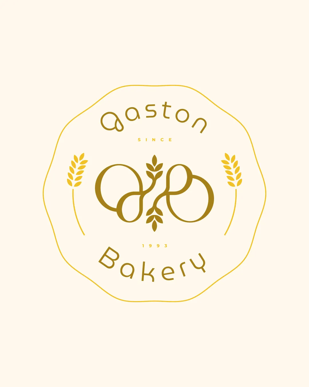
Try it Now!Logo review of aaston Bakery since 1993
 Logo analysis by AI
Recognized style:
Logo type:
Detected symbol:
Detected text:
Business industry:
Review requested by Graphstorm
**If AI can recognize or misinterpret it, so can people.
Structured logo review
Legibility
![]() The text 'aaston Bakery' is mostly legible and suits the decorative style.
The text 'aaston Bakery' is mostly legible and suits the decorative style.
![]() The stylized nature of 'aaston' might slightly affect readability.
The stylized nature of 'aaston' might slightly affect readability.
Scalability versatility
![]() Simple color scheme aids scalability and versatility.
Simple color scheme aids scalability and versatility.
![]() The intricate details may be lost in smaller sizes.
The intricate details may be lost in smaller sizes.
200x250 px
100×125 px
50×62 px
Balance alignment
![]() Good balance between symbol and text.
Good balance between symbol and text.

Originality
![]() Unique blend of initials with wheat symbolism.
Unique blend of initials with wheat symbolism.
![]() Circular ornate shape is somewhat common in bakery branding.
Circular ornate shape is somewhat common in bakery branding.
Logomark wordmark fit
![]() The symbol and text complement each other well.
The symbol and text complement each other well.
Aesthetic look
![]() The logo has a charming, nostalgic aesthetic.
The logo has a charming, nostalgic aesthetic.
Cultural sensitivity dual meaning
![]() No cultural sensitivity issues detected.
No cultural sensitivity issues detected.
Color harmony
![]() Color choices enhance the artisanal, rustic vibe.
Color choices enhance the artisanal, rustic vibe.


