Wondering how your logo performs? 🧐
Get professional logo reviews in seconds and catch design issues in time.
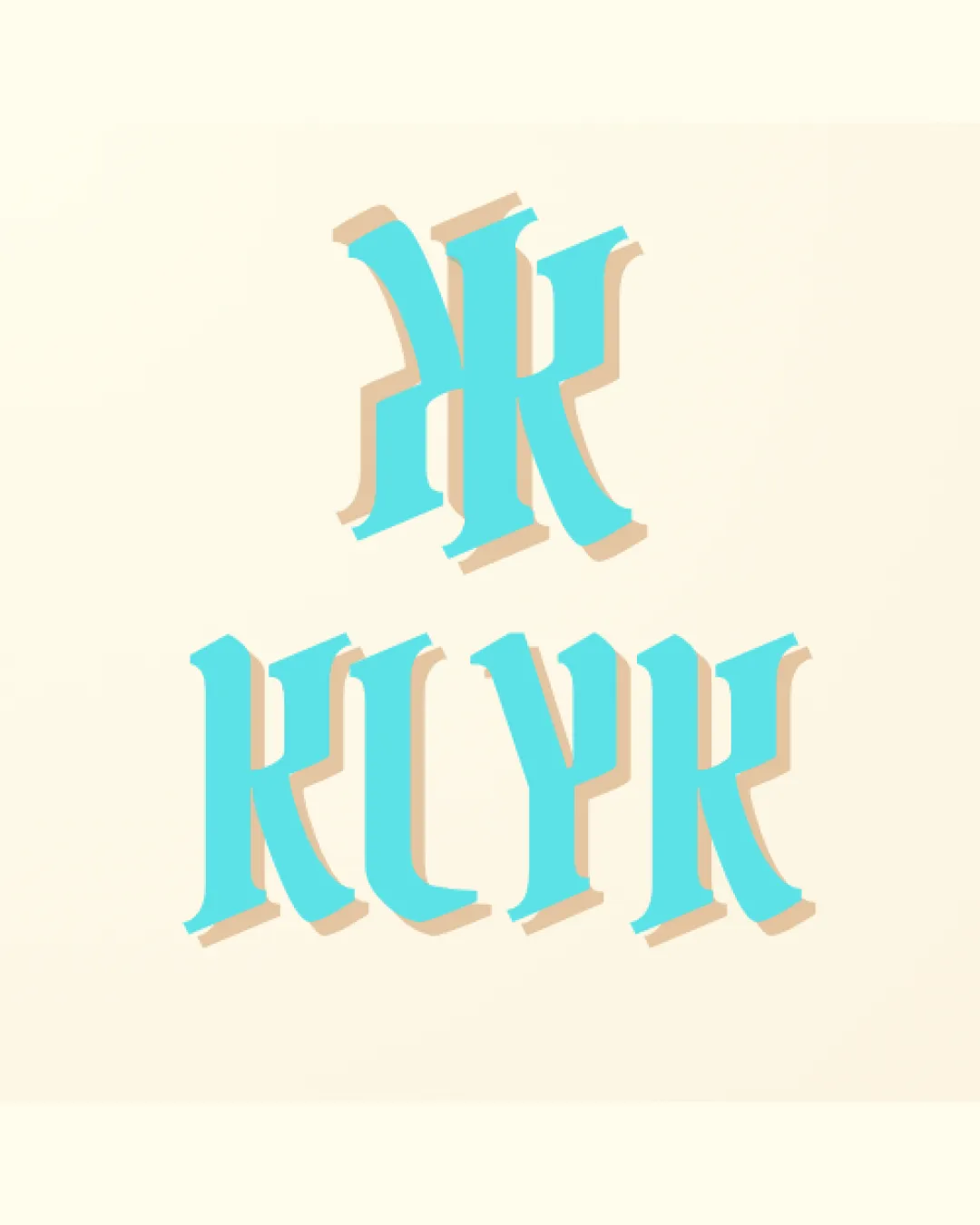
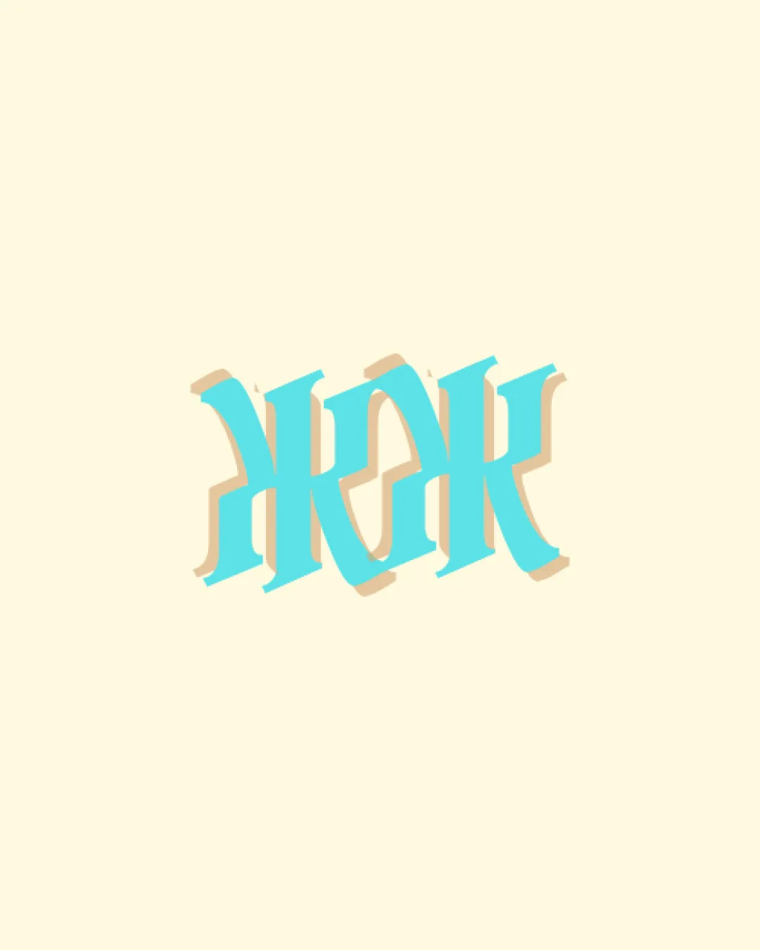
Try it Now!Logo review of AKAK, KAKK (difficult to immediately decipher)
 Logo analysis by AI
Logo type:
Style:
Detected symbol:
Detected text:
Business industry:
Review requested by XavierShayne35
**If AI can recognize or misinterpret it, so can people.
Structured logo review
Legibility
![]() Unique letterforms, artistic approach.
Unique letterforms, artistic approach.
![]() Text is difficult to read at first glance.
Text is difficult to read at first glance.![]() Ambigram styling makes distinguishing the characters challenging.
Ambigram styling makes distinguishing the characters challenging.![]() Letter distinction is poor—removes clarity for new viewers.
Letter distinction is poor—removes clarity for new viewers.
Scalability versatility
![]() Bold shapes may retain form at larger sizes.
Bold shapes may retain form at larger sizes.![]() Distinct color contrast stands out in digital uses.
Distinct color contrast stands out in digital uses.
![]() Thin details and decorative serifs risk being lost at small sizes.
Thin details and decorative serifs risk being lost at small sizes.![]() Shadow effect may blur on embroidery, business cards, or favicons.
Shadow effect may blur on embroidery, business cards, or favicons.![]() Not suitable for limited-color or single-color print applications without rework.
Not suitable for limited-color or single-color print applications without rework.
200x250 px
100×125 px
50×62 px
Balance alignment
![]() Symmetrical structure gives an overall balanced look.
Symmetrical structure gives an overall balanced look.![]() Letterforms have even spacing and proportional consistency.
Letterforms have even spacing and proportional consistency.
![]() Minor inconsistencies in stroke width and shadow placement make the weight feel slightly uneven.
Minor inconsistencies in stroke width and shadow placement make the weight feel slightly uneven.

Originality
![]() Creative use of ambigram/monogram style—stands out from generic logos.
Creative use of ambigram/monogram style—stands out from generic logos.![]() Clever integration of mirrored/rotational elements.
Clever integration of mirrored/rotational elements.
Aesthetic look
![]() Color palette is appealing.
Color palette is appealing.![]() Style feels fresh compared to most typographic logos.
Style feels fresh compared to most typographic logos.
![]() Visual noise from complex shadowing detracts from minimal, modern aesthetics.
Visual noise from complex shadowing detracts from minimal, modern aesthetics.![]() Overly ornate—risks feeling dated or overly decorative for many contemporary applications.
Overly ornate—risks feeling dated or overly decorative for many contemporary applications.
Dual meaning and misinterpretations
![]() No inappropriate or problematic shapes detected.
No inappropriate or problematic shapes detected.
Color harmony
![]() Palette is limited to three complementary shades.
Palette is limited to three complementary shades.![]() Good contrast between monogram and background enhances focus.
Good contrast between monogram and background enhances focus.
Pelorous
#7DD7D7
Champagne
#ECE3CA
Sand
#DAC9A6