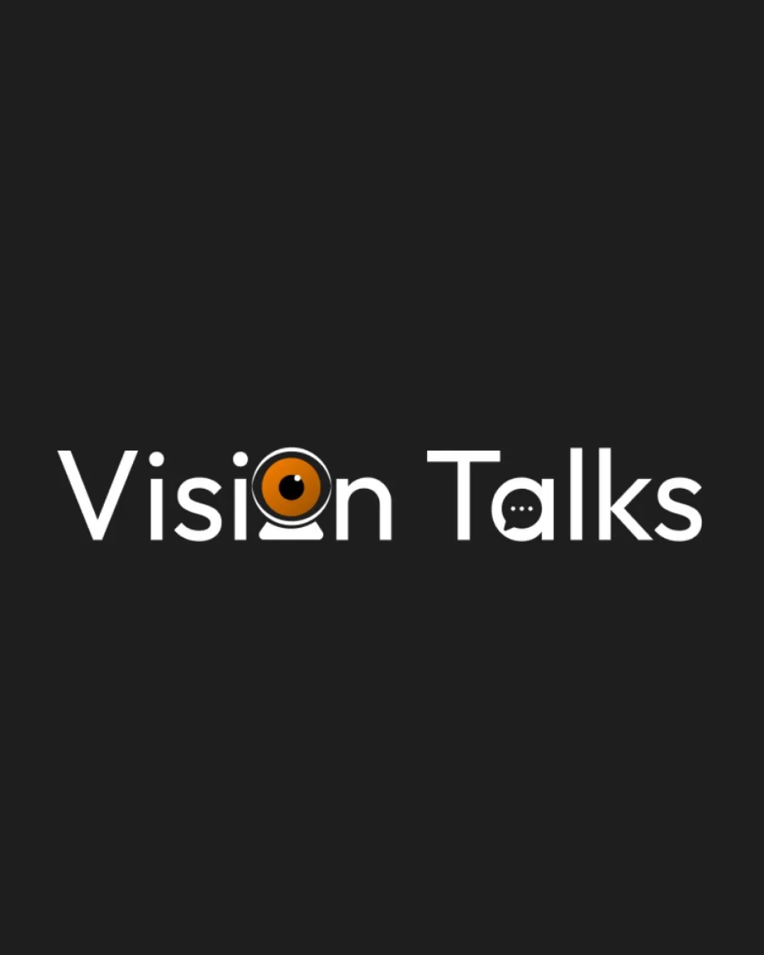
Vision Talks logo review
4.1/5
Logo score

Vision Talks

Review the detailed scores below to see what is working and what should be refined first.

Combination Mark Modern, Minimal, Playful Media
4/5
Legibility
4/5
Originality
4/5
Balance
3/5
Scale
Detailed review

Logo performance breakdown

4/5

Legibility

  • Main text is highly readable with good font choice.
  • Contrast between white text and dark background enhances legibility.
  • The 'a' as a chat bubble can be momentarily ambiguous, reducing instant clarity for readers.
  • Complexity inside 'o' may slightly hinder read-at-a-glance.

4/5

Originality

  • Creative use of the webcam and chat bubble integrated into letters.
  • Dual-symbol integration is uncommon and conceptually fitting.
  • Both webcam and chat bubble are fairly familiar motifs in media/tech logos, so not fully unique.
  • Heavy reliance on literal symbolism rather than abstraction.
5/5

Color harmony

  • Palette is cohesive, modern, and aligns with tech/media brands.
  • Sufficient contrast is maintained.
White#FFFFFF
Ebony#181818
Copper#B96A11

Estimated colors. Use the original design file for exact values.

Create a full color palette using these colors

Create new palette
4/5

Balance alignment

  • Strong horizontal alignment between logotype elements.
  • Visual weight is evenly distributed.
  • Symbolic 'o' and 'a' may slightly interrupt the letter spacing and rhythm.
  • The webcam base slightly overextends compared to the rest of the wordmark.
Uploaded logoAlignment guide overlay

Inspect spacing with the guide. Optical balance may differ from geometric centering.

3/5

Scalability

  • Bold, simple shapes translate reasonably well to different media.
  • Limited color palette aids in printing.
  • Detail in webcam 'o' and chat bubble 'a' will be lost or muddy at small sizes (e.g., favicons, embroidery).
  • May not be as recognizable in monochrome or compact applications.
5/5

Misinterpretations

  • No inappropriate visual connotations detected.
  • Dual symbols are handled thoughtfully.
4/5

Symbol & text fit

  • Symbolic elements are well woven into the wordmark, maintaining consistent stroke weight and style.
  • Visual style is cohesive across symbols and letters.
  • Letter transformation (especially in the 'a') feels slightly forced, affecting type fluidity.
  • Aesthetic difference between geometric symbol and typeface could be further harmonized.
Try your own review

Wondering how your logo performs?

Get a clear logo score, key risks, and priority fix ideas before your client or audience sees it.

Review my logo



