View review
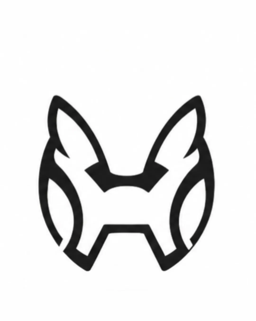
Logo review ofAbstract Fox Head Or Animal Face With Prominent Ea..
Review the detailed scores below to see what is working and what should be refined first.
Logo performance breakdown
Originality
Creative integration of animal features with abstract, stylized lines.
Subtle double-meaning with a hidden letter 'H' in the negative space adds a unique twist.
Geometric animal marks are becoming more common; could benefit from a more distinguishing feature to stand out further.

Color harmony
Monochrome palette ensures maximum flexibility and contrast.
Clean, high-contrast look fits a modern aesthetic.
Black
#000000
White
#FFFFFF
Balance alignment
Symmetrical composition provides strong visual balance.
Geometric shapes create an even weight distribution across the mark.
Scalability
Bold, geometric lines ensure the logo is easily recognizable at various sizes.
Minimalistic design will reproduce well in monochrome or as an icon.
Fine internal details may become less distinct when scaled extremely small, such as on a favicon or embroidery.
The complexity within the ears could be challenging for very small or low-resolution applications.
200x250 px
100×125 px
50×62 px
Misinterpretations
No inappropriate visual elements or unintended negative symbols detected.
The combination of animal and letter is clear without confusion.
Wondering how your logo performs?
Get a clear logo score, key risks, and priority fix ideas before your client or audience sees it.