What to preserve
The wordmark cleverly forms the double 'p' in 'happens' into an infinity symbol, suggesting continuity or endless possibility.
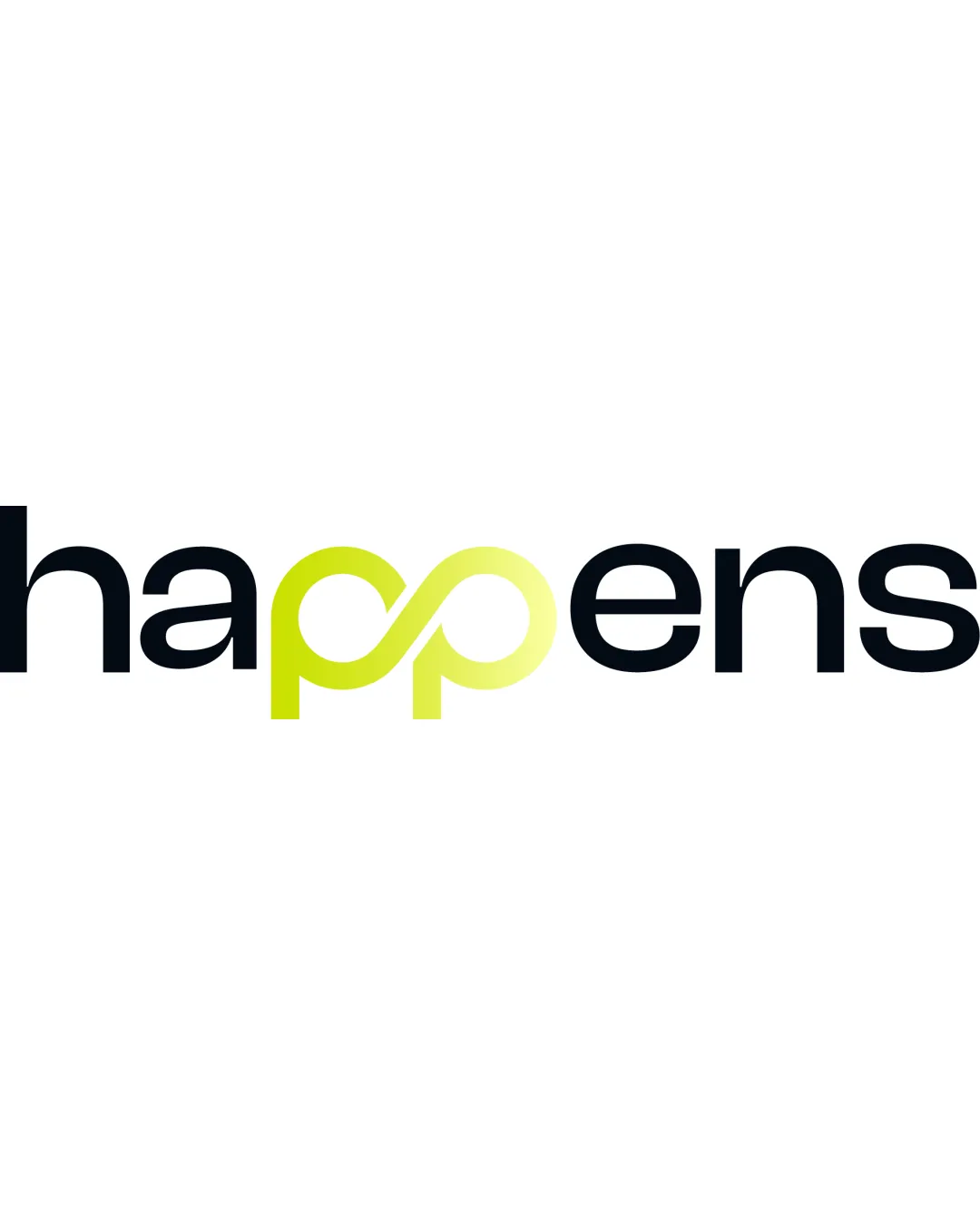
An inventive and lively wordmark with a memorable centerpiece, but the oversized infinity symbol could be refined for improved balance and versatility.
This wordmark shows solid execution, supported by distinctive construction and text readability; improving clarity at smaller sizes is the clearest next step.
Focus on the changes that matter. Keep what makes the logo work.
The wordmark cleverly forms the double 'p' in 'happens' into an infinity symbol, suggesting continuity or endless possibility.
double p/infinity symbol
The infinity symbol as the double 'p' is wider and visually heavier than the other letterforms, causing a slight imbalance in the wordmark.
See the category reviewThe inventive use of the infinity symbol to merge the double 'p' visually supports themes of continuity or endless possibilities, fitting a modern, general-use brand, though minor balance refinements would improve execution.
The gradient transition within the infinity symbol adds visual interest but may not render consistently across all brand applications.
Estimated colors. Use the original design file for exact values.
Create a full color palette using these colors
Create new paletteThe infinity symbol as the double 'p' is wider and visually heavier than the other letterforms, causing a slight imbalance in the wordmark.
Try: Test reducing the width or streamlining the infinity loop to better match the rhythm of the other letters.

Inspect spacing with the guide. Optical balance may differ from geometric centering.
Fine lines and overlapping paths of the infinity shape may become indistinct or merge when displayed at smaller sizes.
Get a clear logo score, key risks, and priority fix ideas before your client or audience sees it.
More credits needed
Add credits to continue without losing your work.
Then $7/month. Cancel anytime.
Essential logo review with AI
Estimated progress