Concept & direction
The wordmark 'kora coffee' is presented with customized playful letterforms, especially the 'k,' possibly evoking organic or animal-like shapes to add character and freshness appropriate for a new generation coffee shop.
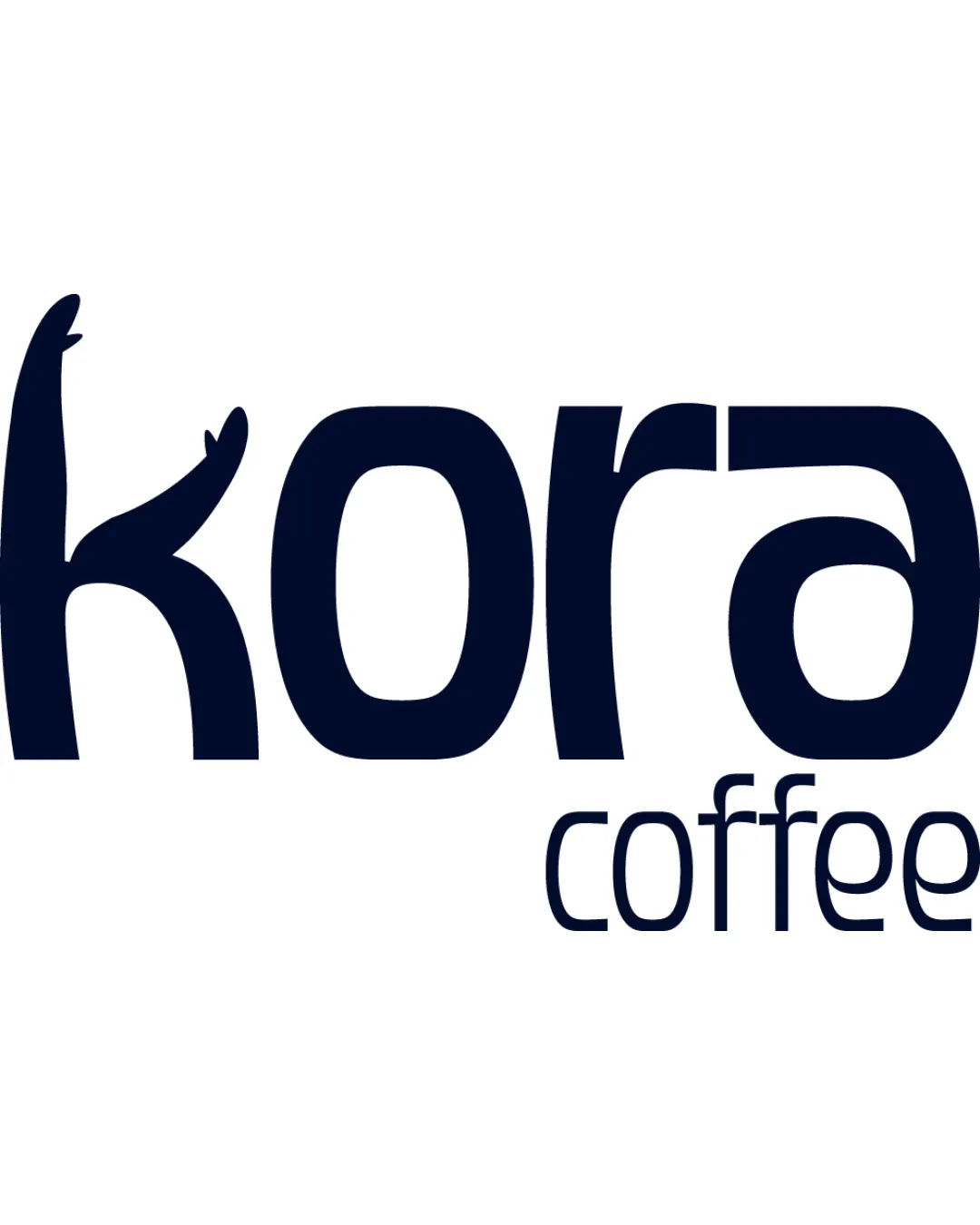
Striking and distinctive wordmark with creative flair, well-suited for a modern coffee shop, but would benefit from a subtle alignment tweak for polish.
This wordmark shows solid execution, supported by distinctive construction and text readability; improving visual balance is the clearest next step.
Focus on the changes that matter. Keep what makes the logo work.
The wordmark 'kora coffee' is presented with customized playful letterforms, especially the 'k,' possibly evoking organic or animal-like shapes to add character and freshness appropriate for a new generation coffee shop.
interaction between 'kora' and 'coffee'
The 'coffee' descriptor is right-aligned underneath 'ora,' shrinking in size and placed closely, which may affect visual weight distribution and can feel slightly imbalanced for a centerpiece logo.
See the category reviewThe quirky, youth-oriented wordmark fits a 'new generation coffee shop' context, though additional cues of coffee culture could further strengthen relevance.
The 'k' features a whimsical, animal/plant-like form on its left stroke, setting a friendly, unique tone for the visual identity.
The 'coffee' descriptor is right-aligned underneath 'ora,' shrinking in size and placed closely, which may affect visual weight distribution and can feel slightly imbalanced for a centerpiece logo.
Try: Consider adjusting the alignment or spacing between 'kora' and 'coffee' for a more cohesive visual block, especially for signage and social media usage.

Inspect spacing with the guide. Optical balance may differ from geometric centering.
Get a clear logo score, key risks, and priority fix ideas before your client or audience sees it.
More credits needed
Add credits to continue without losing your work.
Then $7/month. Cancel anytime.
Essential logo review with AI
Estimated progress