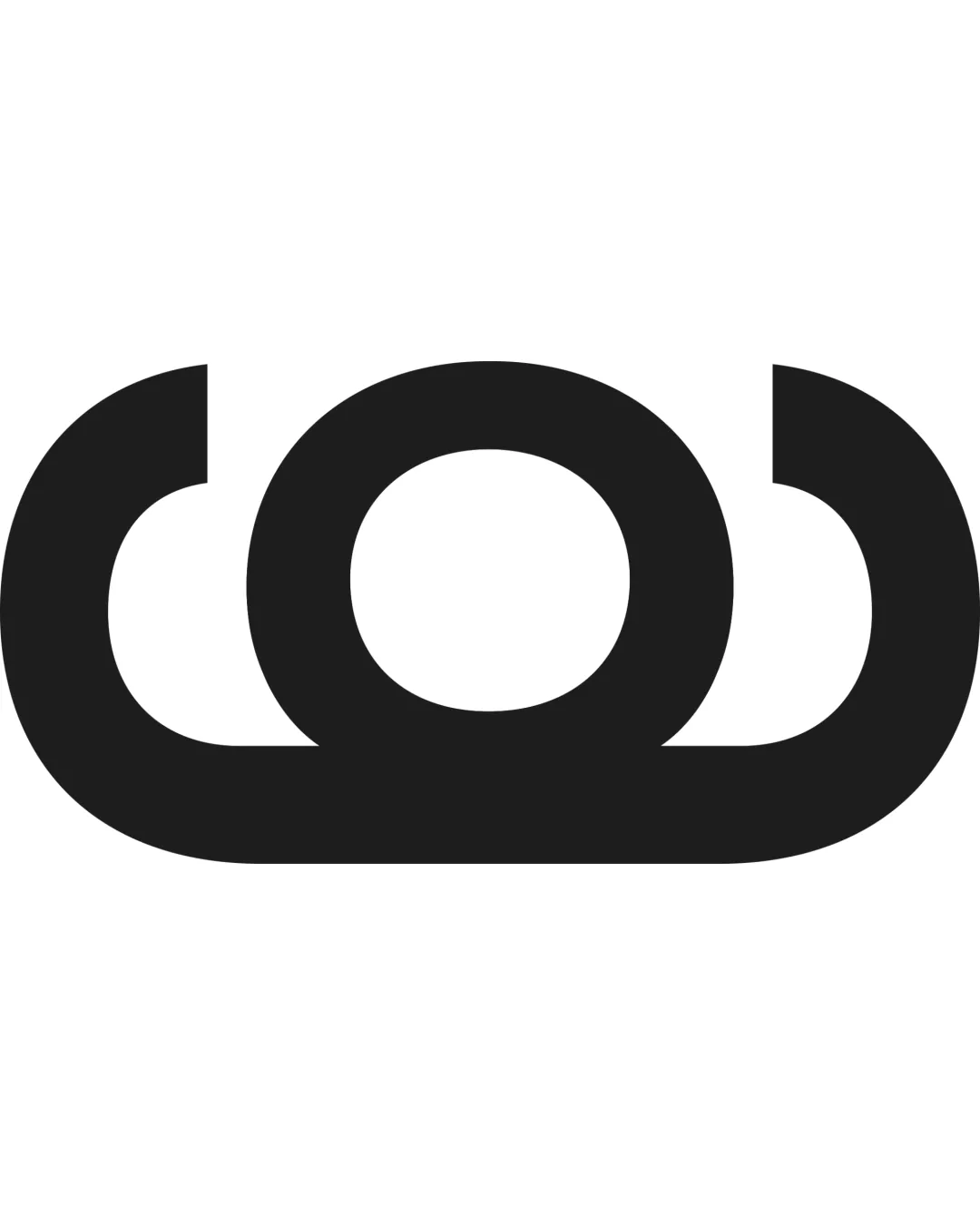
A bold black geometric mark resembling abstract ar.. logo review
3.5/5
Logo score

A bold black geometric mark resembling abstract ar..

@creative111802 Essential logo review

Visually strong and versatile, but needs more distinctiveness for brand ownership.

Standalone Mark Abstract Geometric
3/5
Originality
5/5
Balance
5/5
Scale
Your next steps

What to fix first

Focus on the changes that matter. Keep what makes the logo work.

1

Standalone mark

Consider integrating a subtle, unique detail or form that ties to brand values or sector.

Medium priority Visible issue Medium effort

The abstract form is visually strong and symmetrical but may be interpreted as generic without contextual cues or added distinctiveness.

How to check

Test distinctiveness in industry context and with target audience.

See the category review
Detailed review

Logo performance breakdown

Not scored

Brief & logo match

There isn't enough brand context to assess the match.

3/5

Originality

  • Confident geometric construction.
  • The abstract form is visually strong and symmetrical but may be interpreted as generic without contextual cues or added distinctiveness.

    Visible issue Standalone mark

    Try: Consider integrating a subtle, unique detail or form that ties to brand values or sector.

    Check: Test distinctiveness in industry context and with target audience.
5/5

Balance alignment

  • Symmetrical and balanced across horizontal axis.
Uploaded logoAlignment guide overlay

Inspect spacing with the guide. Optical balance may differ from geometric centering.

5/5

Scalability

  • Bold, simple lines for effective scaling.
  • No fine detail at risk.
5/5

Misinterpretations

  • No clear unintended readings or dual meanings.
Try your own review

Wondering how your logo performs?

Get a clear logo score, key risks, and priority fix ideas before your client or audience sees it.

Review my logo