Concept & direction
A prominent T monogram and elegant serif name create a restrained luxury identity.
Spelling & grammar
No obvious issue foundThe visible name reads TANVERA; its intended spelling is not verified.
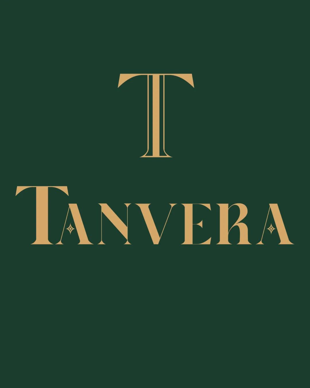
A coherent luxury-style lockup with clear typography, though its familiar styling offers limited differentiation.
This logo lockup shows solid execution, supported by visual balance and text readability; improving distinctiveness is the clearest next step.
Focus on the changes that matter. Keep what makes the logo work.
A prominent T monogram and elegant serif name create a restrained luxury identity.
The visible name reads TANVERA; its intended spelling is not verified.
Monogram stem and stars inside the A letters
The fine monogram lines and tiny star details are much thinner than the main letterforms and may disappear at small print sizes.
See the category reviewThe refined serif styling supports the luxury skincare brief, but the artwork does not visibly communicate its botanical or Indian heritage aspects.
Monogram 3/5 · Wordmark 3/5
The single T and high-contrast serif lettering use familiar luxury-design conventions, leaving limited distinctive detail.
Try: Explore a more distinctive detail that relates to the botanical brief without compromising the name.
Check: Compare the revised detail with the existing serif forms for visual cohesion.
Monogram 4/5 · Wordmark 4/5 · Layout 4/5
Monogram 4/5 · Wordmark 4/5 · Layout 4/5

Inspect spacing with the guide. Optical balance may differ from geometric centering.
Monogram 4/5 · Wordmark 4/5 · Layout 4/5
The fine monogram lines and tiny star details are much thinner than the main letterforms and may disappear at small print sizes.
Try: Test the lockup at intended packaging and digital sizes, and simplify the fine details if needed.
Get a clear logo score, key risks, and priority fix ideas before your client or audience sees it.
More credits needed
Add credits to continue without losing your work.
Then $7/month. Cancel anytime.
Essential logo review
Usually takes under a minute