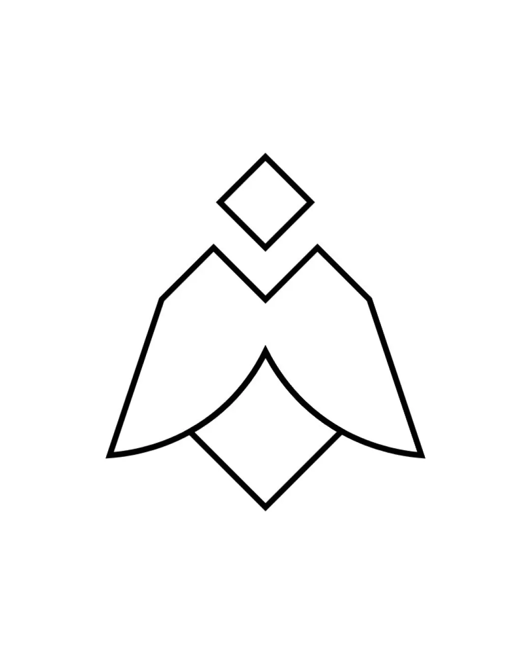
abstract geometric shape resembling a bird with a .. logo review
4.5 / 5
Logo score

Logo review ofAbstract Geometric Shape Resembling A Bird With A ..

Review the detailed scores below to see what is working and what should be refined first.

Logomark Minimal, Geometric, Line Art Technology
4/5
Originality
5/5
Misread
4/5
Balance
5/5
Scale
Review next
Detailed review

Logo performance breakdown

4/5

Originality

Checkmark icon Geometric abstraction and negative space add nuance.
Checkmark icon Diamond above the 'head' creates a distinct mark.

Warning icon Basic geometric birds or origami-inspired icons are somewhat common in technology and creative industries, so the originality is moderate rather than exceptional.

5/5

Color harmony

Checkmark icon Extremely harmonious due to monochrome palette.
Checkmark icon Black on white ensures maximum contrast and clarity.

White
#FFFFFF

Black
#000000

4/5

Balance alignment

Checkmark icon Symmetrical shape provides good visual balance.
Checkmark icon Central axis and mirrored angles enhance alignment.

Warning icon The line thickness does not vary, which may cause the logo to look slightly static or rigid, lacking dynamic energy.

logo 200x250 pixels scalability test alignment grid overlay
5/5

Scalability

Checkmark icon Simple line work ensures strong scalability to both large (billboard, signage) and small sizes (favicon, app icon, business card).
Checkmark icon Minimalist style increases versatility across digital and print media, merchandise, and product branding.

logo 200x250 pixels scalability test

200x250 px

logo 100x125 pixels scalability test

100×125 px

logo 50x62 pixels scalability test

50×62 px

5/5

Misinterpretations

Checkmark icon No inappropriate or accidental negative connotations detected.
Checkmark icon Shape is abstract yet controlled, reducing risk of misinterpretation.

Try your own review

Wondering how your logo performs?

Get a clear logo score, key risks, and priority fix ideas before your client or audience sees it.

Review my logo