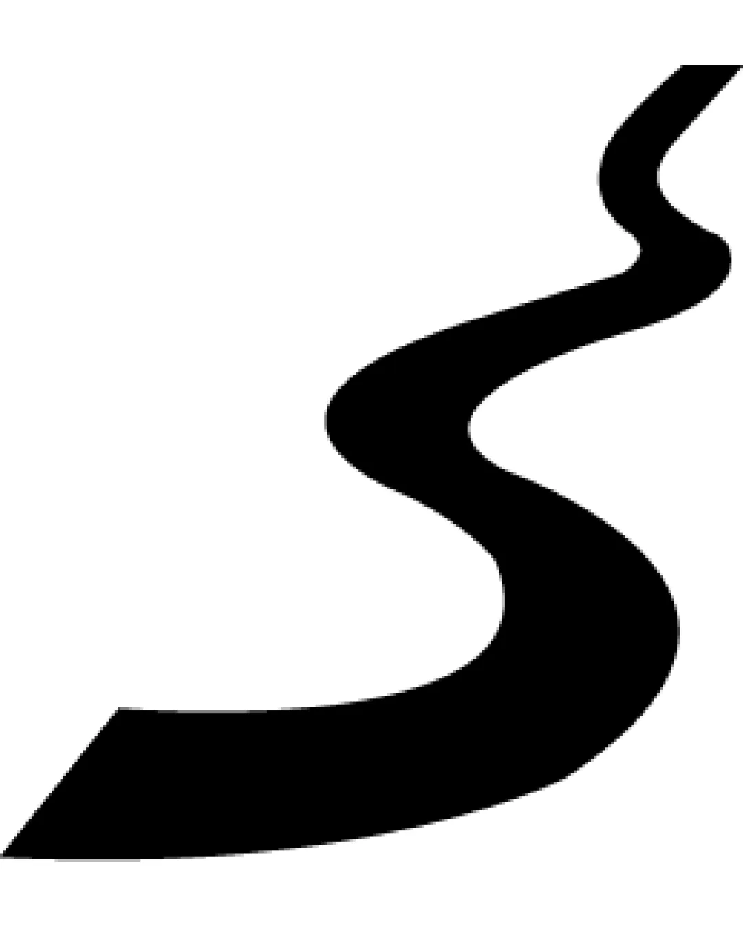
abstract winding road or river shape logo review
4.2 / 5
Logo score

Logo review ofAbstract Winding Road Or River Shape

Review the detailed scores below to see what is working and what should be refined first.

Abstract Symbol Minimalist, Bold, Monochrome Transportation
3/5
Originality
4/5
Misread
4/5
Balance
5/5
Scale
Review next
Action plan

What to fix first

The most important fixes to handle before polishing the full presentation.

1

Fix possible misinterpretation

High priority

Abstract pattern could be misread as a river or a generic squiggle without supporting context.
Impact: High · Effort: Medium

Detailed review

Logo performance breakdown

3/5

Originality

Checkmark icon Minimalist approach avoids clichés like overcomplicated icons.
Checkmark icon Abstract winding path gives a modern touch.

Warning icon The 'winding road' motif is somewhat generic in the transportation or mapping industries.
Warning icon No unique twist or secondary meaning present.

5/5

Color harmony

Checkmark icon Black and white provides maximum contrast and works on any background.
Checkmark icon Monochrome ensures maximum flexibility for reproduction.

Black
#000000

White
#FFFFFF

4/5

Balance alignment

Checkmark icon The visual weight of the shape is generally well-balanced.
Checkmark icon Curved lines naturally draw the eye along the path.

Warning icon Slight irregularity in the top vs. bottom weight distribution could feel unexpected, especially when viewed at smaller sizes or out of context.

logo 200x250 pixels scalability test alignment grid overlay
5/5

Scalability

Checkmark icon The bold, simple shape will scale exceptionally well to all sizes, from favicons to billboards.
Checkmark icon Clarity is retained in black-and-white and on both light and dark backgrounds.
Checkmark icon Well-suited for signage, vehicle decals, and digital assets.

logo 200x250 pixels scalability test

200x250 px

logo 100x125 pixels scalability test

100×125 px

logo 50x62 pixels scalability test

50×62 px

4/5

Misinterpretations

Checkmark icon No inappropriate or unintended shapes are visible.
Checkmark icon Design is unlikely to be misinterpreted in a negative way.

Warning icon Abstract pattern could be misread as a river or a generic squiggle without supporting context.

Try your own review

Wondering how your logo performs?

Get a clear logo score, key risks, and priority fix ideas before your client or audience sees it.

Review my logo