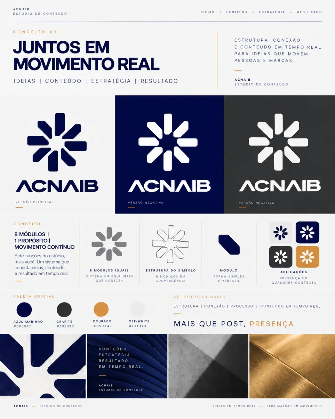
ACNAIB logo review
4.5/5
Logo score
Logo review of

Acnaib

A modern, well-balanced identity system with minor refinements needed for optimal small-scale performance and maximal originality.

Combination Mark Geometric, Modern, Modular Content Creation / Marketing / Strategy Studio
4/5
Legibility
4/5
Originality
5/5
Misread
5/5
Balance
4/5
Scale
Your next steps

What to fix first

Focus on the changes that matter. Keep what makes the logo work.

1

symbol

Test mark clarity at small scale and consider slightly widening key gaps if needed.

Optional refinement High priority Low effort
Area to inspectApproximate location

Fine negative spaces between symbol bars may close up at very small sizes, risking loss of clarity.

How to check

Print or display the symbol at favicon and app icon sizes to confirm visibility of all negative spaces.


See the category review
2

wordmark

Test wordmark readability at small scale and consider subtle adjustment to 'A' and 'I' for instant recognition.

Optional refinement Medium priority Low effort
Area to inspectApproximate location

The stylized 'A' and 'I' may cause a slight moment of hesitation for first-time readers due to their nonstandard forms.

How to check

Survey users unfamiliar with the name to gauge immediate readability.

See the category review
Detailed review

Logo performance breakdown

5/5

Brief & logo match

Based on an inferred industry
Compared with

No user brief given; strong fit for a content/strategy studio seeking to convey connection, process, and real-time presence.

The identity convincingly delivers modularity, structure, and presence for a modern content-driven brand.

  • Modular Symbol

    The eight-bar structure clearly signals modularity and ongoing movement, aligning with the brand's process-driven promise.

  • Readability

    The wordmark is generally clear, though stylized character choices introduce slight risk of confusion at a glance.

4/5

Legibility

  • Clean, geometric lettering
  • Styled wordmark fits brand character
  • The stylized 'A' and 'I' may cause a slight moment of hesitation for first-time readers due to their nonstandard forms.

    Optional refinement wordmark

    Try: Test wordmark readability at small scale and consider subtle adjustment to 'A' and 'I' for instant recognition.

    Check: Survey users unfamiliar with the name to gauge immediate readability.

    Area to inspectApproximate location
4/5

Originality

  • Balanced, modular concept ties to brand story
  • The radiating bar symbol is a strong, modern choice but can resemble common startup or tech marks; subtle customization may boost distinctiveness.

    Optional refinement symbol

    Try: Explore fine-tuning bar angles or core detail for added uniqueness while keeping the modular concept.

    Check: Compare against similar geometric marks to ensure clear standout in the industry context.

5/5

Color harmony

  • Sophisticated palette with versatile applications
Navy#000047
Graphite#303030
Gold#D99A4E
Off-White#FAFAF4

Estimated colors. Use the original design file for exact values.

Create a full color palette using these colors

Create new palette
5/5

Balance alignment

  • Excellent symmetry in symbol and wordmark
  • Harmonious pairing of mark and text
Uploaded logoAlignment guide overlay

Inspect spacing with the guide. Optical balance may differ from geometric centering.

4/5

Scalability

  • Symbol handles reduction well in most contexts
  • Multiple backgrounds shown for flexibility
  • Fine negative spaces between symbol bars may close up at very small sizes, risking loss of clarity.

    Optional refinement symbol

    Try: Test mark clarity at small scale and consider slightly widening key gaps if needed.

    Check: Print or display the symbol at favicon and app icon sizes to confirm visibility of all negative spaces.
    Area to inspectApproximate location
Uploaded logo at 200 pixels wide
200 × 250 px
Uploaded logo at 100 pixels wide
100 × 125 px
Uploaded logo at 50 pixels wide
50 × 63 px

Compare the detail at different sizes. Labels show the full image dimensions.

5/5

Misinterpretations

  • No unintended readings or ambiguous forms detected
5/5

Symbol & text fit

  • Mark and wordmark feel unified and contemporary

Black & white

Does the shape still work without color?

These tests are available only for logos uploaded in vector (SVG) format.

Background contrast

Find the surfaces where your logo stays clear.

These tests are available only for logos uploaded in vector (SVG) format.

Blur & silhouette

A 3px blur softens fine details so you can check whether the overall shape stays recognizable. If key gaps close or elements merge, the logo may rely too heavily on detail.

These tests are available only for logos uploaded in vector (SVG) format.

Try your own review

Wondering how your logo performs?

Get a clear logo score, key risks, and priority fix ideas before your client or audience sees it.

Review my logo