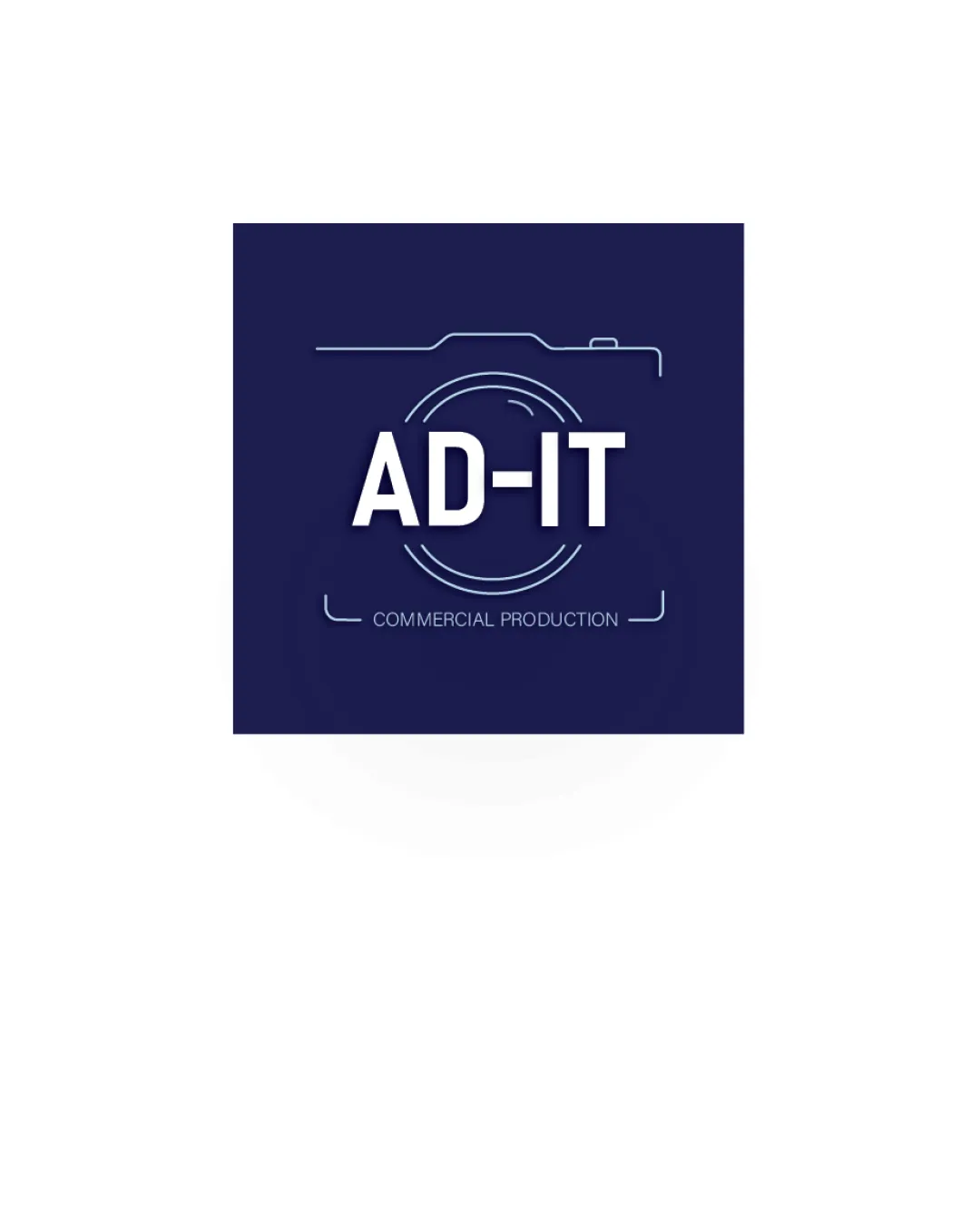
AD-IT COMMERCIAL PRODUCTION logo review
3.7 / 5
Logo score
Logo review of

Ad It Commercial Production

A clean, industry-appropriate combination mark; minor typographic and originality tweaks will improve impact.

Objective AI feedback. Your creative decision.

Combination Mark Modern Minimal Line Media/production
4.5/5
Legibility
3/5
Originality
5/5
Misread
4/5
Balance
3.5/5
Scale
Action plan

What to fix first

The most important fixes to handle before polishing the full presentation.

1

Strengthen tagline visibility for small-scale use by increasing weight or exploring bolder, more consistent secondary type treatment.

High priority

Tagline becomes illegible when scaled down.

Impact: Improves Practical Usability And Brand Recognition In Smaller Applications. · Effort: Low

2

Explore ways to differentiate the camera outline or overall lockup with a custom touch or visual flourish.

Medium priority

Current symbol is functional but generic for the industry.

Impact: Can Significantly Boost Logo Originality And Memorability. · Effort: Medium

Detailed review

Logo performance breakdown

4.5/5

Legibility

Checkmark icon Main wordmark ‘AD-IT’ is very clear and highly readable.
Checkmark icon Tagline uses a distinct but subtle thin type for hierarchy.

Warning icon Tagline text may be hard to read at very small sizes due to light weight.

3/5

Originality

Checkmark icon Camera + wordmark lockup is serviceable and industry-relevant.

Warning icon Line-art camera outline is relatively generic for media/production and lacks unique brand twist.

4/5

Color harmony

Checkmark icon Strong dark blue and white contrast is professional and attractive.

Navy
#181c48

White
#FFFFFF

Your palette is close. Refine the color roles and combinations before updating the logo.

Build brand colors
4/5

Balance alignment

Checkmark icon Good centering and relationships between the camera outline, wordmark, and tagline.
Checkmark icon Well-managed space and proportional balance.

logo 200x250 pixels scalability test alignment grid overlay
3.5/5

Scalability

Checkmark icon Simple lines and bold wordmark scale well for most uses.

Warning icon Thin tagline and fine camera outline could disappear at small sizes.

logo 200x250 pixels scalability test

200x250 px

logo 100x125 pixels scalability test

100×125 px

logo 50x62 pixels scalability test

50×62 px

5/5

Misinterpretations

Checkmark icon No ambiguous or problematic shapes.

4 / 5

Logo structure & brief match

Checkmark icon Camera outline nicely frames and accentuates the wordmark, supporting the theme.

Checkmark icon Industry Association: Camera outline and word choice directly communicate commercial production/media.
Checkmark icon Professional Appearance: Logo looks polished and evokes a modern business approach.

Try your own review

Wondering how your logo performs?

Get a clear logo score, key risks, and priority fix ideas before your client or audience sees it.

Review my logo